| Image |
Comment |
| 09/24/2009 12:12:30 PM |
xoxo-always and foreverby kaifox15Comment by EL-ROI: This one has a bit more depth than your friend's shot of the lips on yellow paper. You also focused well. I'll give you an E for effort. |
| 09/24/2009 12:20:05 AM |
|
| 09/22/2009 11:14:27 PM |
Sector 9by kaifox15Comment by geinafets: I think this image has a lot of potential. It's technically sound, but I think it would be a bit bolder if you darkened the blacks and ran this through Topaz (or a similar program) to bring out some grungy detail of the cement. Vignettes are illegal under this editing set, but if you want to work on this image some more once the challenge is over, I think a vignette would be another thing to add. |
| 09/22/2009 06:37:18 PM |
|
| 09/15/2009 05:14:38 PM |
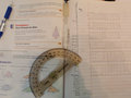
Geometryby kaifox15Comment by Lydia: Hmmm... I like the idea of this... but it seems that the only think close to being in focus is the backwards writing. If you'd flipped it over... I don't know. It needs more oomph, I think. More contrast, a closer crop and better lighting, I fear. The shadows are making it more dingy. (not voting) |
| 09/15/2009 12:15:11 PM |
|
| 09/13/2009 08:31:36 PM |
Geometryby kaifox15Comment by kandykarml: hmmm, too much here.. would have been fine with just the book and one of the additional objects.. and, check your white balance.. that can easily be fixed.. this seems to have a peachy hue to it.. it's a 4 for me. |
| 09/13/2009 04:45:53 PM |
Geometryby kaifox15Comment by Damzel: this falls a lil flat for me. And your shadow cast on it darkens it even more. |
| 09/12/2009 02:35:30 PM |
Geometryby kaifox15Comment by fitz3000: You have could come with a better idea for this contest or maybe more suitable composition of your objects, it's kinda messy |
| 09/11/2009 01:21:00 PM |
Geometryby kaifox15Comment by Yo_Spiff: Comes off a bit flat and dull looking. Popping this into my editor shows me the histogram is flat on the light end, which accounts for the appearance. A quick levels or curves adjustment can fix that. |
Home -
Challenges -
Community -
League -
Photos -
Cameras -
Lenses -
Learn -
Help -
Terms of Use -
Privacy -
Top ^
DPChallenge, and website content and design, Copyright © 2001-2026 Challenging Technologies, LLC.
All digital photo copyrights belong to the photographers and may not be used without permission.
Current Server Time: 07/16/2026 02:39:03 AM EDT.