| Image |
Comment |
| 08/21/2011 05:29:59 PM |
|
| 08/21/2011 11:33:05 AM |
|
| 08/19/2011 03:02:42 AM |
Time = D / Vby amnonComment by HarveyG: Brave for a simple challenge topic that implies a picture of a watch is what should be photographed. Good one! |
| 08/19/2011 01:09:10 AM |
the villageby amnonComment by Leo: Good city scape. The buildings look tilted to the left though. A bump in contrast, maybe saturation would have helped. It looks a bit washed out. |
 Photographer found comment helpful. Photographer found comment helpful. |
| 08/17/2011 06:47:22 PM |
|
| 08/17/2011 12:22:46 AM |
|
| Photographer found comment helpful. |
| 08/14/2011 08:38:25 PM |
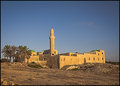
the mosqueby amnonComment by cowtownmom: I love your subject and think this picture could be improved with some post processing. It looks a bit washed out and could be improved by playing with brightness/contrast and hue saturation. |
| Photographer found comment helpful. |
| 08/07/2011 05:40:38 PM |
On the stageby amnonComment by grahamgator: Very good black and white tones and pretty model. A little too much softening for my taste and the shadows are a ittle distracting. (voted earlier) |
| 08/03/2011 08:14:31 PM |
|
| Photographer found comment helpful. |
| 08/03/2011 01:59:52 PM |
On the stageby amnonComment by Dphoto: On my monitor it looks like it's over sharpened. Maybe it's just me.... I like the composition..... |
Home -
Challenges -
Community -
League -
Photos -
Cameras -
Lenses -
Learn -
Help -
Terms of Use -
Privacy -
Top ^
DPChallenge, and website content and design, Copyright © 2001-2026 Challenging Technologies, LLC.
All digital photo copyrights belong to the photographers and may not be used without permission.
Current Server Time: 07/16/2026 01:50:43 AM EDT.