| Image |
Comment |
| 02/11/2010 08:42:03 PM |
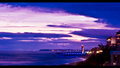
Umhlanga lighthouseby tinkie2010Comment by snaffles: Greetings from the Critique Club!
An interesting photo. Rule of thirds is followed well here, but right behind the lighthouse is a busy cityscape, which draws the eye away from the focal point. The saturation does look quite heavy. You want people to see the picture, not the post-processing! You probably could have cropped out everything on the right from the yellow sign on the building to the border and not hurt this shot at all. To be perfectly honest, this looks like a snapshot taken with a p&s.
The aperture and shutter speeds are fine for a shot of this nature, but if you shot at ISO 640 you were likely shooting handheld. Invest in a tripod and don't be afraid to use it. Then you can shoot at f.22, ISO 200 (or less) and leave the shutter open for a few seconds. That will give a greater sense of place and being, not to mention the razor-sharp focus so loved on this site.
Feel free to PM me with any questions,
Susan |
 Photographer found comment helpful. Photographer found comment helpful. |
| 02/09/2010 02:40:55 PM |
The Lookby tinkie2010Comment by sfalice: GREETINGS FROM The CRITIQUE CLUB
Hello,  tinkie2010 tinkie2010. We meet again. And again you have a delightful image. This time of a charming young girl. Indeed, she looks sleep-tousled and sweet.
I think you processed the image well and have made the young child come alive in the frame. So there isn't much of anything for me to critique in this Challenge entry.
I'm delighted to have seen it again, and wish you success in future entries.
Alice |
| Photographer found comment helpful. |
| 02/08/2010 01:06:00 AM |
The Lookby tinkie2010Comment by kellmak10: can't believe your score....imo picture is way better than that. this was one of my favorites! |
| Photographer found comment helpful. |
| 02/06/2010 05:04:23 PM |
The Lookby tinkie2010Comment by unbreakable: great photo. IMHO a little more contrast shadow to light would have made this even better but still a 9 |
| Photographer found comment helpful. |
| 02/06/2010 12:20:23 AM |
|
| Photographer found comment helpful. |
| 02/05/2010 12:41:47 AM |
|
| Photographer found comment helpful. |
| 02/03/2010 11:12:51 AM |
|
| Photographer found comment helpful. |
| 02/03/2010 09:27:13 AM |
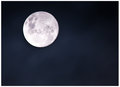
Blue moonby tinkie2010Comment by sarampo: Hi Marna, greetings from the Critique Club!
First of all, don't be discouraged by your score / placing in this challenge. You can only do it better next Moon challenge :)
Composition
Nothing to be said here. You respected the rule of thirds, and although it was a very plain shot (no clouds, distinguishable features any than the moon) it was very effective.
Settings
It seems to my eye that the focus on the moon was a weeeeee bit off. I assume that you were at the long end of your lens (that has peak sharpness at f/11 @400mm), and it's very difficult to focus like this.
Since you had a tripod, you could have used live view and zoomed in to focus exactly where it would be sharp.
Processing
If you shot in RAW, you could try to use Recovery to gain some lost details on the white, and then selectively burn some parts of the image, so the craters would be enhanced.
If you have any questions feel free to contact me.
Regards,
Joao |
| 02/01/2010 04:45:53 PM |
|
| Photographer found comment helpful. |
| 02/01/2010 01:56:11 PM |
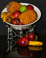
Refelctionby tinkie2010Comment by Nuzzer: Greetings from the Critique Club.
First impressions are that there is far too much going on in this shot.
Technically the lighting is too harsh - that will be the flash. Did you bounce it or diffuse it? Composition needs work too - the platter thing is too cramped against the edge of the frame.
Artistically the choice of platter may not have been best but I don't think that's the biggest issue here. The surface you have used is too reflective and that complicates the image rather than allowing us to focus on the fruit and the bowl.
In summary this is a good idea but it just hasn't come off. Try to reduce the harshness of the lighting and make the composition less complex.
Feel free to PM
me if you have any queries.
Gerry |
| Photographer found comment helpful. |
Home -
Challenges -
Community -
League -
Photos -
Cameras -
Lenses -
Learn -
Help -
Terms of Use -
Privacy -
Top ^
DPChallenge, and website content and design, Copyright © 2001-2026 Challenging Technologies, LLC.
All digital photo copyrights belong to the photographers and may not be used without permission.
Current Server Time: 07/18/2026 03:20:56 PM EDT.