| Image |
Comment |
| 05/14/2003 10:54:42 PM |
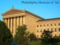
Philadelphia Museum of Artby ClubJuggleComment by christo: I think this is a pretty good entry for the "postcard" challenge.
First, the subject you chose (a museum) perfectly fits the theme. It was a good move to photograph one of the usual sights of your city. The composition you chose to illustrate the subject also well fits the theme since it is classic of postcards: a global view of the building. But the trees are definitely too distracting. The angle you chose to photograph this museum is perfect, but couldn't you have avoided those trees? It is sometimes interesting to add something in the foreground, I agree. But this has to be related to the subject and shouldn't distract from it. And in this case I think it does.
The exposure is very good, and you achieve a very good detail and sharp image. Very well done. It might even look oversharpened, but most of the postcards are... Same thing for the sky: the cyans are oversaturated in my opinion, but I think it fits the theme.
Looking again at this entry and thinking of what *I* would have done to improve this pic comes to my mind that the right side of the building is not very interesting. Maybe I would have tried a portrait crop of the columns between the trees. Pretty much with the same angle. Try and crop this one to have an idea.
That's all I can think of. A good picture anyway.
Good luck with your future entries!
The Critique Club |
 Photographer found comment helpful. Photographer found comment helpful. |
| 05/09/2003 06:29:43 PM |
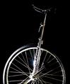
Balanceby ClubJuggleComment by Gracious: Critique Club Comments by Grayce
The low key process works very well with this subject. This meets the challenge nicely, and is artsy to boot!!! I like that. Keeping this as a black and white picture was a good choice. It makes the eye study the form as there are no distractions.
The flare draws attention, perhaps more than it deserves, but it does convey the glaring quality of the metal.
I love that you used a black bg for this. It really helps the subject pop.
OVer all I like this. Good job!
Regards,
Grayce |
| Photographer found comment helpful. |
| 05/09/2003 05:01:00 AM |
|
| Photographer found comment helpful. |
| 05/08/2003 11:50:31 PM |
Philadelphia Museum of Artby ClubJuggleComment by frisca: the sky colour looks unnatural, but I love the sharpness and detail on the building..we can see the bricks! Also , there are too many trees obstructing the view..a slightly different angle with fewer of them in the shot might have helped! |
| Photographer found comment helpful. |
| 05/08/2003 02:24:00 PM |
Philadelphia Museum of Artby ClubJuggleComment by eloise: Almost, but not quite. It's a decently interesting shot, but the composition is strange and an actual postcard-style angle wouldn't have had any trees obscuring the main point of interest. As it is, the eye is drawn first to the triangular pediment over the columns and then to the vast expanse of blank beige wall, leaving the viewer kind of foundering there. |
| Photographer found comment helpful. |
| 05/08/2003 12:03:59 PM |
Philadelphia Museum of Artby ClubJuggleComment by albright1: I love the color of the sky against that lovely brick. What a great building to photograph! The greens from the trees really add to the overall quality of the photo. |
| Photographer found comment helpful. |
| 05/07/2003 03:43:03 PM |
Balanceby ClubJuggleComment by Kavey: Kavey Critique
Initial thoughts
Nice subtle image – great study of an interesting bit of equipment.
Composition/ Content
I really like that the wheel is cropped – it makes it more abstract than a picture of a whole unicycle might be.
I also like the angle of the sticky-uppy rod, though I think a slightly greater angle, putting the seat further into a corner, would be better still.
My only criticism of the contents lies in the way the seat fades into the background. I think I’d like a little more lighting on it to bring it out more.
I like the flare from the light but not necessarily it’s position in the frame – I’d be interested to see other shots that have that flare in slightly different positions.
Background
Rich black is good, though I am not sure that I like the way that some of the tyre and the seat fade into it. Without seeing the same shot on a different background, I have to admit that I am not sure!
Fits The Challenge
Yes, and is a little unusual too.
My Opinion On The Photo
I like the low key choice and the abstract nature but the composition doesn’t quite click for me.
|
| Photographer found comment helpful. |
| 05/07/2003 01:23:04 PM |
Philadelphia Museum of Artby ClubJuggleComment by e301: That big blank expanse of wall doesn't help this shot - as a postcard, that is. It makes me wonder if the view from 90 degrees to the left isn't better ... and the way the trees obscure the building also doesn't help. Also looks like a bit of over-sharpening has gone on around the top of the building, but other than that a good solid technical shot. can imagine it on a postcard stand - but I wouldn't buy it! |
| Photographer found comment helpful. |
| 05/06/2003 12:43:24 PM |
|
| 05/06/2003 04:36:23 AM |
Philadelphia Museum of Artby ClubJuggleComment by kiwiness: That is a very impressive building and you've managed to get everything in your image in focus. The trees are stopping you from capturing a full view of the museum but there isn't too much you can do about that unless you got up on a crane or something. It is a very good postcard shot, and that blue sky works as an excellent background for the yellowy color of the building. |
| Photographer found comment helpful. |
Home -
Challenges -
Community -
League -
Photos -
Cameras -
Lenses -
Learn -
Help -
Terms of Use -
Privacy -
Top ^
DPChallenge, and website content and design, Copyright © 2001-2026 Challenging Technologies, LLC.
All digital photo copyrights belong to the photographers and may not be used without permission.
Current Server Time: 07/22/2026 12:58:50 PM EDT.