| Image |
Comment |
| 06/27/2003 01:04:59 PM |
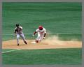
Employee Theftby ClubJuggleComment by jillz: Woo, Red Sox. Greatr action shot. Good use of negative space. One of my favorites. Don't care for the grey border! |
 Photographer found comment helpful. Photographer found comment helpful. |
| 06/26/2003 12:28:54 AM |
Employee Theftby ClubJuggleComment by mcrochip: I think a tighter crop may make this photo a bit more interesting - the expanse of grass in the upper 1/2 of the picture is just too much I think. Otherwise, a good photo, and the title adds a bit of humor. |
| Photographer found comment helpful. |
| 06/25/2003 07:45:31 PM |
Employee Theftby ClubJuggleComment by Sonifo: Wow! Great photo. To bad I can't see the butts. hehehhe...You got a good stopmotion on the Phillies guy. It almost looks like a dance pose. Good luck! |
| Photographer found comment helpful. |
| 06/24/2003 10:39:02 PM |
Employee Theftby ClubJuggleComment by tecent642: awesome shot. i love the stopped motion. your title is very original. and to top it off, the best sport in the world!!!! |
| Photographer found comment helpful. |
| 06/23/2003 10:54:34 PM |
|
| Photographer found comment helpful. |
| 06/23/2003 10:06:19 AM |
Employee Theftby ClubJuggleComment by justine: Phillies are my favorite team and have been since I was a kid....[long ago]..nice color, action, light. Focus is the only weak point. |
| Photographer found comment helpful. |
| 06/23/2003 12:45:37 AM |
|
| Photographer found comment helpful. |
| 05/14/2003 10:54:42 PM |
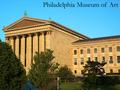
Philadelphia Museum of Artby ClubJuggleComment by christo: I think this is a pretty good entry for the "postcard" challenge.
First, the subject you chose (a museum) perfectly fits the theme. It was a good move to photograph one of the usual sights of your city. The composition you chose to illustrate the subject also well fits the theme since it is classic of postcards: a global view of the building. But the trees are definitely too distracting. The angle you chose to photograph this museum is perfect, but couldn't you have avoided those trees? It is sometimes interesting to add something in the foreground, I agree. But this has to be related to the subject and shouldn't distract from it. And in this case I think it does.
The exposure is very good, and you achieve a very good detail and sharp image. Very well done. It might even look oversharpened, but most of the postcards are... Same thing for the sky: the cyans are oversaturated in my opinion, but I think it fits the theme.
Looking again at this entry and thinking of what *I* would have done to improve this pic comes to my mind that the right side of the building is not very interesting. Maybe I would have tried a portrait crop of the columns between the trees. Pretty much with the same angle. Try and crop this one to have an idea.
That's all I can think of. A good picture anyway.
Good luck with your future entries!
The Critique Club |
| Photographer found comment helpful. |
| 05/09/2003 06:29:43 PM |
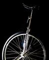
Balanceby ClubJuggleComment by Gracious: Critique Club Comments by Grayce
The low key process works very well with this subject. This meets the challenge nicely, and is artsy to boot!!! I like that. Keeping this as a black and white picture was a good choice. It makes the eye study the form as there are no distractions.
The flare draws attention, perhaps more than it deserves, but it does convey the glaring quality of the metal.
I love that you used a black bg for this. It really helps the subject pop.
OVer all I like this. Good job!
Regards,
Grayce |
| Photographer found comment helpful. |
| 05/09/2003 05:01:00 AM |
|
| Photographer found comment helpful. |
Home -
Challenges -
Community -
League -
Photos -
Cameras -
Lenses -
Learn -
Help -
Terms of Use -
Privacy -
Top ^
DPChallenge, and website content and design, Copyright © 2001-2026 Challenging Technologies, LLC.
All digital photo copyrights belong to the photographers and may not be used without permission.
Current Server Time: 07/21/2026 06:24:31 PM EDT.