| Image |
Comment |
| 04/30/2009 05:26:09 PM |
|
 Photographer found comment helpful. Photographer found comment helpful. |
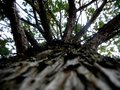
| 04/29/2009 01:20:52 PM |
A View From Belowby Be-realComment by risenphoenixster: I like that the perspective on this almost makes the branches look like trees in and of themselves. The light coming through is also neat. I understand why you left the trunk in the photo - it's what establishes the view. I think that some may see it as distracting. Nice job! |
| Photographer found comment helpful. |
| 04/17/2009 09:47:29 PM |
Evening Daisyby Be-realComment by emorgan49: checking this picture on my home (calibrated) monitor - It's dark but not as dark here and the colors are much brighter. Lighten it up. I wonder why you chose to cut off the petals in three sides. Since you decided to cut, maybe a closer crop would be even more dramatic. |
| Photographer found comment helpful. |
| 04/17/2009 06:01:29 PM |
Evening Daisyby Be-realComment by marcusvdt: You change your mind and start to do at least basic editing of your photos. If you are not a Photoshop fan like me, you can try to use Paint Shop Pro. I've a forum thread here were I mentioned some basic steps from my workflow, and got advice from pro's on how to improve it. Since I'm now dealing with eliminating noise, I can tell your picture is too noisy, and noisy pictures are risky even if the noise is intentional. Something else that I learnt recently is that overall voters will score down any oversaturated picture, and your picture looks oversaturated to me. At last but not least, I'd mention also that the photo is too dark. |
| Photographer found comment helpful. |
| 04/17/2009 03:44:58 PM |
Evening Daisyby Be-realComment by emorgan49: So, I guess your own statement, no editing done, explains the score. While the colors are lovely and the composition isn't bad, the overall image on my monitor is quite dark. It's always risky to enter a dark photo, even if you intended it to be dark. You will lose points due to "poor voter monitor calibration syndrome". Take a look at this on some other monitors (PC and Mac) and see what you think. Personally I would have lightened it up, the center of the flower is completely black with only red dots to show the structure. Look at your bell curve - Not many people "loved" it, most people thought it was "ok" and a few people "hated" it. This is a contest for mass appeal, to score well you please the masses. After a while you will give up trying to please everyone and say to yourself "hell, I like it a lot, who cares about the score". Do you like this a lot? |
| Photographer found comment helpful. |
| 04/11/2009 06:14:32 PM |
Beach footballby Be-realComment by Teafran: A good entry into the challenge, it meets the criteria in a different and unique way. From a technical standpoint, the image is adequate with a few minor issues that are not worth mentioning. The artistic impact is rather bland and uninteresting, but the offset viewpoint is a plus. A little more time taken with composition would have given the author a better score. |
| Photographer found comment helpful. |
| 04/10/2009 10:27:45 AM |
Beach footballby Be-realComment by Steef: meets the texture challenge very well, but artistically, it doesn't do a lot for me. maybe sacrificing some of the texture for a wider shot could help with the overall composition |
| Photographer found comment helpful. |
| 04/10/2009 01:08:32 AM |
|
| Photographer found comment helpful. |
| 04/08/2009 09:55:19 AM |
|
| Photographer found comment helpful. |
| 04/04/2009 07:31:57 PM |
Freedom, The Basis of America by Be-realComment by Teafran: Ah - well.
Grafitti is a form of expression and to me, this was a 10 and I rated it as such. It was more a question of how the image was composed and how you saw the image with the slight offset which attracted me to it.
Having said that, I think you over reached with the title. Some people view titles as part of the image and this was a political statement that some, not all certainly, might object to it for a myriad number of reasons. I wouldn't even begin to suggest what you should have titled it, but that would be my guess - I thought it was clearly head and shoulders, as an image, over 90% of the images in the Language challenge.
Having said that... :>)
If you look at your vote distritution, it's amost even and you might as well have rounded up and got a 5 - which, after viewing a lot of images over the past two weeks, seems to be acceptable as a score.
Later,
Tom |
| Photographer found comment helpful. |
Home -
Challenges -
Community -
League -
Photos -
Cameras -
Lenses -
Learn -
Help -
Terms of Use -
Privacy -
Top ^
DPChallenge, and website content and design, Copyright © 2001-2026 Challenging Technologies, LLC.
All digital photo copyrights belong to the photographers and may not be used without permission.
Current Server Time: 07/16/2026 09:59:33 PM EDT.