| Image |
Comment |
| 11/24/2003 03:54:02 AM |
|
 Photographer found comment helpful. Photographer found comment helpful. |
| 11/24/2003 03:23:53 AM |
|
| Photographer found comment helpful. |
| 11/21/2003 06:03:56 PM |
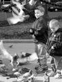
Year of the Dragonby SamaraComment by JC_Homola: Greetings from the Critique Club
This is a challenge to critique! I'm having a very hard time trying to decide what to say.
My initial reaction is that it hurts my eyes. It is being very hard to focus on.
I think if you had a less straight on approach, adjusted the lighting to accentuate the texture of the item and pushed it back in the frame it would be more interesting.
Even though I can tell it is a 3 dimensional object it looses some of it's depth, again because of the lighting and angle.
I'm going to assume you used a very shallow DOF in order to maintain the black background. While a good technique, it did eliminate some the detail on the end of the dragons snout and the front claw.
The little bit of green reflection at the bottom isn't too bothersome. A little post challenge spot editing would fix that.
Have you tried playing with the Contrast settings, and levels?
I hope this helps.
JC |
| Photographer found comment helpful. |
| 11/20/2003 03:12:04 PM |
|
| Photographer found comment helpful. |
| 11/20/2003 09:56:44 AM |
|
| Photographer found comment helpful. |
| 11/20/2003 09:27:10 AM |
Stop and Smell the Rosesby SamaraComment by moodville: I feel this should have even been a close up shot or probably vertical. There is a lot of empty space on the sides and yet the top of the bouquet has been cropped. Cropping off some flowers is sometimes ok if you have it full frame and there is cropping on all sides, but because this is only at the top I feel it has a severed feeling. The mix of pinks and reds on the flower are good, lighting is good with nothing blown or too dark. The connection to the phrase is good. Only thing letting it down is I think it really needed to be a vertical shot. |
| Photographer found comment helpful. |
| 11/19/2003 03:56:05 PM |
Stop and Smell the Rosesby SamaraComment by adine: Lovely roses. Wish the roses at the top weren't cut off. I wish there were signs like the one you made, maybe people would be more relaxed. |
| Photographer found comment helpful. |
| 11/18/2003 06:24:36 PM |
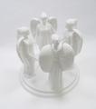
Circle of Angels to Watch Over Youby SamaraComment by StevePax: Greetings from the Critique Club!
This white-on-white piece really catches my eye. Your focus is just soft enough to give the whole piece a sort of cloudy feel (very appropriate given your subject). Compositionally, I think you have done a good job of breaking up the monotony of a centered subject by roting it just a bit, so the heads of the angels are nicely staggered.
I think I would like this just a little better if there were slightly more contrast between the angels and your background. Other than that, fantastic! |
| Photographer found comment helpful. |
| 11/17/2003 08:57:31 PM |
|
| Photographer found comment helpful. |
| 11/17/2003 04:19:55 PM |
|
| Photographer found comment helpful. |
Home -
Challenges -
Community -
League -
Photos -
Cameras -
Lenses -
Learn -
Help -
Terms of Use -
Privacy -
Top ^
DPChallenge, and website content and design, Copyright © 2001-2026 Challenging Technologies, LLC.
All digital photo copyrights belong to the photographers and may not be used without permission.
Current Server Time: 07/17/2026 03:52:14 AM EDT.