| Image |
Comment |
| 01/31/2007 01:10:17 AM |
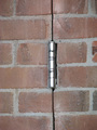
Funny Place for a Hingeby GeneralEComment by levyj413: Hmm. Might've worked better not right in the middle. The concept is interesting, but the shot is blandly lit. Try increasing the contrast and maybe the saturation. If you can, get the light to one side to create some shadows, too. |
 Photographer found comment helpful. Photographer found comment helpful. |
| 01/30/2007 01:07:36 PM |
|
| Photographer found comment helpful. |
| 01/29/2007 03:09:13 PM |
|
| Photographer found comment helpful. |
| 01/29/2007 01:44:47 PM |
|
| Photographer found comment helpful. |
| 01/29/2007 06:55:03 AM |
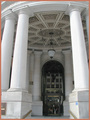
The Bankby GeneralEComment by dcl53: Column are always tricky. Here the foreground columns appear to bow outward. |
| Photographer found comment helpful. |
| 01/29/2007 12:24:24 AM |
|
| Photographer found comment helpful. |
| 01/28/2007 11:32:22 PM |
|
| Photographer found comment helpful. |
| 01/28/2007 01:07:05 AM |
|
| Photographer found comment helpful. |
| 01/27/2007 11:44:11 PM |
|
| Photographer found comment helpful. |
| 01/27/2007 11:35:02 PM |
The Bankby GeneralEComment by OrionThe Hunter: move to the right and center the colums amd the doorway ,,,,,,,,,,, |
| Photographer found comment helpful. |
Home -
Challenges -
Community -
League -
Photos -
Cameras -
Lenses -
Learn -
Help -
Terms of Use -
Privacy -
Top ^
DPChallenge, and website content and design, Copyright © 2001-2026 Challenging Technologies, LLC.
All digital photo copyrights belong to the photographers and may not be used without permission.
Current Server Time: 08/22/2026 04:22:03 PM EDT.