| Image |
Comment |
| 07/18/2003 12:46:05 AM |
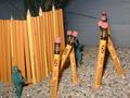
Recycleby GeneralEComment by Fayech: i love the colors! good use of border, compliments the idea of recycling (clean). |
 Photographer found comment helpful. Photographer found comment helpful. |
| 07/16/2003 08:33:14 PM |
|
| 07/16/2003 05:24:49 PM |
Recycleby GeneralEComment by meknapp: I like the way the concept fits the theme as well as the pic itself. Good job. |
| Photographer found comment helpful. |
| 07/16/2003 05:58:17 AM |
Recycleby GeneralEComment by puppy52: personally I might cropped the bottom off :) but that's just me :P nice work tho :D |
| Photographer found comment helpful. |
| 07/16/2003 02:04:05 AM |
|
| Photographer found comment helpful. |
| 07/16/2003 01:54:43 AM |
Recycleby GeneralEComment by OneSweetSin: OOOOhhhhh yeahhh thats it that photo oh yeeehhh mmmmm recycle ooohhhhhh yeahhhhhh =o) Sorry I couldn't resist the opportunity to give you the comment you wanted to sign up for! |
| Photographer found comment helpful. |
| 07/16/2003 12:11:04 AM |
Recycleby GeneralEComment by Lustre: Nice way of meeting the challenge - the whole concept of recycling is quite circular. |
| Photographer found comment helpful. |
| 07/15/2003 10:37:55 PM |
|
| Photographer found comment helpful. |
| 07/15/2003 09:50:10 PM |
|
| Photographer found comment helpful. |
| 07/15/2003 09:06:24 AM |
|
Home -
Challenges -
Community -
League -
Photos -
Cameras -
Lenses -
Learn -
Help -
Terms of Use -
Privacy -
Top ^
DPChallenge, and website content and design, Copyright © 2001-2026 Challenging Technologies, LLC.
All digital photo copyrights belong to the photographers and may not be used without permission.
Current Server Time: 05/07/2026 07:44:52 PM EDT.