| Image |
Comment |
| 07/29/2003 08:28:04 PM |
|
| 07/29/2003 02:54:13 AM |
Ventby GeneralEComment by kiwiness: It's something different for sure, but it does the job for the challenge :-) |
| 07/28/2003 08:11:11 AM |
|
 Photographer found comment helpful. Photographer found comment helpful. |
| 07/28/2003 01:17:38 AM |
|
| Photographer found comment helpful. |
| 07/28/2003 12:51:14 AM |
|
| Photographer found comment helpful. |
| 07/27/2003 01:45:02 PM |
Swelteringby GeneralEComment by OneSweetSin: *Critique Club*
Good take on the challenge with Isaac. =o) Psst Paul make sure you wind the windows down when the ac isn't working. LOL joking aside...It is a little dark and also there is a bit of a green cast. But the focus and sharpness seem just fine.
Meets the challenge well. Isaac looks really hot!
Anna |
| Photographer found comment helpful. |
| 07/26/2003 03:01:09 PM |
|
| Photographer found comment helpful. |
| 07/25/2003 08:24:05 AM |
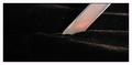
Velvet and Steelby GeneralEComment by Imagineer: A single 'horizon line' of velvet would have worked bettter for me (right across the shot) - so that the blade has the illusion of appearing against a pitch black sky. The border is too large and distracting too, especially with the dark subject matter. [5] |
| Photographer found comment helpful. |
| 07/24/2003 12:16:36 PM |
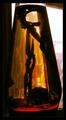
Lava Lampby GeneralEComment by Mitonski: Dont get much of the 'lamp' feel from this with the daylight shining through, but I know it can be hard to get a sharp focus in low light... perhaps some sort of screen in the window to soften the light coming through. |
| Photographer found comment helpful. |
| 07/24/2003 09:42:43 AM |
|
Home -
Challenges -
Community -
League -
Photos -
Cameras -
Lenses -
Learn -
Help -
Terms of Use -
Privacy -
Top ^
DPChallenge, and website content and design, Copyright © 2001-2026 Challenging Technologies, LLC.
All digital photo copyrights belong to the photographers and may not be used without permission.
Current Server Time: 05/07/2026 07:45:18 PM EDT.