| Image |
Comment |
| 08/14/2003 12:18:41 AM |
|
| 08/13/2003 10:42:45 PM |
7-AUG-2003by GeneralEComment by dsidwell: Really cool idea and lovely execution. The streaming lines do make it look like some kind of time warp! 9 |
 Photographer found comment helpful. Photographer found comment helpful. |
| 08/13/2003 04:43:00 PM |
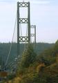
Bridge Towersby GeneralEComment by GeneralE: Thanks for all the comments -- their consistency is quite gratifying.
I was riding in the back seat as we were driving at about a 45 degree angle towards the left. I took the shot out the front passenger-side window over my dad's shoulder. The motion blur combined with a bit of haze, road vibration, and the backlit conditions did in any chance for a sharp photo. But it was the "best" right-angle shot in terms of composition I had in the one day I had between returning from my trip and the entry deadline.
One of my outtakes is perhaps a better photo, but I think the "strength" comes from other elements than the right-angles. |
| 08/13/2003 09:53:38 AM |
|
| Photographer found comment helpful. |
| 08/13/2003 08:24:20 AM |
|
| Photographer found comment helpful. |
| 08/13/2003 04:10:48 AM |
|
| Photographer found comment helpful. |
| 08/13/2003 02:32:53 AM |
|
| 08/13/2003 12:59:15 AM |
|
| Photographer found comment helpful. |
| 08/12/2003 08:15:40 PM |
|
| Photographer found comment helpful. |
| 08/12/2003 12:45:04 PM |
|
| Photographer found comment helpful. |
Home -
Challenges -
Community -
League -
Photos -
Cameras -
Lenses -
Learn -
Help -
Terms of Use -
Privacy -
Top ^
DPChallenge, and website content and design, Copyright © 2001-2026 Challenging Technologies, LLC.
All digital photo copyrights belong to the photographers and may not be used without permission.
Current Server Time: 05/07/2026 09:30:18 PM EDT.