| Image |
Comment |
| 04/27/2005 02:46:33 AM |
|
 Photographer found comment helpful. Photographer found comment helpful. |
| 04/27/2005 02:38:36 AM |
The Final Piece of ...by GeneralEComment by sofapez: In minimalism; the subject should consume only a small portion (how much is debateable) of the overall image. If the puzzle piece were in focus and the rest of the puzzel burred or background to the piece, that would be minimalism. |
| Photographer found comment helpful. |
| 04/26/2005 05:55:48 PM |
|
| Photographer found comment helpful. |
| 04/26/2005 03:13:46 PM |
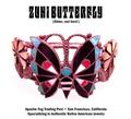
Zuni Butterflyby GeneralEComment by neophyte: Original piece and ad design. Many probably won't get the name play on the musical group. The silver needs to be more brilliant and there needs to be more contrast. Placement and Comp are excellent. |
| Photographer found comment helpful. |
| 04/26/2005 01:00:04 PM |
|
| Photographer found comment helpful. |
| 04/26/2005 03:33:04 AM |
|
| Photographer found comment helpful. |
| 04/26/2005 12:23:34 AM |
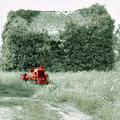
Old Barn and Tractorby GeneralEComment by GeneralE: Originally posted by Montereykiddo:
Think the tractor is a bit oversaturated. The dull green tone of everything else is cool, but I would ahve gone with a dull rustic-y looking tractor instead of the bright vibrant oversaturated version :) Nice pic though |
Thanks to everyone for the comments, which seem pretty consistent -- this one seemed a good exemplar ...
After some hundreds of challenges, I'm pretty sure this is the first time I've used the selective desaturation technique. The oversaturation of the tractor is partly on purpose, to really make it stand out against the background.
That exaggerated treatment is kind of necessary, because I'm one of those with a red/green color defect, and I need a lot of contrast in some colors to make them stand out. I should have masked out the tires, but just didn't really notice the red tint there.
This actually started as a vertical shot; personally I still like including the dirt road. And I think the horizon is straight, and that it's the barn roof which is crooked. I'm afraid straightening out the roof's ridgeline would make the tractor look off-kilter.
Anyway, I'm glad so many people thought the (overused) desaturation techniqued worked (in principle) for this one -- maybe I'll go back and try and get the tractor closer to International Harvester red instead of International orange : ) |
| 04/25/2005 09:15:11 PM |
|
| Photographer found comment helpful. |
| 04/25/2005 04:38:52 PM |
Zuni Butterflyby GeneralEComment by snackwells: I like the lighting here but it has a pinkish cast to it which may actually reflect the true color of this piece, but appears somewhat odd. I think this works very well for an advertisement. 7 |
| Photographer found comment helpful. |
| 04/25/2005 04:07:27 PM |
Zuni Butterflyby GeneralEComment by Brad: Main title font kind of hurts this one in my opinion.
Hard to read, and the caption "Silver, not Iron!" almost doesn't belong in an advertisement in my opinion.
A unique take on this challenge and the photography is good overall. |
| Photographer found comment helpful. |
Home -
Challenges -
Community -
League -
Photos -
Cameras -
Lenses -
Learn -
Help -
Terms of Use -
Privacy -
Top ^
DPChallenge, and website content and design, Copyright © 2001-2026 Challenging Technologies, LLC.
All digital photo copyrights belong to the photographers and may not be used without permission.
Current Server Time: 05/11/2026 03:26:39 PM EDT.