| Image |
Comment |
| 10/17/2011 05:22:29 AM |
|
 Photographer found comment helpful. Photographer found comment helpful. |
| 10/17/2011 12:14:57 AM |
|
| Photographer found comment helpful. |
| 06/03/2011 09:04:20 PM |
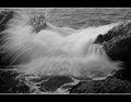
White water, black rockby dmsmithComment by Alicia: Hello from the Critique Club! You asked for an indepth critique of your image and here it is:
First, I'm glad  bohemka bohemka left you a long commend, since you got one of the monosyllabic idiot comments from "puzzle". Seriously.
But back to your photo. I actually liked it and gave it a 6. It's sort of quirky with that water spray. They eye wanders up to the left top corner where the action is. Therefore, it's a little unconventional. And DPC doesn't usually appreciate unpredictability in photography. One of the reasons you got a 5, I'm sure.
That aside, you captured the motion of the water very well. The frame of the black rocks is good, as well. The frame you added sort of pulls everything together, though I'm not usually a fan of fat frames.
The black and white tones are a bit flat - lack of contrast. And compositionally, there's no flow (ha). I feel a wider shot might have helped, so that the eye has somewhere to go.
Keep shooting! I'll be interested to see what you come up with in the future.
Best wishes,
Alicia |
| Photographer found comment helpful. |
| 04/04/2011 06:22:05 PM |
|
| 04/04/2011 05:50:26 PM |
White water, black rockby dmsmithComment by bohemka: Very nice movement. I'm not voting, but I'll critique this anyway because I like photos like this where I actually might have a decent suggestion. Emphasis on might.
As powerful and impressive as the motion of the wave is, I'll contradict myself now and say the photo to me is too busy. And I think that is because it's a tight crop and the border does not suit the crop. I might have pulled back off this crop a little to get a greater sense of perspective of the scene, or had the water rushing in from out of frame more (compositional preferences only), but my main issue is that I feel the thick, white lines overpower the white of the wave, and also contradict the lines in the wave, which are running near vertical. I think if you were to ditch those white lines (or at a minimum reduce them to a pixel wide each and soften the white (maybe pulling the white from the wave with the eyedrop tool)) this would be a much stronger and less confusing image.
I typically don't give a damn about borders, but this seems like a really quick way to improve this photo.
Keep in mind I'm not a good photographer, but as a viewer, that's what I see. |
| Photographer found comment helpful. |
| 04/04/2011 03:54:48 PM |
IMG_1226 - DMS1by dmsmithComment by spiritualspatula: I agree with what Cory said, particularly about it being soft. It coul dalso be a slight misfocus too, but nothing seems to be quite as sharp is it should be in this, and that's a big big big part of action shots- you either need obvious blur or super sharpness.
The tilt Cory notes is there as well, but isn't as distracting to me because the horse is relatively vertical. However, having an actually horizontal horizon would enhance the sense of speed of the horse, so there is that to be said. |
| Photographer found comment helpful. |
| 03/23/2011 08:28:07 AM |
|
| Photographer found comment helpful. |
| 11/26/2010 03:36:39 PM |
|
| Photographer found comment helpful. |
| 11/23/2010 09:45:31 AM |
|
| Photographer found comment helpful. |
| 11/23/2010 03:14:52 AM |
|
| Photographer found comment helpful. |
Home -
Challenges -
Community -
League -
Photos -
Cameras -
Lenses -
Learn -
Help -
Terms of Use -
Privacy -
Top ^
DPChallenge, and website content and design, Copyright © 2001-2026 Challenging Technologies, LLC.
All digital photo copyrights belong to the photographers and may not be used without permission.
Current Server Time: 07/16/2026 06:02:06 PM EDT.