| Image |
Comment |
| 07/20/2005 08:59:58 AM |
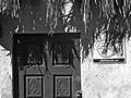
Wall in Mexicoby BAMartinComment by Jutilda: With the wall presumably being a light color, the light makes it just a tad harsh. Maybe tone down the bright just a touch. Interesting play of shadow with the grassy roof. I find the Coke sign a bit distracing. It could be as effective if it were completely cropped out and shot from a diff. angle so the door isn't dead center. Hope this is helpful. Good luck. |
 Photographer found comment helpful. Photographer found comment helpful. |
| 07/20/2005 02:07:39 AM |
|
| Photographer found comment helpful. |
| 07/20/2005 01:27:04 AM |
Wall in Mexicoby BAMartinComment by Germaine: I'm not sure I care for the cropping, and it's too bad the top of the door is in such deep shade. You lose all detai. |
| Photographer found comment helpful. |
| 07/13/2005 08:44:57 AM |
|
| Photographer found comment helpful. |
| 07/12/2005 08:01:17 PM |
|
| Photographer found comment helpful. |
| 07/12/2005 06:25:10 PM |
|
| Photographer found comment helpful. |
| 07/12/2005 05:07:00 PM |
|
| Photographer found comment helpful. |
| 07/12/2005 04:39:55 PM |
|
| Photographer found comment helpful. |
| 07/11/2005 06:36:41 PM |
|
| Photographer found comment helpful. |
| 07/11/2005 08:11:55 AM |
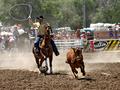
Lassoby BAMartinComment by asitv: would have done better in the sports challenge... jsut a week later.
nice capture and composition. |
| Photographer found comment helpful. |
Home -
Challenges -
Community -
League -
Photos -
Cameras -
Lenses -
Learn -
Help -
Terms of Use -
Privacy -
Top ^
DPChallenge, and website content and design, Copyright © 2001-2026 Challenging Technologies, LLC.
All digital photo copyrights belong to the photographers and may not be used without permission.
Current Server Time: 07/16/2026 05:07:08 AM EDT.