| Image |
Comment |
| 08/17/2003 11:14:43 AM |
|
 Photographer found comment helpful. Photographer found comment helpful. |
| 08/14/2003 04:08:51 PM |
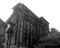
Abandonedby medic391Comment by shutterfly: challenge met. I think this might be better in color, to bring out the tree and the wood, maybe try a different angle. Contrast is uneven, too light at the top. |
| Photographer found comment helpful. |
| 08/14/2003 01:24:44 AM |
Abandonedby medic391Comment by azzemoto: Wow I really like this building or whats left of it. Good entry I am sure that you will do well. A solid 7! |
| Photographer found comment helpful. |
| 08/13/2003 03:32:08 PM |
Abandonedby medic391Comment by Pidd: The building itself is a bit dark. Bringing out the details of the warped and rotting timber would help enhance your theme. |
| Photographer found comment helpful. |
| 08/13/2003 10:54:32 AM |
|
| Photographer found comment helpful. |
| 08/13/2003 08:21:02 AM |
Abandonedby medic391Comment by Grandmom: The angle of this shot is ideal and the subject absolutely appropriate. I, personally, would love to see it in color |
| Photographer found comment helpful. |
| 08/05/2003 03:57:55 PM |
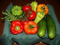
bountyby medic391Comment by myqyl: Nice concept... You may want to look for better lighting sources though... Also, the table doesn't add to the shot and should be cropped out :) |
| Photographer found comment helpful. |
| 08/05/2003 02:01:52 PM |
bountyby medic391Comment by Pidd: The colors and lighting are wonderful in this shot, but it lacks in overall appeal. The green cloth draping the basket (or whatever you have the produce resting on) is bland (the cucumbers disappear into it) and you can see little bits of it peeking out at the bottom. Tthe placement is neither directly center or off-center enough to seem purposeful. |
| Photographer found comment helpful. |
| 08/05/2003 11:35:33 AM |
|
| Photographer found comment helpful. |
| 08/04/2003 11:46:13 PM |
bountyby medic391Comment by tarique: Good composition - would have benifitted from a more cheerful backdrop |
| Photographer found comment helpful. |
Home -
Challenges -
Community -
League -
Photos -
Cameras -
Lenses -
Learn -
Help -
Terms of Use -
Privacy -
Top ^
DPChallenge, and website content and design, Copyright © 2001-2026 Challenging Technologies, LLC.
All digital photo copyrights belong to the photographers and may not be used without permission.
Current Server Time: 07/16/2026 12:43:21 AM EDT.