| Image |
Comment |
| 04/26/2006 01:49:38 AM |
|
 Photographer found comment helpful. Photographer found comment helpful. |
| 04/26/2006 01:24:57 AM |
|
| Photographer found comment helpful. |
| 04/23/2006 05:51:31 AM |
|
| Photographer found comment helpful. |
| 04/22/2006 12:42:09 AM |
|
| Photographer found comment helpful. |
| 04/20/2006 11:16:59 AM |
|
| Photographer found comment helpful. |
| 04/14/2006 11:59:15 AM |
|
| Photographer found comment helpful. |
| 04/14/2006 01:02:49 AM |
|
| Photographer found comment helpful. |
| 04/13/2006 02:13:23 PM |
Gas Worksby langdonComment by klstover: Only my sixth critique, and I get your image? Er, of course I'm not intimidated...! ;-)
Greetings from the Critique Club!
First, let me say that I am not a professional or even a very good amature photographer, so you may want to take my comments with a grain of salt.
I love the silhouettes (although as mentioned before, the leaning aspect is there) and think that they are quite interesting looking. There is a lot of detail there, which is very nice. The crop works very well. However I do think that what could have made this a vastly improved image is the sky. I would have loved to see more of the brighter blue and less of the grey blue, for a greater contrast. As it is, your picture is a very good one technically but it doesn't seem to have the impact that many of your other photos have.
I hope this helps! Feel free to PM me if you have any questions. |
| Photographer found comment helpful. |
| 04/12/2006 09:21:50 AM |
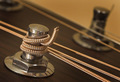
Yellow Tortexby langdonComment by Neuferland: I did not get to this during the challenge but I like it! The small amount of yellow is very well done, stands out and really draws my attention into the shot. But the colors for the rest of the shot left me feeling off for some reason, maybe a more b&w take would have made a difference? Look at me, offering advice to you, LOL :) Just my thoughts, I do really like the shot though. Well done. If I had made it this far in the voting I would have given this a 7 |
| Photographer found comment helpful. |
| 04/09/2006 12:08:34 AM |
|
| Photographer found comment helpful. |
Home -
Challenges -
Community -
League -
Photos -
Cameras -
Lenses -
Learn -
Help -
Terms of Use -
Privacy -
Top ^
DPChallenge, and website content and design, Copyright © 2001-2026 Challenging Technologies, LLC.
All digital photo copyrights belong to the photographers and may not be used without permission.
Current Server Time: 07/16/2026 05:13:37 AM EDT.