| Image |
Comment |
| 01/13/2012 07:29:36 PM |
Gourmet Meal for Wormsby P-A-U-LComment: Could have been an interesting mix of textures and colours but I don't personally like the processing; I feel it's been oversharpened and the saturation is up too high, especially on the reds. It makes the image too busy and a bit of an eye-strain to try and connect the different things. |
 Photographer found comment helpful. Photographer found comment helpful. |
| 01/13/2012 07:29:32 PM |
Dumped Drainpipe by jenicklasonComment: Some good detail captured but without the title I wouldn't know what it was, it's not really evident so I can't see garbage, just old metal. Contrast could be a wee bit darker. |
| Photographer found comment helpful. |
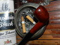
| 01/13/2012 07:28:27 PM |
Grandpa's Garbageby patrinaritterComment: The glare on the tobacco pack is quite harsh, a more diffused light might have been better; I'm not sure about the angle either, it sort of feel to me like looking at a wooden panelled wall, not a table and the things are somehow stuck to the wall sideways. I can't stand smoking and I don't care for smoking shots so a bit of personal bias on my part here but the subject really quite unappealing. Focus and colours are Ok. |
| Photographer found comment helpful. |
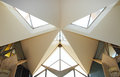
| 01/13/2012 01:22:23 PM |
Architectural Attackby RianBotesComment: It almost looks like a Transformer's face, haha. A very cross-looking structure. Nice lighting in there, looks like a very pretty place. |
| Photographer found comment helpful. |
| 01/13/2012 01:18:17 PM |
Departed Hopes by gyabanComment: I think this one fits the challenge the most. Love the perspective, perfect exposure, great crisp focus and a very interesting subject. Well done, ribbon ahead hopefully? |
| Photographer found comment helpful. |
| 01/13/2012 01:06:14 PM |
Bon appetit !by ionelpopComment: Yuck! Haha. Interesting angle, good dof and nice colours. Would have liked to see something in the glass though to complete the dining set. |
| Photographer found comment helpful. |
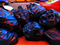
| 01/13/2012 01:05:12 PM |
Expensive garbageby mariucaComment: I don't understand the title? The red saturation is up too high, it makes the pavement looks strange; overall the shot isn't really very interesting I'm afraid, it doesn't look like art. The focus looks to be Ok but it's a bit hard to tell with the strong colour processing. |
| Photographer found comment helpful. |
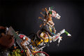
| 01/12/2012 11:15:39 AM |
Emergence by gyabanComment: That is freakin' awesome. This probably took a Helluva long time to set up! Nice lighting, a nice mix of colours and the most creative use of garbage in the challenge as far as I'm concerned. I hope you ribbon. |
| Photographer found comment helpful. |
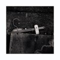
| 01/12/2012 10:42:07 AM |
Eine kleine Nachtmusikby whiteroomComment: Unless Mozart wrote Eine Kleine Nachtmusik to honour a broken coathanger he once saw, I'm not sure how the title fits, lol. Great shot regardless; beautiful tones, nice light, great focus. Border is a little too thick for me though. |
| Photographer found comment helpful. |
| 01/12/2012 10:41:53 AM |
emptyby vawendyComment: Nice and crisp, I like the splash of colour on the label; the white background looks a bit blown-out behind the crushed bottom of the bottle but it doesn't detract too much, only a couple of small details lost. My main dislike is actually the border, as I generally dislike coloured borders but that's purely personal preference. |
| Photographer found comment helpful. |
Home -
Challenges -
Community -
League -
Photos -
Cameras -
Lenses -
Learn -
Help -
Terms of Use -
Privacy -
Top ^
DPChallenge, and website content and design, Copyright © 2001-2026 Challenging Technologies, LLC.
All digital photo copyrights belong to the photographers and may not be used without permission.
Current Server Time: 05/11/2026 09:35:31 PM EDT.