| Image |
Comment |
| 10/26/2010 12:53:44 AM |
Pizza Time!by FourPointXComment: Heyo!
New PB!
Congratulations Joe. I was anxiously awaiting the end of voting for this one. :) |
 Photographer found comment helpful. Photographer found comment helpful. |
| 10/16/2010 01:06:36 PM |
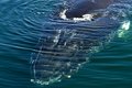
Coming In For A Close Upby patchesComment: Hello from the Critique Club;
First I need to point out that I've never actually seen a whale in person, so that's pretty awesome that you've had a number of chances to catch pics like this. In your comments, you allude to the other whale photos you have entered and their placement. As a general comment, I think whales are creatures that are really hard to photograph, since you have very little chance to "direct" the photo, and you don't generally have all that many encounters with them. It doesn't help things, either, that when most of us see a whale, it's an amazing National Geographic shot, so the bar is set pretty high.
Regarding this particular shot though, I'd say that you've nicely capture a whale as it comes up for air. It isn't as much of an action shot as "The Grace of The Dive" or "Dive-Dive-Dive," so I imagine that's part of why it scored where it did. Free Studies just demand superb photos that are also of "WOW" moments, and this one isn't as WOW as National Geographic shots. This is an interesting composition though, and I like how the whale's head is just pushing into the frame towards the viewer. I also like the effect of the water ripples distorting our view of its head. Personally, I don't see much of anything wrong with this shot, so I think you did a great job with things. |
| Photographer found comment helpful. |
| 10/14/2010 03:54:52 AM |
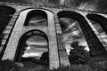
Monument to a past ageby sidpixelComment: Hello from the Critique Club-
Upon looking at your photo, I’m struck by how gigantic this structure appears, and this is owing to your composition. The slight angling really adds a lot of grandness to this shot, and makes it feel as though it stretches off into eternity. I also thoroughly like the texture you have captured on the surface itself. This texturing, which causes a variation in tones, really keeps the viewer focused on the structure and not distracted by elements in the background. This effect is also aided by the darker sky. It seems as though the processing was a smidge excessive due to the fashion that some parts of the clouds have turned into “dust.” This is forgivable, especially since the sky is secondary in your shot. Lastly, I do like that the tree is nicely framed by the arch, it’s a nice touch to an already great shot.
|
| Photographer found comment helpful. |
| 10/14/2010 03:34:55 AM |
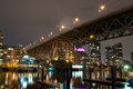
Granville St Bridgeby sapperComment: Hello from the Critique Club.
My first thoughts on your photo-
I like how the bridge crosses the scene, and the sky is a nice use of negative space to direct us towards the terminus of the bridge. Visually, I then trace my way back up the bridge towards the right of the photo, but this is inhibited a bit by the reflections in the water bottom left. At this point, I’m sorta in the nether world and the competing elements of the docks, reflections, and boats are all fighting each other for attention. I like how the buildings in the back are framed by the bridge, tucked away behind things. Exposure is good, maintaining detail throughout most of the bridge understructure. Really, all I would say is to try and declutter the scene by altering your vantage point slightly. It’s a nice photo of a bridge, otherwise.
Good job on your first challenge!
|
| Photographer found comment helpful. |
| 10/13/2010 06:25:39 AM |
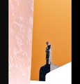
Fire and Iceby zencowComment: Wow, thought this would score higher. I was trying to figure out what the heck I was looking at, but couldn't figure it out. Nice shot though. The way the fire (light) radiates throughout things is really neat looking visually. |
| Photographer found comment helpful. |
| 10/05/2010 04:51:15 AM |
Defensesby PenelopeKComment: There are so many different lines going on in this.... awesome. Very good use of negative and the interplay of light and dark. My favorite so far I believe. |
| Photographer found comment helpful. |
| 10/05/2010 04:46:14 AM |
The Third Orderby AliciaComment: This is really interesting in that it almost looks like a block print or modern art piece, not a photo. I love the simplicity of things, the large swaths of uniform color. Great application. |
| Photographer found comment helpful. |
| 10/05/2010 04:44:26 AM |
the Dark Side...by HarveyGComment: The yellow stripe really adds a neat vibrant aspect to this. The shadow is interesting too. Nice find. |
| Photographer found comment helpful. |
| 10/05/2010 04:43:46 AM |
Stormy Skiesby christinebristowComment: Cool shot- makes me think of Japanese paintings. The negative flop really makes the leaves pop out from the sky, which is great. |
| 10/05/2010 04:39:13 AM |
The Cleanerby farraComment: This is just a sweet rotation. I really like flipping this horizontally. It makes me look up above (to the side) of the person, then pulls me down (physically up) the skyscraper. Nice shot. |
Home -
Challenges -
Community -
League -
Photos -
Cameras -
Lenses -
Learn -
Help -
Terms of Use -
Privacy -
Top ^
DPChallenge, and website content and design, Copyright © 2001-2026 Challenging Technologies, LLC.
All digital photo copyrights belong to the photographers and may not be used without permission.
Current Server Time: 06/20/2026 11:07:29 PM EDT.