|
|
|
Showing 731 - 740 of ~1843 |
| Image |
Comment |
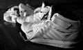
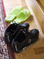
| 09/13/2005 12:56:13 AM | · sleeping on a bench ·by BKerrComment: Hello, and greetings from the Critique Club. I am Artyste, your critiquer for today, so let us go on a thrill ride. (sorry, it's lonely here. hehe)
Initial Thoughts
Interesting view, not often you see this perspective on a classic candid.
Composition / Content
I personally like the perspective you've used here, effectively placing the shoes as a focal point while keeping the editorial feel. However, it being DPC, I think you probably got hit for it being a candid and/or photojournalistic type of shot. A lot of people will just automatically vote a shot of this type lower unless it's a very unique or "wow" type photograph. I, however, quite honestly like it and congratulate you on turning an almost everyday sight into something a little unique.
Background
A nice transition into an OOF background, although I think you could have benefitted from a shallower depth of field here. Having the far man and more of the background that much more blurred would have helped the focus on the shoes.
Camera Work / Technical
Without information on your camera settings, I regret I am unable to provide a critique or any feedback on this area. There are no glaring errors, however.
Digital Processing
Again, without the information, I can't really say anything without simple conjecturing. I do like the overall feel of this photo though, there was definitely some decent processing going on.
Fits the Challenge
For me, it fits it very nicely. Your focus *is* on the shoes, (although it could have been stronger), and that's what the challenge is about.
My Opinion of the Photo
A very nicely taken photojournalistic type of candid. Not exactly a pure DPC-style photo, but it gives a little insight into humanity in a small way, and provides a decent picture to look at.
A nice shot, but DPC can be fickle. Good luck in future challenges. |  Photographer found comment helpful. Photographer found comment helpful. |
| 09/13/2005 12:33:39 AM | Like Father, Like Sonby pix-alComment: Hello, and greetings from the Critique Club. I'm Artyste, and I'm honored to give your first ever entry it's first every Critique Club Critique. I promise to be gentle.. ish.
Initial Thoughts
Interesting choice of canvas size, and a little overexposed.. and yes, those are definitely shoes.
Composition / Content
First challenge entry, and already you are going different with the size and crop of your photo :) Just a reminder that on DPC, a crop of this nature isn't generally well received, but a great photo can counterbalance it occasionally. I think it works well here, and gives an otherwise straightfoward shot a bit of an edge. I think voters agreed to some degree giving you a higher score than I would have expected personally. Content wise, you've nailed the challenge, but not done much else. The helter-skelter arrangement of the shoes doesn't say anything specific to me, and speaks of a hurried shot. You say that you didn't want to try anything too clever, so I'll take this as a testing grounds sort of entry. Just don't be afraid to play around with perspectives, angles, or set-ups.
Background
One word. Wrinkles. Wrinkles are death here on DPC, and care should be taken to make sure your background is as smooth as possible (unless you're really adamant that a wrinkled texture is key to your photo, which could happen). I'm not sure if this is just a furniture cover, or if you hung it for the purpose of the shoot, but a quick ironing can really help for next time :)
Camera Work / Tehcnical
This looks to me like natural light, but the white shoes are really over-exposed (with hot spots on the background as well). Using a smaller aperature (say 5.6 and up), would have helped control the over-exposure here. To keep detail in the darker shoes, use a white board or some other form of reflective material to fill in the shadows. Alternatively, you could but the darker shoes more in the light, and the lighter ones towards the shadow. You've got a nice touch on the focus though, although the scene does seem to still be slightly soft.
Ditial Processing
In addition to curves, I think that a little touch of sharpening work would have helped out as well. Sharpening should be one of, if not *the*, last steps of your processing. Generally, USM is the best method, and a starting point of 254%/0.3/0 (0.3 radius and 0 threshold), works pretty well, and you can tweak it from there. It takes some experimenting, but decent sharpening can really benefit a photo.
Fits the Challenge
Indeed it does, but lacks that "wow" category that everyone talks about.. although you admit that you weren't really going for that anyway.
My Opinion of the Photo
It's cute, and evokes a little bit of emotion, but there's not much else going for it. The over-exposure is a little bit eye-straining, and that wrinkled sheet just does nothing for me. Still, for a first challenge entry, it's really not that bad.. just a few things to work on for next time. Good to have you with us, stick around, and good luck on future challenges. | | Photographer found comment helpful. |
| 09/12/2005 04:44:55 PM | Court Shoes!by robconComment: Hello, and greetings from the Critique Club, I am your critiquer, Artyste.. prepare to be amazed! (or not).
Initial Thoughts
Nice lighting, cool shot, but a little small and crowded.
Composition / Content
Composition is nice, although a little more negative space in the image might have given it a less crowded feel. I like the choice of shoes, elegant in a way. The perspective also seemst to give the shot a bit of a tilt that I'm not entirely big on. Also there's just something about the loose lace that flows counter to the image.I think if it was coming back toward the heel it might give a better feel. I just don't, personally, like the way it disrupts the black toe line.
Background
I'm not entirely sure if I like the crumpled jersey there, although it does anchor the shoes (without it the shot would be unbalanced), so it was a good choice to have in. I'm not sure about the lighter background in the one corner either.. but can't explain why it throws me like it does.
Camera Work / Technical
Great job of lighting and metering. Good exposure, no harsh or glaring hotspots or washouts. Hard to do with white objects and dark surroundings. Focus is also great, although I do agree that the DOF went too shallow too quickly.
Digital Processing
No information given, but I like the B&W conversion. It's pretty strong.
Fits the Challenge
Definitely does that, but still lacks a certain other quality. It's still a rather, mundane shot of shoes, as I see it. Well done, but just no real extra to it.
My Opinion of the Photo
As much as I like the shot itself, and you show some great technical know-how, I feel this just suffers from the "ho-hum" syndrome. To many voters this will just be "another pair of shoes". Experiment with angles and perspectives and creative set-ups in future challenges, and your technical efforts will begin to pay off. A good entry that probably should have scored higher than it did. Good luck in future challenges. |
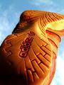
| 09/12/2005 03:58:59 PM | adidasby nikmaticComment: Hello, and greetings from the Critique Club. Allow me rip your photo to shreds in the name of constructive criticism (j/k!)
Initial Thoughts
Wooo.. that's a heck of a thing, cool angle.
Composition / Content
Very interesting and unique perspective, I like to see people trying new things, and this is pretty effectively done. Personally, I would have tried to avoid cropping the toe out on the side there.
Background
The upper sky is really nice, but might have benefitted from a polarizer or ND Grad filter. The bottom right is a little blown out, which detracts just a little bit.
Camera Work / Technical
Seems to me to be a *slight* over-exposure in areas here, though whether that was in-camera, or done in post-processing, I don't know. Your focus and DOF are great, but I'm thinking 1/500 would have given you a better exposure than 1/300. There are some hot-spots on the shoe itself that could have been better dealt with with a stop or a half-stop drop.
Digital Processing
Not sure what you did, but everything looks pretty good besides the exposure and hot-spot issues. Nice coloration on the shoe and the sky is ok (slightly darker would have been my own preference). Sharpness is wonderful.
Fits the Challenge
Definitely does that :)
My Opinion of the Photo
It's a fantastic original perspective, something different for a rather mundane challenge. The hot spots and exposure just kick this a little too far into the "Very good, but not *great*" range for me.
A good entry, and good luck in future challenges. | | Photographer found comment helpful. |
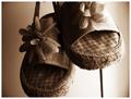
| 09/12/2005 03:16:43 PM | My Childhood Shoesby LaSofiComment: Hello, and greetings from the Critique Club. You asked, we delivered. Tell your friends.
Initial Thoughts
Striking, and cute, but something's missing..
Composition / Content
You have the right idea here, but for me, you've come in too close. Cutting off your subject in the frame is seldom a good idea unless there's a distinctive reason for it, and I personally don't see one here. Having more space below the toe of the left shoe, and showing more of the string/laces holding them up would have given the shot a lot more dynamic. Instead, it feels a touch crowded. The content is wonderful, very nostalgic, but the composition suffers.
Background
For me, your lighting is wrong. The light part would serve the photo much better if it was centered more, allowing light fall-off on either side of the shoes. This would work very well following the compositional suggestions I gave as well, and would have framed them beautifully. It also would have helped with the slight blowouts on the right side of the right shoe. That string/lace/whatever hanging down below the left shoe needs to go too. It's a superfluous element that only serves to distract. Be careful and observant while shooting to notice the little details like that.
Camera Work / Technical
To me, the use of a large aperature here has possibly given you too shallow a DOF for your subject, especially in as close as you are (unless you cropped a lot). Your focus has suffered because of this and isn't as crisp as it could be throughout. Your exposure is pretty good, however, especially for a sepia tone, although you do have some rather strong shadows. A simple secondary light (diffused or just low powered) or a reflector, would have helped that.
Digital Processing
Sepia is a great choice for this image, as it helps with the nostalgic feel you seem to have been going for. I also think this image could have benefitted from a little more sharpening work. I'd suggest using USM at 254%/0.3/0 and tweaking it from there.
Fits the Challenge
No arguement here.
My Opinion of the Photo
This has all the makings of a very wonderful photo, and is a great attempt. I do like it for what it is, but also see the potential of what it could have been. A nice take on the challenge, and good luck in the future. | | Photographer found comment helpful. |
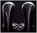
| 09/12/2005 02:57:19 PM | Shineby pollComment: Hello, and greetings from the Critique Club. I am your critiquer, Artyste, and I'll try and do my best to bring some intelligent discourse to your photo.
Initial Thoughts
What the.. oh.. hey, clever.
Composition / Content
A very unique view of shoes, which is confusing at first glance, but then slowly grows on you. The curves you've gotten are really quite nice. If I have one issue, it is that the setup seems slanted to the right, a little offsetting, but minor.
Background
Nice and clean, and compliments the coloring well.
Camera Work / Technical
First thing I want to touch on is the lighting. Mostly, it's done well, subtly, but I feel that the right side of the right shoe being in full shadow needed to be corrected. The image in my mind would have benefitted if the lighting on that side was the same as the lighting on the left. Falling off into shadow there unbalances the image for me, and contributes to that right-leaning slant I mentioned earlier. Also, your focus seems just the *slightest* bit off at the top of the back of the shoes. I personally love the shallower DOF, putting straps in front OOF.
Digital Processing
You didn't mention any processing, but I think that maybe working on selective colors to try and tweak the muddy burgundy/brown into something a little more dynamic would have also boosted the look of this photo. Just a suggestion though.
Fits the Challenge
While it definitely fits the challenge, it *does* have that initial "what am I looking at here?" thing that can result in turning a 6 or 7 vote into a 5 from people that are in a hurry. Just something to think about. Abstracts really take a certain something to do really well on DPC, I find.
My Opinion of the Photo
Despite the initial confusion, it's a photo that grows on you as you look at it. I like the creativity and simplicity. I'd have liked to see a little more color to it, perhaps more glow in the background, but it works as is too. Good work, and good luck in future challenges. | | Photographer found comment helpful. |
| 09/12/2005 02:45:41 PM | Lucky number 9by sigurdjonComment: Hello, and greetings from the Critique Club. I am your critiquer, Artyste, so let us get started.
Initial Thoughts
Interesting, but a little bland.
Composition / Content
I think what we have here is a little bit of a mis-match between your perspective, and your DOF. What I mean is that the DOF seems to fall off to quickly as related to the angle of view you have on the shot. In my opinion, you are too far above the shoes. Had you come down by about half a foot or so, and given the vanishing point of the background more distance, the DOF would probably have been more natural, and not so "forced". Not sure if I'm explaining it well enough, but that's my feeling on it. Also, the green shoes don't have a strong enough tie in to the runners, and that can really put voters off as well. Any percieved "superfluous" element can normally be a negative, and should be carefully considered. This ties in with the carpet as well, which is a little distracting.
Background
As I already said, having the perspective and vanishing point be lower in the photo, and thus giving more view of the background, might have been a stronger element. As it is, it's good, the DOF fall-off *is* nice, it just seems a little too strong for your perspective, as, again, I've said.
Camera Work / Technical
Some great camera work here, you've metered the scene extremely well. Has a very nice soft light look, and focus is sharp where it needs to be.
Digital Processing
Whether it was in-camera or not, I really like how you've got detail in your shadows, and how you've lit the black shoes, yet kept the rest of the scene inviting without over-exposing horribly. Some fine technical work. Using auto (for curves, contrast, color, levels), is something I always tend to try first myself.. sometimes it just does the right job. This is one of those times.
Fits the Challenge
No arguement that it doesn't fit the challenge.
My Opinion of the Photo
I really like this, and would have scored it pretty high, but here's my take on why it scored low: The clutter of the carpet, mixed with the perspective/DOF issue I mentioned has combined to add a "snapshot" element to this photo that DPC voters tend to pick up on quite quickly. It also doesn't have that immediate *snap* that higher scoring photos do. Having that more dynamic perspective, against a clean floor, and a better choice of secondary shoe (perhaps ballet slippers, sticking with the "sports/performance" theme), would have really increased this photo's natural 'wow' factor. As it is, it's a really good technical achievement, but lacks a few key artistic factors. A great try, and I hope you aren't too discouraged by the score. Keep it up, and good luck in future challenges. | | Photographer found comment helpful. |
| 09/12/2005 02:25:21 PM | My cat loves my shoesby ChioComment: Hello, and Greetings from the Critique Club. I am your host, Artyste, and we have a lovely critique on the menu today.
Initial Thoughts
A little cluttered with some harsh lighting.
Composition / Content
Your content is ok here, and I can grasp what you were going for, but the way you've shot it and your composition is too, plain. One of the things you really want to avoid when shooting for DPC are objects that leave the frame all around the photo as if no though was given to them, and if you have no clear and intended subject to focus on. Here, there are just too many shoes, placed randomly, with too many of them not having any real element in the image. The cat, also, is in my mind just another afterthought, instead of being a focal point itself. It's hard to explain fully what I mean by this, but on DPC, this "snapshot" look is almost impossible to sell. Experimenting with perspectives, with set-ups, with different angles of shooting.. will all help you start to look at a your shot a little more artistically. Never be afraid to try something different.
Background
The shelving unit is a little too dark, and far too cluttered. It gets the essense of your intention across, but does nothing for the photo itself for me.
Camera Work / Technical
A good job with focus, although you seem to have gotten a little OOF in the front left corner. I don't know if that's a camera issue though. Using a smaller aperature (f/4 - f/5.6) might have helped there, or a slightly faster shutter speed. (1/40 is a tough speed to get a clean shot with). Using flash on a subject so close and in a darker area indoors will also contribute to the "snapshot" look, but sometimes it's unavoidable. Getting a tripod, and lighting the room up however you can can help in that way, as it reduces the harsher highlights and shadows.
Not always do-able, of course, but it helps to pay attention to your light sources and try to make the best of them. You can also try and diffuse your flash by using tissue paper (at various thicknesses), or other form of cloth or plastic items in front of your flash to reduce the glaring light.
Digital Processing
You didn't give any information on this, so anything I say is conjecture. Most of the post-processing on this I would have suggested is illegal under basic editing, but some slight levels work might have helped a bit. A little boost in contrast as well, but unfortunately, as people say a lot around here, even the best icing can't fully fix a poorly baked cake. There are many things before processing that hurt this photo as a DPC challenge photo.
Fits the Challenge
This definitely fits the challenge, and is a *good* idea. The execution was hurried possibly, and as a result suffers, but I do like the creative thinking. Definitely keep that up :)
My Opinion of the Photo
For DPC, this is just too much of a snapshot. A hurried photo with a good idea, but executed without much real thought. It's humorous, but falls a little flat in most areas. I'd suggest looking around at more portfolios and paying attention to compositions, color, etc, and experimenting more. Good luck in future challenges, and keep those ideas coming. |
| 09/12/2005 02:47:53 AM | Expressionsby reemasComment: Actually, I'm kind of partial to the grey background here. In fact, had it even been a slightly lighter shade, further into the corners, the masks would have stood out that much more. I think the real issue in this shot was your focus. Not quite as crisp as it could have been, and some detail was lost in some of your highlights. Also, the crop might have been slightly tight.
As to how to obtain black/white backgrounds, there are many, many different ways of obtaining this. Black ones aren't too hard. Any deep black fabric does nicely, or non-reflective black poster board. White can be trickier, and involves a lot more lighting issues. Soft-boxes, diffused flashes, light tents.. all things to consider for white backgrounds. Also, exposing your shot so you can bring levels up and "white-out" off-white backgrounds can help there too. Experimentation is key. | | Photographer found comment helpful. |
| 09/12/2005 12:57:58 AM | Friendsby CalliopeKelComment: I'm glad to see this in the top 20. Probably would have placed higher if it was a little sharper, and less reliance on smoothing.
Great shot though. | | Photographer found comment helpful. |
|
Showing 731 - 740 of ~1843 |
Home -
Challenges -
Community -
League -
Photos -
Cameras -
Lenses -
Learn -
Help -
Terms of Use -
Privacy -
Top ^
DPChallenge, and website content and design, Copyright © 2001-2026 Challenging Technologies, LLC.
All digital photo copyrights belong to the photographers and may not be used without permission.
Current Server Time: 07/27/2026 12:40:02 AM EDT.
|