| Author | Thread |
|
|
11/17/2005 10:33:35 PM |
|
there is way too much burn out..! |
|
|
|
09/15/2005 12:14:02 PM |
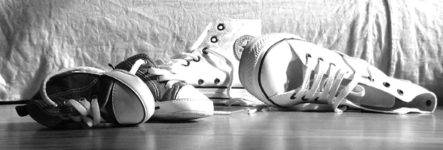
I'll comment on this without having read Artyste's critique, so - sorry if I repeat what he said :)
I like your initial idea for the challenge, showing that father and son wear the same shoes reveals a certain family bond between them. However, I feel that your execution failed to show that idea sufficiently to the viewer. Maybe a different arrangement would have shown the similarities in design and the difference in size better.
Since you shot this in your living room, I guess that you used natural light. That light source however was too harsh, resulting in the blown-out (no pixel-information) white shoes. If you had reduced the light with curtains, or taken the shot in a different part of the room, the lighting would have been much more gentle and diffuse, thus allowing a more emotional, less cold shot. |
|
 Photographer found comment helpful. Photographer found comment helpful. |
|
|
09/13/2005 12:33:39 AM |
Hello, and greetings from the Critique Club. I'm Artyste, and I'm honored to give your first ever entry it's first every Critique Club Critique. I promise to be gentle.. ish.
Initial Thoughts
Interesting choice of canvas size, and a little overexposed.. and yes, those are definitely shoes.
Composition / Content
First challenge entry, and already you are going different with the size and crop of your photo :) Just a reminder that on DPC, a crop of this nature isn't generally well received, but a great photo can counterbalance it occasionally. I think it works well here, and gives an otherwise straightfoward shot a bit of an edge. I think voters agreed to some degree giving you a higher score than I would have expected personally. Content wise, you've nailed the challenge, but not done much else. The helter-skelter arrangement of the shoes doesn't say anything specific to me, and speaks of a hurried shot. You say that you didn't want to try anything too clever, so I'll take this as a testing grounds sort of entry. Just don't be afraid to play around with perspectives, angles, or set-ups.
Background
One word. Wrinkles. Wrinkles are death here on DPC, and care should be taken to make sure your background is as smooth as possible (unless you're really adamant that a wrinkled texture is key to your photo, which could happen). I'm not sure if this is just a furniture cover, or if you hung it for the purpose of the shoot, but a quick ironing can really help for next time :)
Camera Work / Tehcnical
This looks to me like natural light, but the white shoes are really over-exposed (with hot spots on the background as well). Using a smaller aperature (say 5.6 and up), would have helped control the over-exposure here. To keep detail in the darker shoes, use a white board or some other form of reflective material to fill in the shadows. Alternatively, you could but the darker shoes more in the light, and the lighter ones towards the shadow. You've got a nice touch on the focus though, although the scene does seem to still be slightly soft.
Ditial Processing
In addition to curves, I think that a little touch of sharpening work would have helped out as well. Sharpening should be one of, if not *the*, last steps of your processing. Generally, USM is the best method, and a starting point of 254%/0.3/0 (0.3 radius and 0 threshold), works pretty well, and you can tweak it from there. It takes some experimenting, but decent sharpening can really benefit a photo.
Fits the Challenge
Indeed it does, but lacks that "wow" category that everyone talks about.. although you admit that you weren't really going for that anyway.
My Opinion of the Photo
It's cute, and evokes a little bit of emotion, but there's not much else going for it. The over-exposure is a little bit eye-straining, and that wrinkled sheet just does nothing for me. Still, for a first challenge entry, it's really not that bad.. just a few things to work on for next time. Good to have you with us, stick around, and good luck on future challenges. |
|
| Photographer found comment helpful. |
|
|
09/07/2005 11:42:44 AM |
BIG AL,
Sometimes I am dumfounded and dismayed when I read some of the comments posted during voting. One here is regretable and unforgivable and you certainly know which one that is. I have been in this community for three months and there were a few times when I could have thrown in the towel after the cavalier, almost abusive tones of some comments. Fortunately I have a relatively thick skin (comes from 65 years of taking life's lumps.) I persevered through my early attempts which were rated as low 4's, even a 3+. I have learned from the criticisms of mature, well-meaning members, and now have a few 6+'s under my belt. I love the idea you went after in this challenge and I would hope that you would browse the forums so that you can match up the comments with the people who made them. This would allow you to "consider the source."
Basically, I hope you don't get discouraged. You obviously have a great sense of humor and creativity. Go for it!
Larry |
|
| Photographer found comment helpful. |
Comments Made During the Challenge  |
|
|
09/05/2005 09:54:18 PM |
|
|
|
09/05/2005 07:36:09 PM |
|
Great family feel to this image. Nice composition and use of light. Like the texture of the bed spread. Good luck |
|
| Photographer found comment helpful. |
|
|
09/03/2005 09:48:15 PM |
|
;-) Gotta love shoes like this! Maybe a tad too bright for my taste, but nice setup |
|
| Photographer found comment helpful. |
|
|
09/03/2005 08:09:50 PM |
Fit Challenge Criteria: 2/2
Contrast/Color: 1/2
Composition: 2/2
Photo Quality: 1/2
My Subjective Affinity: 1/2 |
|
| Photographer found comment helpful. |
|
|
09/02/2005 07:09:17 PM |
|
hmmm... i think its really cute |
|
| Photographer found comment helpful. |
|
|
09/02/2005 04:37:36 PM |
|
Cute idea. Very nice contrast, and the lighting was great. Border comes in a little more on the right than on the left, but it's not really that noticable. :) Keep up the great work. |
|
| Photographer found comment helpful. |
|
|
09/02/2005 11:23:47 AM |
|
too much white results in glare on shoes |
|
| Photographer found comment helpful. |
|
|
09/01/2005 07:36:53 PM |
|
I like the idea! This is so cute! Maybe colors would have been better.. But good job and I hope you do well in this challenge! |
|
| Photographer found comment helpful. |
|
|
09/01/2005 05:53:53 PM |
|
Just didn't make it did it. Neitherr the story nor the picture come off. |
|
Home -
Challenges -
Community -
League -
Photos -
Cameras -
Lenses -
Learn -
Help -
Terms of Use -
Privacy -
Top ^
DPChallenge, and website content and design, Copyright © 2001-2026 Challenging Technologies, LLC.
All digital photo copyrights belong to the photographers and may not be used without permission.
Current Server Time: 06/29/2026 07:41:56 AM EDT.