| Image |
Comment |
| 09/09/2004 02:35:36 AM |
Peppers On A Lightboxby RefocusedComment: Too much fore-lighting cancels out whatever backlighting you were using. This looks like a regular studio still-life to me. |
 Photographer found comment helpful. Photographer found comment helpful. |
| 09/09/2004 02:34:10 AM |
Enlightenedby nikon_girlComment: I like this alot. The softness is a good choice, relaxing. Wonderful exposure. |
| Photographer found comment helpful. |
| 09/09/2004 02:32:23 AM |
It Came From The TREES!by postaltheclownComment: Hahaha.. this is very funny! Your focus on the dactyl is a little soft, and noisy in my opinion, but I don't know what I would have done to fix it. Nice shot though, great creativity. |
| Photographer found comment helpful. |
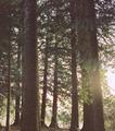
| 09/09/2004 02:24:39 AM |
Through the treesby l_mg18Comment: A nice concept, but this piece falls short for a number of reasons, in my view. Your brightness and contrast are quite flat. It adds no definition and makes it look like no real time or thought was put in to the photo. The crop was a little too tight, and the sun just supplies no real "backlighting" because of its position. It seems to just wash out the one side. I'd suggest experimenting more with exposure values, and/or, if you can, aperatures an shutter speeds. Try and find one subject to focus on so that you get less general clutter in your shot, and really just try to visualize something, then go and work on making it happen. (A part that I still have major troubles with myself.) I just thought that I'd help try and give you some pointers, as comments on my stuff early on really helped me. Good luck! |
| 09/09/2004 02:19:25 AM |
Fall in favour...by ursulasComment: This reminds me of a few Canadian music collection album covers I've seen. The grain really helps sell this, and the autumn colors are very striking. You've put together a very well-balanced piece. |
| Photographer found comment helpful. |
| 09/09/2004 02:17:55 AM |
Over the top by berenyiComment: This is a *great* example of backlighiting. I like that you've used the empty space to suggest a precipice that your subject is hanging over. I liked this immediately on viewing. The only thing I *don't* like, is the heavy border. I don't feel it was really necessary, and could have gotten away with a third of it's thickness and been effective. |
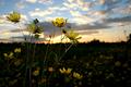
| 09/09/2004 02:15:29 AM |
Wildflowers at Sunsetby John SniderComment: Good backlight, and you've used the flash to nice effect here. Not sure about the cropping, but I don't feel it takes too much away. A good feel nonetheless. |
| 09/09/2004 02:13:27 AM |
|
| Photographer found comment helpful. |
| 09/09/2004 02:12:11 AM |
Going for a Spinby BradComment: Nicely done. Perhaps a litte soft on the source light, but you can clearly see it being backlit. Colors are a *tad* dull to my eye, but the focus and exposure are nice. |
| Photographer found comment helpful. |
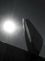
| 09/09/2004 02:10:33 AM |
The Wings at Hoover Damby alphakappaComment: I find that the sun completely overpowers this photograph, keeping your subject in too much of a silhouette and detracting from the composition. |
| Photographer found comment helpful. |
Home -
Challenges -
Community -
League -
Photos -
Cameras -
Lenses -
Learn -
Help -
Terms of Use -
Privacy -
Top ^
DPChallenge, and website content and design, Copyright © 2001-2026 Challenging Technologies, LLC.
All digital photo copyrights belong to the photographers and may not be used without permission.
Current Server Time: 07/24/2026 02:10:21 AM EDT.