|
|
|
Showing 151 - 160 of ~1843 |
| Image |
Comment |
| 06/12/2006 02:52:25 AM | Moving Dayby TommyMoe21Comment: Greetings from the Critique Club. My critiques are generally geared towards trying to help you improve your score within DPC, and not on any true "artistic" merit of the photograph itself, unless it relates to DPC voters and scoring. Please keep that in mind as you read this.
Initial Thoughts
Not much to this.. what's with the big sign?
Composition/Content
While I understand what you were trying to accomplish with the composition (or, at least I think I do), It was a little too little for a shot that is otherwise just plain boring. I don't want to sound harsh, but that's how voters probably looked at this. You have everything you need for the challenge.. but there's just nothing *too* it. The harsh light from the ceiling fan only serves to detract as well, and really adds nothing. So, kudos to trying to liven up the shot with a different angle and perspective, but you just needed more to begin with. The sign is also.. to me.. a little gratuitous. The color clashes, and it really doesn't say anything the viewer doesn't already suspect. The room is empty, the challenge wanted the room empty, we don't really need to know *why* it is empty.. especially when the reason is done by means of photo attention stealing lime green sign.
Background
Not really applicable in this sense.
Camera Work/Technical
You exposure is ok for the most part, but the glaring lights hurt the shot. Were you to process the shot to take advantage of the lights (more gritty, dark, or contrasty), it might have worked more to your advantage. If you can't get a "WOW" shot for DPC, at least go overboard artistically, and try to wow some of us out there that can appreciate something a little different.
Digital Processing
Nothing really grabs you in this shot. The processing shows a realistic room with realistic lighting, and so it remains realistically plain. Some work and playing around with different filters and concepts could have brought something out in this that just isn't there as it is.
Fits the Challenge
Sort of.. it's an empty room, but you've kind of "filled" it with that sign. Like I said, gratuitous, and needed to go.. IMO.
My Opinion of the Photo
A nice job with perspective to try and turn a very mundane shot into a little something different. Without that sign, and with a bit more creative processing, you could have been on to something that might have garnered a higher 5. Always remember that DPC voters need something that grabs them immediately and can hold their attention. For my money, this is simply a shot I'd click 4 or 5 on within the first few seconds and move on. |
| 06/11/2006 04:40:19 PM | Cloneby KronusComment: hahah.. this is why I want the 10-17mm fisheye zoom.. I LOVE shots like this. |  Photographer found comment helpful. Photographer found comment helpful. |
| 06/02/2006 12:35:40 PM | Hell expressby jsonComment: Greetings from the Critique Club. My critiques are generally geared towards trying to help you improve your score within DPC, and not on any true "artistic" merit of the photograph itself, unless it relates to DPC voters and scoring. Please keep that in mind as you read this.
Initial Thoughts
Where're the tracks?
Composition/Content
Not a bad composition overall. You leave enough space to really make something of this photo, but.. unfortunately, don't really complete the idea. On DPC, this can really lead to voters scoring you lower because of the expectations that aren't realized. What I think you needed were some tracks, and perhaps a little more ambient environment.. hints of the evil that hell is known for, and perhaps just a little more train (instead of just an engine). I can't guarantee that it would have placed you all that much higher, but I do think you'd have done much better than you did. It's a nice, creative idea.. but it just fell a little short in application.
Background
Because of the front-lighting, you have some noisy background elements that could have been cloned or dodged out some, but over-all it's a good effect.
Camera Work/Technical
A pretty good exposure, nice and dark and moody. Focus is good, although sharpening is a bit soft.
Digital Processing
One of the problems with this shot is the color balance working against you. Even with all the flames, it still has a "cooler" look to it.. no so much "heat". I don't get the sense of heat radiating. If you'd used some warmer tones throughout the shot, I think you could have put that across a little better. It's not bad, as is, but I think the effect definitely could have worked better. As I said, there are little marks and spots throughout the photo that could have used some spot editing as well.
Fits the Challenge
Certainly fits, although with the warmer tones I talked about, I think you could have really made it say "heat" better.
My Opinion of the Photo
I like the idea. It's creative and shows a good deal of initiative. However, the fact that it's incomplete (missing the tracks, more train, and a certain ambiance), hurts it. The voters probably picked up on this in their quick pass-by and thus you suffered in voting. As it stands, it's still a rather plain image with not much pop or that ever-present "WOW". A great try, so keep on working on your ideas, and good luck in future challenges. | | Photographer found comment helpful. |
| 06/02/2006 06:11:09 AM | Ring of Fireby kanoComment: Greetings from the Critique Club. My critiques are generally geared towards trying to help you improve your score within DPC, and not on any true "artistic" merit of the photograph itself, unless it relates to DPC voters and scoring. Please keep that in mind as you read this.
Initial Thoughts
Simple, engaging, and well representative of the challenge.
Composition/Content
While some of your commenters thought the composition needed a little work, I believe that it's quite strong as it is. You have some good use of negative space, and beautiful symmetry. I don't think that was your problem. Contentually, it might be a little.. "dull".. but not overly so, and the blue flame and symmetry of the shot really help. Simplicity is generally overlooked sometimes, and I quite like it in this case. You do have a distracting bright element in the lower right of the burner, which people probably noticed that throws things off more than it probably should.
Background
Nice, solid black.
Camera Work/Technical
A good exposure. The problem with the bright area I don't exactly know how to fix. You might have wanted to try to selectively burn that down a little so it didn't stand out so much, or perhaps some creative cloning. It really is the one critical detail, that stands out simply because of the darker image and the symmetry of the rest of the shot.
Digital Processing
As I said, working on the bright area would have helped a lot, I think. There are also a few artifacts remaining in your flames, giving them the "not DPC smooth" look that could have garnered a few subconciously low votes. Not sure if that was a product of saving it to jpg or something in your RAW conversion though.
Fits the Challenge
Well, I don't see how it doesn't.. Flames generally aren't cool :)
My Opinion of the Photo
A wonderfully simple take on the challenge that I, myself probably would have voted quite high. If it wasn't for the fact that you have one glaring bright spot throwing the image off a bit, and the fact that because of the simplicity that I personally like, you were probably given the "eh, not wow" vote, you might have scored much higher. I personally believe this is underrated, but it's DPC we're talking about here. While I have no suggestions on how to increase that all-important "WOW".. I think you shoud be proud of just giving us an image that is peaceful and contemplative.
P.S. Something I just thought of. Had you considered rotating this so that the flame ring was at the bottom of the image? That's a composition that might have increased the strength of the image as well. Just a thought. Also, as undieyatch pointed out.. you also fell victim to the "Too many similar photos in the challenge" syndrome. Which I despise, but is all too real. So unfortunate. However, it *is* true.. Getting a good shot is one thing, getting a good *original* shot is quite another.. so for future challenges, try to get that ol' thinking cap on and don't fall into the trap of shooting something that might be a very popular subject.
From experience though, that's harder than it sounds. Message edited by author 2006-06-02 06:15:31. | | Photographer found comment helpful. |
| 06/02/2006 06:01:16 AM | Hot Night in Delawareby rmlphotoComment: Greetings from the Critique Club. My critiques are generally geared towards trying to help you improve your score within DPC, and not on any true "artistic" merit of the photograph itself, unless it relates to DPC voters and scoring. Please keep that in mind as you read this.
Initial Thoughts
white flame-ball in top corner very over-powering, and using a "sexy" model is a little cliche.
Composition/Content
Quite a number of people chose the "hot model" route in this challenge, and it's not an altogether bad choice. Male voter demographics are rather large. Knowing that, however, you generally still need a very good technical photo to really score high, even with the best looking models. For me, and others have noted, your choice to have the furnace opened has kind of taken away from this shot. Yes, it helps convey "heat" a little more, but it also overpowers the shot, your model, and the lighting. Your composition is nice for your choice of including the flame, but I think you'd have done better cropping closer in, leaving the flame out, giving the background a nice red/hot "feel", and maybe spritzing the model to simulate sweat. Just a suggestion of course, but as your photo stands, one can't help to just be distracted by that nuclear ball of flame.
Background
Just a touch busy, but it's that ball of flame that keeps standing out for me. Kind of the "lesser of two evils" thing.. but I do believe you could have conveyed heat without it, and not caused it to be the focal point of your photograph.
Camera Work/Technical
Nice work to expose this, given the intense light you had to work with in areas. You've lost detail in some parts of the model because of the glow, but not to the point where it detracts too much. I am impressed with how well you've captured most of the model given the lighting conditions though.
Digital Processing
Not much information given, but I do see a little too much over-smoothing here. For me, it doesn't really help to convey the "heat" element. A little more perspiration on the model (real or fake), would have helped sell that idea for me. Otherwise.. everything looks pretty good.
Fits the Challenge
Well, it fits the challenge, but as I've noted, probably could have fit it much better. I'm left struggling with what exactly it was you were trying to say was heat here.. the model, or the great big ball of flame. Unfortunately, for me, they are such conflicting elements that "both" doesn't really work.
My Opinion of the Photo
Well, obviously I'm not a fan of the flame, we've covered that, but I also don't really like the gratuitous use of a "sexy model", even if the challenge lent itself well to such a thing. However, having said that, you've pulled it off rather well, for what it is. Less smoothing, more emphasis on one or the other element in this shot, and a tighter crop, might have helped you score better than you did.
Good luck on future challenges. |
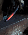
| 06/02/2006 05:45:38 AM | The Smithy's Anvilby BeeCeeComment: Greetings from the Critique Club. My critiques are generally geared towards trying to help you improve your score within DPC, and not on any true "artistic" merit of the photograph itself, unless it relates to DPC voters and scoring. Please keep that in mind as you read this.
Initial Thoughts
A simple, striking image, but lacking something in the DPC vein.
Composition/Content
It's a rare thing indeed to see an old-time metal working happening on the spot, at least for me, so that makes it a little more of an interesting shot as is. However, I feel that it's lacking a litte bit of energy. Just a little too static to really grab the attention of the voter. Had you captured a nice moment of hammer striking, with the sparks/etc, I think it would have given the shot the action/energy that could have propelled it higher in the voting. People tend to like that sort of thing. Compositionally, I think you probably left a little too much space at the bottom. There is some dead area down there that is a little distracting and doesn't really contribute to the overall feel of the shot. Seeing more of the Smith himself could have given the shot a more grounded, emotive feel. You've done well showing the heat of the metal, however.
Background
Nicely OOF, while still showing us the environment. I still think more of the upper part of the photo and less of the lower would give us more impact.
Camera Work/Technical
Great exposure here, but you've mixed up your shutter speed and aperature in your details (just watch for that in the future). Luckily, I know that 1/250 isn't a valid aperature. hehe. I think your choices in-camera worked very well, and gave the shot a good base for your processing.
Digital Processing
Everything looks good. You have no visible processing marks, and everything runs together very nice. Your focus and sharpening are dead-on. (maybe just a *touch* soft). Love the contrast.
Fits the Challenge
While it fits the challenge, I do think that you could have boosted it even more showing some of the action of working the metal. Give the voter some sparks and the energy of hammer hitting iron, and I bet we'd have seen an extra 0.3 to 0.5 in your score. (along with the shift in crop or initial framing)
My Opinion of the Photo
It's a good photo as it stands, and I quite like it. However, I've mentioned some tweaks that I believe could have stood it out even more, and I think it'd be worth thinking about them and noting them for the future. Pay attention to your composition most of all. Beware of dead space, and try to utilize your frame to bring out the best of the photo. In this one, drop the red-hot iron more to the bottom right, give the viewer more of the Smith himself, and throw in a little action/energy, and you'll be able to see the difference.
Good luck in future challenges. | | Photographer found comment helpful. |
| 05/31/2006 03:37:50 AM | Barn Windowby swallaceComment: Greetings from the Critique Club. My critiques are generally geared towards trying to help you improve your score within DPC, and not on any true "artistic" merit of the photograph itself, unless it relates to DPC voters and scoring. Please keep that in mind as you read this.
Initial Thoughts
A good shot, but not so much on the choice of sepia, for me.
Composition/Content
Very nice compositionally. The criss-crossing window pane works very well (although the slight off-plane is a bit distracting). I like where you are positioned, but could have worked with you being a little higher as well.
Background
Nice shallow DOF, no distracting elements. A little noisy, which probably hurt you slightly with voters.
Camera Work/Technical
Exposure of some highlights are a little blown. Whether this is in post-processing or not, I don't know, but it is especially noticeable on your cheek, under your left eye. (viewers right). Distracting to me. A little healing brush, or low-opacity burning could have helped that. It's about my only real critical mark.
Digital Processing
Now, this is purely my own taste, but the sepia toning you've used here doesn't really help the photo, I feel. It's just a little too light and yellow, and speaks of photos from old, old newspapers.. yet you have more of a modern look to yourself which would have been better served, IMO, with a deeper sepia. Something suggestive of warmth and a more modern look. Yes, I know that your score suggests that people liked it this way, but for me it just doesn't work, clashes just a little too much. Also, it lacks a touch of contrast to really bring out the blacks and give the image a touch more punch.
Fits the Challenge
Unless it's not you, it fits.
My Opinion of the Photo
I suppose I should have left what I said in processing for here, but it stands both ways. I honestly do believe with a different sepia look, you could have been staring at a high 6. As it is, you have a score anyone would be proud of.. so you did something right regardless of my own tastes. A well done photo, and good luck on future challenges. Message edited by author 2006-06-01 01:29:23. | | Photographer found comment helpful. |
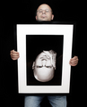
| 05/31/2006 03:17:41 AM | Two Heads are Better Than Oneby hotpastaComment: Greetings from the Critique Club. My critiques are generally geared towards trying to help you improve your score within DPC, and not on any true "artistic" merit of the photograph itself, unless it relates to DPC voters and scoring. Please keep that in mind as you read this.
Initial Thoughts
Hmmm.. not sure I'm going to be able to say much to help you :)
Composition/Content
Actually, there is something I'd like to say. Had you been able to get your camera higher up, I think you could have really improved the composition of this one. As it is, there's just a *little* too much distortion here, and your struggling to look over the frame draws too much attention away from what you are trying to achieve. Had it been a more comfortable pose, with more symmetry between the real you and the framed you, I think this would have been a much stronger image, and a much higher score. Heck.. just the portrait of you in the frame is a 6.x scoring photo in and of itself.
Background
Nicely done and solid black background which really helps highlight the frame. One suggestion would be a mottled grey background, so that the frame wouldn't have disappeared into it so much. Of course, that all depends on *having* one :)
Camera Work/Technical
Nice lighting, good exposure (maybe slightly light on the real you). You seem to lose a little bit of focus in the face of the real you, however, so a deeper DOF would have been recommended. Say, f/5.6 or 6.2 or somewhere in there. (which would have helped the lighting on your skin-tones as well.
Digital Processing
Good work on the processing. No visible marks, everything seems really solid. A little more selective sharpening on your real face might have helped though. Now that I noticed it's softer, I can't seem to move away from that.
Fits the Challenge
Doubly so :)
My Opinion of the Photo
A fantastic concept and well pulled off. As I said, having the camera up just a little higher, or having yourself not looking over the frame so much would have really grounded this for me, and maybe for the voters as well. As it is, you have a fantastic score, but a couple of elements kept it from the ribbons.. which could have been attainable IMO.
Good job, and good luck in future challenges. | | Photographer found comment helpful. |
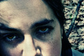
| 05/31/2006 03:03:33 AM | The Trees Tell no Talesby xianartComment: Greetings from the Critique Club. My critiques are generally geared towards trying to help you improve your score within DPC, and not on any true "artistic" merit of the photograph itself, unless it relates to DPC voters and scoring. Please keep that in mind as you read this.
Initial Thoughts
Very emotive, a good strong image, but probably a little too artistic for DPC.
Composition/Content
You've taken a different route compositionally with this one, as close-ups of this nature are rarely done in landscape orientation (at least in my experience). Usually square or portrait cropped. I feel that, because of this, the amount of forehead you've left takes too much from the focus of your photo, the eyes, and there's too much space left to wander to. An even tighter crop, giving us a much more elongated photo, with less forehead, could have really pushed those eyes at us, and grabbed the attention needed.
Background
What background there is, is nicely done. good shallow DOF, and plays well. The chaos works with the tender sadness of the eyes. I doubt that many voters would catch such a thing though, but even for them, I doubt that it detracted from the photo.
Camera Work/Technical
f/22 and you still had an OOF background? Crazy, was this using a macro lens? Also, for 1/13th, I see no visible motion blur or anything, so good on you for being so still. Your eyes are wonderfully in focus, and I imagine that was a very hard thing to do.
Digital Processing
Now, while I know that this look is becoming more and more common and well-recieved on DPC, It's not a look that I really like for portraiture tha much. (the acid filter look). I prefer a more naturally colored portrait. However, because of the emotive qualities you've given, I think it was a good choice to use... which is rare for me to say. Still, I suspect that it is one of the reasons that lower scores were given out.. but probably not as big a reason as the cropping choice. The work on your eyes is beautiful, however. Great job there.
Fits the Challenge
Unless it's not you, it definitely fits the challege.
My Opinion of the Photo
A strong emotive shot that is a rarity on DPC. It's nice to see, even with the lower score, and I'm glad people still *want* to do this type of shot. Like I said though, I'd have preferred to see a different crop on this, isolating the eyes, and giving us less to wander off to.
Overall, a great shot, but just not DPC strong. Lacks too many elements that voters want, and *negative* emotion never tends to do well outside specific challenges.
Good luck in future challenges. | | Photographer found comment helpful. |
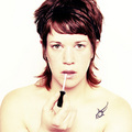
| 05/31/2006 02:53:29 AM | E Y Eby hannekeComment: Greetings from the Critique Club. My critiques are generally geared towards trying to help you improve your score within DPC, and not on any true "artistic" merit of the photograph itself, unless it relates to DPC voters and scoring. Please keep that in mind as you read this.
Initial Thoughts
Great look, not too big on the coloring though.
Composition/Content
Compositionally, this is very good. You've made good use of the "thirds", you don't crowd the frame, and everything has a nice flow to it. The added action of putting on lip gloss gives this that extra touch that many usual portraits of this nature tend to lack too.
Background
A nice white background that is only just slightly over-exposed down near the shoulders.. or at least, the background isn't over-exposed, the shoulders are, and kind of run into the background slight. Makes me a little squinty.
Camera Work/Technical
While the first thing I'll mention is that the subject itself is over-exposed, it also has that *intentional* feel, and works well enough in this instance. Voters also picked up on that I see, by your score, so it was a good choice, if a little brave. I suspect some voters also gave you lower marks for it as well.. one of those "art over technicals" that sometimes gets pulled off for the better. Job well done. I, personally, would have preferred it slightly less exposed, but to each their own. Focus is dead on though, and the eyes look fantastic.
Digital Processing
The yellow coloring of the skin, while classic for the acid filter, doesn't really work for *me*. I wonder, if it was a little more naturally toned, if this wouldn't have grabbed a few higher votes as well, and maybe bumped you up even further? Speculation though, so I'll not pursue it further. What I like is the toning of the hair. That is brilliant.
Fits the Challenge
Unless this isn't you, it definitely fits.
My Opinion of the Photo
While I know that this kind of "surrealistic" look is growing ever more popular on DPC, I myself prefer more naturally toned portraits. While I love the hair and eyes, the skin really turns me off a bit, and I suspect did the same for some voters as well. Still, it all comes down to taste, and you obviously appealed to more voters than you didn't, and a 6.3+ is a great score. I just think, with a more naturally toned photo (especially skin tones), and less blown highlights, you might have been able to hit high 6s. Nonetheless, good job, and good luck on future challenges. | | Photographer found comment helpful. |
|
Showing 151 - 160 of ~1843 |
Home -
Challenges -
Community -
League -
Photos -
Cameras -
Lenses -
Learn -
Help -
Terms of Use -
Privacy -
Top ^
DPChallenge, and website content and design, Copyright © 2001-2026 Challenging Technologies, LLC.
All digital photo copyrights belong to the photographers and may not be used without permission.
Current Server Time: 07/22/2026 07:55:12 PM EDT.
|