| Image |
Comment |
| 10/03/2004 12:46:38 AM |
Interludeby PedroComment: I think this subject matter called for *less* clarity and/or neatimage. I would have loved to have seen a grittier, moodier look. |
 Photographer found comment helpful. Photographer found comment helpful. |
| 10/03/2004 12:44:28 AM |
forever and a dayby grigrigirlComment: I personally don't like the fading border. Just seems a little out of place somehow. I also seem to fight between viewing the subject and viewing the background. It's nicely framed, the pose is wonderful. I'd have liked to have seen a closer crop and a tighter shot on the subject, to help us see her face and expression better. 7 |
| Photographer found comment helpful. |
| 10/03/2004 12:34:39 AM |
Warmthby joannsComment: I love the pose in this, it's got a nice feeling and mood. Colors are really nice, but the clarity is a little off. It looks like you tried for a soft focus, but it kind of just looks a little blurred, but that could just be me. Not sure if the border really works for this as it tends to take away from the size of the photo and thus losing some detail.
I like it a lot though, it's a really nice portrait. 7 |
| Photographer found comment helpful. |
| 10/03/2004 12:28:08 AM |
In the Fangs of Shadowby librodoComment: This is a great look.. the child looks happy.. yet world-weary, as if he expects something bad to happen any minute. The lighting on the face is a little hard, and the eyes just a little dark, but that tends to happen with a bw/sepia conversion. I'd originally given this a 7, but I keep coming back to it, so I'm bumping it up to an 8. It's a nice portraiture. |
| Photographer found comment helpful. |
| 10/03/2004 12:24:48 AM |
Mercyby hopperComment: The background kind of detracts from this portrait. The sky is blown out and bright, and it's a little too busy. That stick right beside your subject is especially distracting.
I like the peeking out from the tree. It's a classic pose, but you've capture it nicely. Good job getting some light into the eyes as well. 7 |
| Photographer found comment helpful. |
| 10/03/2004 12:22:57 AM |
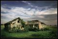
The Ruinby e301Comment: This is one of the better landscapes in the challenge, IMO.. A little dark. I like to see the greens a little brighter, livelier.. It's an interesting subject, and I wonder how it would have worked in a sepia/bw. Nice positioning of the horizon as well, the sky doesn't overpower. I just think this would have been a better picture with a little more brightness to it. 7 |
| Photographer found comment helpful. |
| 10/03/2004 12:20:03 AM |
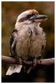
Kookaburraby moodvilleComment: Nice composition.. lighting is a litttle dark, but the colors work. Not much dynamic or energy here in my eyes though, but definitely a subject that isn't captured often, around here. 7 |
| Photographer found comment helpful. |
| 10/03/2004 12:18:15 AM |
Up and over... and in?by arnitComment: Adam Sandler is a goalie!! This is a nice sports shot. A little dark, and the crowd is still distracting, the players' heads seem to get sucked in there. Too bad about the 4th player on the right too.. would have been a much stronger composition without him in the picture. 7 |
| 10/03/2004 12:15:54 AM |
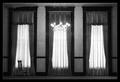
Haunting Absenceby tyt2000Comment: I love the composition of this, but the lighting seems a little harsh, and the clarity a little low. The lone chair.. I dunno, I'm up in the air about that.Also, and you can't really help this.. but the left window, at the top, detracts a bit because of the lack of symmetry. 7 |
| Photographer found comment helpful. |
| 10/03/2004 12:14:07 AM |
Vickiby KonadorComment: I don't know why, but this picture seems a little stretched horizontally. The saturation in the eyes is very nice, very subtle, but still noticable. The soft focus is good. I'm not too big on the crop though (which may be why it looks stretched), and I don't get a lot of emotion out of the pose. 7. |
| Photographer found comment helpful. |
Home -
Challenges -
Community -
League -
Photos -
Cameras -
Lenses -
Learn -
Help -
Terms of Use -
Privacy -
Top ^
DPChallenge, and website content and design, Copyright © 2001-2026 Challenging Technologies, LLC.
All digital photo copyrights belong to the photographers and may not be used without permission.
Current Server Time: 07/23/2026 07:56:00 PM EDT.