|
|
|
Showing 1331 - 1340 of ~1843 |
| Image |
Comment |
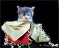
| 11/15/2004 01:48:27 AM | The December Kittenby OneSweetSinComment: Welcome from the Critique Club
Initial Thoughts
Cute photo, but the kitten seems a little distressed. The packaging is also a bit too chaotic, at first glance.
Composition / Content
The composition seems a little bit off to me. The wrappings of the open gift kind of overpower the kitten, and the bulk seems to be too far to the left, where I think a horizontal centering would have looked much stronger here. A kitten in a box for December is pretty cliche, so works well for a "calender"
Background
The black background doesn't really work well here to me. Seems too cold and uninviting.
Camera Work - Technical
Great focus and DOF, but the exposure is a little bright. Some harsh highlights on the kitten, and bits of the wrapping. Foil is notoriously hard to expose for, of course, but your light source seems a little too bright.
Digital Processing
From what you've put down as digital processing, I can't see any glaring problems. A good use of USM, as the image doesn't seem too over-sharp, and I can't tell where you've cloned or smudged.
Fits the Challenge
I think this image definitely fits the challenge. It's a good tie-in to the month, and has a decent cliche that would fit in a calender of this type. A more, "holiday" type background would have helped, or even a plain white bg.
My Opinion on the Photo
It's a good subject for a calender, but a few things turned me off about the photo itself. The kitten looks distressed, the background is harsh and doesn't really belong, and the whole thing is a little over-exposed. I'd have also worked on getting a different perspective to work with a more horizontally centered crop. Good Luck with future submissions. |  Photographer found comment helpful. Photographer found comment helpful. |
| 11/15/2004 12:18:32 AM | | | Photographer found comment helpful. |
| 11/15/2004 12:11:03 AM | Portraits of an Infant - Januaryby ArtysteComment: Welp, You learn something every day.
In this challenge, I learned that a cluttered studio setup is murder.
I agree with everyone that the baby's connection to the teddy bear was tenuous.. I didn't really think of that before submitting. Thanks.
I know what to do next time.
Still, and I have to say this to vent..
This shot got beat out by some *PRETTY CRAPPY* photographs.. it just makes me boggle. I thought I had quite a decent shot here, but I guess boring, out of focus, over and underexposed nature shots mean something.
Another lesson learned. (not that I'm applying it. I hate taking nature shots and always will. lol).
Seeya in Heroes! |
| 11/15/2004 12:00:53 AM | October colorsby Dim7Comment: Hello from the Critique Club
Initial Thoughts
My first thoughts were that this was a pretty cluttered shot, with the subject I wanted to see blocked by foreground objects.
Compostion / Content
The composition is hurt by the foreground here. The stream itself is a nice subject, surrounded by fall colors, but unfortunately, the tree in the way only detracts. Another perspective, maybe from being almost in the stream shooting upstream, would have made for a nicer comp. Again, in content, just a little too much in the photograph, especially in the foreground.
Background
The background is almost *too* green for a photograph of "October Colors", and I feel that it should have included more of the coloring that you show in the foreground.
Camera Work - Technical
You do have a really crisp focus here, with a good DOF. The exposure might be a little dark. Bumping the shutter speed to 1/250 or even 1/125 might have helped that aspect. Metering in different areas as an experiment might have helped as well.
Digital Processing
You didn't give the details for your post processing, but I think a little brightness/contrast and levels work would have helped here, in order to brighten up the over all shot.
Fits the Challenge
Being a Free Study, it obviously fits the challenge.
My Opinion on the Photo
It's a nice shot of nature, but the foreground elements to me are distracting, and would have made much better *backgound* elements. The stream would have been a much stronger subject, and playing around with perspectives and angles can do wonders. Good luck in the future. |
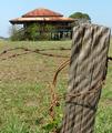
| 11/14/2004 11:45:58 PM | Long Forgottenby biggood53Comment: Hello from the Critique Club.
Initial Thoughts
My first thoughts were that it was lacking in contrast, with the color being a little washed out, and the subject confusing.
Composition / Content
I like the composition here, but other factors in the content cause it to become a little weak. I feel that you almost have two subjects in this photo, and the viewer may become confused as to exactly which subject your title is referring to. The post, or the hut? or both? Stronger contrast would have helped this out, seperating the post more from the background.
Background
It's a great background, but I feel that it needed a slightly shallower DOF. The grass and hut, if blurred just a *touch* more, would have allowed to viewer to more easily determine the subject. Conversely, the *post* being more blurred and the hut sharpened, would have had the same effect, only in reverse. You're on your way (the post *is* sharper), but I feel it needed a little bit more.
Camera Work - Technical
Again, this could have benefitted from a touch more DOF. This could be accomplished by zooming in a touch more (and standing back a bit), or stopping down the aperature, or a combination. I have the Fuji s7000, so I know that it's a bitch to get shallow DOF at times, but I know that it can be done.. and the s5000 has a large zoom, so take advantage of it :) Moving on, your focus is wonderful, and exposure is also very nice.
Digital Processing
What I feel is missing here is a lack of color. The color seems very washed out, and the white balance seems to be a little too far into the yellows. You may have done this on purpose to give the shot more of an "old" feel, but I wonder if you played around with doing this shot in B&W, or sepia tones? Both of which may have helped that aspect. As it is, the color wash just gives it a flat, unnatural feel.
Fits the Challenge
Being a Free Study, it obviously fits the challenge.
My Opinion on the Photo
I like the potential of this shot, and think you have the right idea. A little tweaking with some of the things I mentioned, and this could potentially be a wonderful shot. Great perspective, good idea, so keep it up. Good luck in the future. |
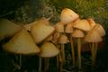
| 11/14/2004 11:29:38 PM | Secretsby rileyComment: Welcome from the Critique Club! Your prayers have been answered.
(just kidding)
Initial Thoughts
First of all, I didn't realize you could use a lighting effects filter under the advanced editing. Huh.
Ok, my first thoughts on this shot were that it's a little too dark in areas, but then I thought.. they're mushrooms, it's supposed to be dark.
Other than that, I only thought, "yah, they're mushrooms". :)
Composition / Content
I feel that your composition is weak on the left side of the image. I really like the small grouping of mushrooms on the right, but when they go off to the left, they go a little too chaotic. Perhaps a change of perspective, or more space on the left so the one mushroom isn't cropped off would have helped? As for content, it's a very idyllic little piece of flora, that invokes a kind of fairy tale look.
Background
The background is great, giving a feel of coming upon this grouping of fungii in a secret cave somewhere, with sunlight filtering in.
Camera Work - Technical
Nice focus on the mushrooms. DOF is really nice. The exposure is the only part that is a little weak, as the left side of the image suffers for it.
Digital Processing
The neatimage was applied nicely, as it's not fully noticeable, although I think the lighting effects filter may have aided in causing the lit part of the photograph to be a little too smooth.
Fits the Challenge
Being a Free Study, it obviously fits the challenge.
My Opinion on the Photo
It's really quite a good photograph of mushrooms. Not *my* favorite subject, but you've done a good job, and turned an ordinary subject into something worth looking at. | | Photographer found comment helpful. |
| 11/14/2004 11:18:52 PM | Notre Dame Cathedralby xsnrgComment: Hello from the Critique Club. I am Artyste, and I'll be serving you today.
Initial Thoughts
A lack of focal point here, with the fence in the foreground being a distraction. The subject you've chosen is far too far away to be effective, and without the title, one could miss it as a subject far too easily.
Composition / Content
The composition lacks a number of points here. There is no true focal point, as I've mentioned. The Cathedral is just a small object in the background, and not the true subject as you seem to have desired. The horizon is just a little too central, which also detracts from giving the viewer a path of viewing, setting them up to wander all over the photograph. As for content, it's a nice shot of a part of a city, but, again, no real interest.
Background
Your problem here is that your subject *is* the background, and while that isn't always a *bad* thing, you generally want a path of interest leading to your subject, if it's in the background, and this photo doesn't have one. The river *almost* works, but because of the clutter of the architecture around it, the fence in the foreground, and the fact that the river is cut off long before reaching the cathedral, it ultimately doesn't work.
Camera Work - Technical
The camera work here *is* good. You have a great sunlight exposure, focus is crisp, and DOF is deep and clear.
Digital Processing
You didn't give any details on your post, but I'll assume that you probably played with the basics such as bright/contrast, USM, and the like. Nothing you've done in post, if anything, has taken away from the image.
Fits the Challenge
Being a Free Study, it definitely fits the challenge.
My Opinion on the Photo
I feel that it's an average snapshot of a city, that had a lot more potential. I'm a little confused as to your choice of subject, it being so far away. If you had a stronger path to the subject.. a horizon that was closer to the bottom of the photo, giving you more sky and a stronger look at the cathedral, it might have helped.. or just had simply been a lot closer *to* the cathedral, this photo would have worked much better. Keep shooting, and good luck in the future. |
| 11/14/2004 06:40:45 PM | Midwayby RLSComment: Hello from the Critique Club.
Initial Thoughts
What I first thought of when I saw this was, "Where's the focal point?" I had a tough time deciding if I wanted to look at the ship.. or the lookout point.. or the sail-boats. (ok, not the sailboats so much :))
I feel that you're almost teasing the viewer with a hint of this huge carrier, and then.. that's it.
Composition / Content
I would have liked to have seen more focus on the Carrier/Battleship, as it seems to be the thing that cries for the attention here, but is instead, put to the side, almost as an afterthought. The composition suffers because of that fact, leaving the viewer wondering what, exactly, they should be looking at.
Background
A *touch* busy, but out of your control for the most part, and is good for the setting. The problem is, the Ship becomes, in this photo, a part of the background, instead of being the focal point.
Camera Work - Technical
A nice focus on the ship, but the shot seems pretty noisy, and overexposed in many areas, especially in the sky to the left hand side. I suspect that your metering was done on a darker spot of the area, as your aperature (f8) should have been good for a daytime shot. This may have contributed to the noise levels as well.
Digital Processing
Don't have any information on what you did in post, if anything. Problem with over-exposed shots is that they're almost impossible to really fix in post. Looking at the picture, I feel that you may have over-sharpened too much, however.
Fits the Challenge
With a Free Study, everything fits.
My Opinion on the Photo
I feel, as I've mentioned, that it lacks a strong focal point. You give the viewer too much to look at, the over-exposure makes it a little more difficult to look at, and the shot, having so much potential, is kind of a let-down for me. I wanted so much to see more of the carrier/battleship, but alas. A good try at capturing a unique subject, but we, the viewer, demand more :) |
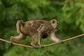
| 11/14/2004 06:25:32 PM | Hold tight, we are almost thereby RUEDISCHMUTZComment: Hello from the Critique Club!
I'm just starting out, so bear with me :)
Initial Thoughts
A nice, different shot of a monkey. Generally you see them just sitting around, so I liked that this one was in action. That she's carrying her baby is a nice touch as well. At the same time, I wasn't really drawn into the photograph all that strongly either, on first view.
Compostion / Content
Nothing really wrong with the composition here, although I wonder if a centering would have been stronger. (Sometimes it can work), or perhaps more of a view of where she's going along the rope. The content is also good. You've got a nice shot of an animal in motion, concentrating on getting there. A refreshing change from many animal shots where they are just sitting around.
Background
The background is really good. Nicely OOF, and complements the subject well, as it gives you a feeling of "Naturalness" and helps off-set the rope. One can imagine that the rope is actually from a rope bridge somewhere in the jungle.
Camera Work - Technical
Good focus, great DOF. Your exposure seems to be a little dark, and could have benefitted from maybe even one stop down to an f4, or perhaps even a slightly slower shutter speed. (You can probably drop to 250 or so without losing much stop motion). Experimentation, of course, is the key. A better exposure would have helped the monkey stand out a lot better against the background.
Digital Processing
You didn't leave any comments to what kind of processing you did, so I can only really guess. This shot doesn't look like there was a heck of a lot done to it. My suggestions would have been to have increased the contrast/brightness a bit in order to help the exposure problems I mentioned, along with working on curves, and/or levels.
Fits the Challenge
In a Free Study, everything fits the challenge.
My Opinion on the Photo
I liked this photo, but as I said, the exposure left it a little hard to see, with a little too much blend into the background. I loved the change of pace on the animal in motion. There's probably just not enough in this photograph, however, to set it *really* apart from a strong field like one sees in a Free Study. It's still a wonderful entry, and good luck in the future. |
| 11/14/2004 06:05:59 PM | The Waspby spydrComment: Hello! I see that you haven't received any after-challenge comments, so here's one from the Critique Club.
Initial Thoughts
To be honest, my initial thought was, "I've seen this before". However, this shot, while popular (insect macros always are, especially wasps/bees), has a wonderfully original use of complementary colors in the purple and yellow, which one doesn't see so often. Another initial thought after, "I've seen this before." was, "but still, wow." :)
Composition / Content
I really like the composition in this shot. You've got the wasp itself centered instead of it's face, and this creates a nice strong triangular look between the wasp's head, and the branching of the flower. Having the wasp look directly into the camera is a little chilling, especially for those of us with phobias :) The content, while not unique, is still put forth extremely well.
Background
I can't find anything wrong with the background. It's nicely OOF, the color is good and complements the image well, and it isn't cluttered. Good job.
Camera Work - Technical
Focus is crisp, DOF is great, and the exposure is practically dead on. Your camera work is really nice.
Digital Processing
This photograph *looks* a little over smoothed. The antennae and the eyes just have a kind of "plastic" look. The color work you did is really nice, giving it a beautiful saturation, and you said you did a little burning, but it wasn't entirely noticeable to me at first, which is a sign of a good burn job.
Fits The Challenge
Being a Free Study makes this part easy on me, how can it not fit the challenge? :)
My Opinion on the Photo
An absolutely wonderful photograph, that got high marks from me in the challenge (9). As I said, I was put off a touch by the plastic look of the wasps eyes and antennae, but everything else was beautiful. This is a work to be proud of. *edit* Oh, and one last thing. I think that you may have suffered in voting a little bit, because of content. As I also said, people tend to see a lot of insect macros, and it probably played a part in voting. Message edited by author 2004-11-14 18:07:20. | | Photographer found comment helpful. |
|
Showing 1331 - 1340 of ~1843 |
Home -
Challenges -
Community -
League -
Photos -
Cameras -
Lenses -
Learn -
Help -
Terms of Use -
Privacy -
Top ^
DPChallenge, and website content and design, Copyright © 2001-2026 Challenging Technologies, LLC.
All digital photo copyrights belong to the photographers and may not be used without permission.
Current Server Time: 07/24/2026 10:26:31 PM EDT.
|