| Image |
Comment |
| 07/28/2003 12:20:38 AM |
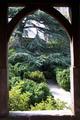
Framed Gardenby ChiquiComment: Lighting could be better on the inside of the window frame but the overall image is good. I like how the path sets the image off-center. |
 Photographer found comment helpful. Photographer found comment helpful. |
| 07/28/2003 12:16:10 AM |
Old Soul by sherComment: The lighting is a little hot around the left side of the image but the color and textures in the image are spectacular. Good framing. |
| Photographer found comment helpful. |
| 07/20/2003 11:48:21 PM |
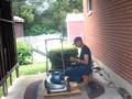
cooler in hereby Crafty SueComment: This picture has an organic, alive feeling that makes me almost tend to smell the gasoline, sweat and cut grass. The angles of the picture help to make it seem more realistic in my opinion but the image wouldn't have suffered from slightly tilting it closer to upright. The sunlight off the chain link feence (seen between the mower's handle and the engine) is too hot and creates a white area with no definition. This photo probably could have benefitted if the artist moved about 2 steps to the left before taking this picture. |
| 07/20/2003 11:45:47 PM |
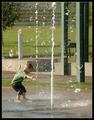
Beatin' The Heatby sherComment: This shot has a quality that invites many viewers in. Whether you went to a city park, an amusement park or your grandmother's yard where you pointed the water hose straight up in the air and just stood and felt the droplets falling on your head, most people have had some experience where they enjoyed the cool water keeping them from overheating in the summer. |
| Photographer found comment helpful. |
| 07/20/2003 11:43:46 PM |
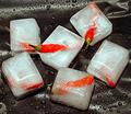
Chilli?by robsmithComment: Good idea. Very creative.
The lighting is a little hot on some of the ice cubes but the matte finish to the plastic bag (my assumption) under the cubes in the shot helps to dull down the light. This shows some forethought. I like the way the hot subjects tend to protrude from the cold storage. |
| Photographer found comment helpful. |
| 07/18/2003 07:29:34 PM |
The Upstairs Maidby jodiecostonComment: This was probably my favorite of this whole challenge. It's sexy but impersonal. It coveys femininity without focusing on any particular woman. The lighting makes adds to this picture by defining the front of the outfit but it also detracts by washing out a little of the upper curve of the breasts. Overall I loved this one. Great job.
Are you going to offer prints of this (he asked hopefully)? Message edited by author 2003-07-18 19:30:41. |
| Photographer found comment helpful. |
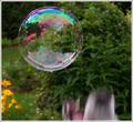
| 07/17/2003 10:47:15 PM |
Don't Burst my Bubble!by Everyday ReneeComment: I would like to see the background blurier but I can see the impending loss of the photo with the rising teeth at the bottom of the image. |
| Photographer found comment helpful. |
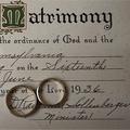
| 07/17/2003 10:45:30 PM |
The Rings of Eternityby OneSweetSinComment: Unique take on this contest. You made a personal link for almost anyone that views this image (as most people have been married and, thus, have a marriage certificate. The focus around the top left corner seems a little mushy to me but that could just be the initial M and the way it was printed. |
| Photographer found comment helpful. |
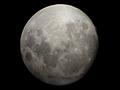
| 07/17/2003 10:43:07 PM |
The Moonby SwashbucklerComment: Clear photo. I think you could have strengthened the "roundness" link in this photo by cropping the sides in more to make the black background a perfect square, thus, highlighting the roundfulness of the moon. |
| Photographer found comment helpful. |
| 07/17/2003 10:41:40 PM |
Eyesoresby LilCasualGurlComment: Very different take on this. The "roundness" refers primarily not to what is "there" but what is missing. The missing mask in circles around the eyes draws attention to the eyes (round). Creative. |
Home -
Challenges -
Community -
League -
Photos -
Cameras -
Lenses -
Learn -
Help -
Terms of Use -
Privacy -
Top ^
DPChallenge, and website content and design, Copyright © 2001-2026 Challenging Technologies, LLC.
All digital photo copyrights belong to the photographers and may not be used without permission.
Current Server Time: 06/01/2026 04:47:10 AM EDT.