| Image |
Comment |
| 09/01/2003 07:02:38 PM |
Rule of Thirdsby Firstrich1Comment: Good perspective and I like the juxtaposition between the light and dark of the metalwork set against the rich reds and browns. The lightness of the sky detracts from this shot just a little especially since the sky on the left is so hot with those clouds and the blue on the right shows a good tone that contributes to the contrasting colors and shades in the photo. I wonder how this would look with a polarizing lens. I'd also like to see this same shot not done for DPC where you remove the clouds from the top left and burn that side of the sky to match the righthand side.
Good shot - 8 |
 Photographer found comment helpful. Photographer found comment helpful. |
| 08/27/2003 10:37:23 PM |
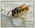
Wingsby inspzilComment: Great shot! Incredible detail and a nice color range. |
| 08/27/2003 10:03:39 AM |
Hot August day by pitsamanComment: Great capture. Wonderful color and definition. Congratulations on the ribbon |
| Photographer found comment helpful. |
| 08/25/2003 12:42:51 PM |
Beauty in the Gardenby TerryGeeComment: Terry,
I posted these comments in response to your request in a forum thread about this challenge ( //www.dpchallenge.com/forum.php?action=read&FORUM_THREAD_ID=40433&PHPSESSID=7dcb27baea25a3e53744a87cce1f1e86).
You mentioned that this post was similar to your post for the first Negative Space and that the first one scored better. For myself I scored this image a 5 and probably would have scored the image for the first challenge higher. Here's why. The goal of the Negative Space II challenge was that the negative space should create the WOW of the image and this one falls short not because your subject isn't centered or is a macro. This submission doesn't meet the bar because the background (your negative space) contains elements that make it resonate with the foreground (the main subject). Thus, your negative space doesn't make your main subject stand out in a powerful manner; rather, it gives some continuity from your subject to the background. My points would be that the pinkish hue in the flower is replicated below and to the right of it. Likewise the maize-colored areas on the butterfly's head and one spot on the wings seems to harmonize with the yellow-tan colors in the top left of this image. In contrast, the image you submitted for the original Negative Space challenge ( link) had a vibrant difference between the pink flowers of your main subject and the blurred space caused by the narrow DOF. You might have played with the colors in that submission to desaturate the yellows and generate a version that I would find even stronger but IMO it is a better presentation of this effort. I think you used a good technique but because of the blurred colors surrounding your subject in this submission you watered down the methodology you used to make your subject stand out. Message edited by author 2003-08-25 12:43:14. |
| 08/25/2003 12:09:58 AM |
Trinity by crabappl3Comment: Congrats on the ribbon. Love the contrast here. Good, sharp focus at the bottom of the image trailing into the negative space above. |
| Photographer found comment helpful. |
| 08/25/2003 12:06:42 AM |
Freestylerby ToddhComment: Great shot. Congrats on the ribbon. You really captured the moment. |
| Photographer found comment helpful. |
| 08/25/2003 12:06:02 AM |
|
| Photographer found comment helpful. |
| 08/24/2003 09:46:28 PM |
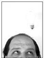
Not a Bright Ideaby moodvilleComment: Hmmm. The background and negative space concept works well with the human subject's head as there is enough contrast to bring out the features of the head. Adding the lightbulb detracts from this on one level as the bulb doesn't even have a continuous line defining its surface, causing it to blend with the negative space and leaving this viewer to wonder if any light is supposed to be coming from it (like a dimwitted idea - is this a barely lit bulb?). The noise to the right of each subject is a little distracting and draws from the negative space as well. I do think this is a bright idea for this contest but I think a hooded light source might have made for better results on the negative space. - 5 |
| Photographer found comment helpful. |
| 08/24/2003 09:41:03 PM |
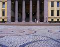
Come on dear, we're lateby johnmkComment: Wonder how this will score with the community. For my money this is a great example of negative space. The space contains active elements but it is subdued and homogenous; not drawing attention to itself but rather creating the atmosphere or ethos of the composition. This would not work for me if the camera was raised much higher as I think that would tend to give emphasis to the ground and it would become more prominent. Likewise, while the buildings to either side are necessary to set an opposing color tone against which the neutral colors create a negative space, too much more of those buildings would have overpowered the central area of the blueish-gray pavement and columns. Good work and I'd like to see how much work it took from you to get this image. How many did you take? - 8 |
| Photographer found comment helpful. |
| 08/24/2003 09:35:57 PM |
|
Home -
Challenges -
Community -
League -
Photos -
Cameras -
Lenses -
Learn -
Help -
Terms of Use -
Privacy -
Top ^
DPChallenge, and website content and design, Copyright © 2001-2026 Challenging Technologies, LLC.
All digital photo copyrights belong to the photographers and may not be used without permission.
Current Server Time: 05/31/2026 06:57:34 PM EDT.