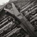
Seemingly Endless Tracksby
dacrazyrnComment: Composition
This is a good subject. Nice composition. Your selection is germain to the topic, it conveys a visual aspect of continuation (as the tracks go past the viewer's ability to discern) and your choice to turn the photo on this angle allows you to get more of the rails in the photo as well as providing a different view of a fairly common subject. This speaks well for your creative eye. The tracks are a little off center on the diagonal in the top lefthand corner but this isn't much of a distraction. The photo like it was either at a high ISO with a lot of noise or perhaps an infrared (IR) shot. The photo has a high grain that can contribute to many photos but in this case it is a distraction. In the immediate FG the subject could be much clearer and the level of graininess cuts down on the viewer's ability to perceive the rails distinctly before going very far back into the photo. While that is a desired effect I think you would want to create it with a clearer photo and the depth of field (DOF) rather than the graininess of a high ISO or an IR shot as the latter selection affects the whole composition while the DOF choice affects only the subject as it interacts into the BG.
Color
Nice choice in using B&W. It helps to cut down on visual competition. Often due to the objects in a photo having a higher or lower albedo, B&W can be distracting. With your selection everything seems to have a common level of reflection and, thus, not much seems to overpower the rails. The wooden railroad ties in the FG provide a little contrasting competition (especially since they are at right angles to the "infinite" rails).
Lighting
You seem to have good lighting here with no hot spots.
Focus
Focus is okay on this photo but the DOF could be a little larger. The effect given by the rails going out of focus is good and provides another visual clue to the "infinite" but having a slightly larger DOF wouldn't have cut into this too much.
Overall
Good subject, good interpretation. The graininess, whether by choice, oversight or limitation, is a distracting element and it is for that reason I lowered the score on an otherwise appropriate and artistic submission for this challenge. I rated this a 7 with a higher score in artistic nature. It just falls short technically to me.