| Image |
Comment |
| 08/09/2004 12:27:38 AM |
Samantha009by cbellerComment: Chris,
Great lighting. Fantastic lighting. Love the slight catchlight in the eyes (could be a little more pronounced), the lips (perfect there) and the shoulder (gives a sun-kissed kind of look). The setting is wonderful; it provides a nice backdrop that with several elements but you've managed to capture it with some blur to keep it from competing too much with the subject yet the color and texture of the rocks and grass can be appreciated for enhancing the smoothness of the model's skin. They kind of allow you to show her feminine smooth side without resorting to a "plasticky" feel that something like too much NeatImage might give you. Now this is just a nit from my initial view of the shot; keep in mind that I think this is a great photo. I think that in this pose if you'd had the model turn her hips more in profile it would have accentuated her femininity a little better. Say, something like taking the knees around about 4-6 inches to the model's right would have closed her hips more to you but left her upper body at roughly the same angle. This would have helped to accentuate her chest and back curves. As it is the edge on look at the subject's left arm shows that she is a young lady with little body fat content as her arm looks trim. While she doesn't look large at all, there is an illusory discrepancy between how thin her arm looks and how full her chest looks at about bicep level. Added to that (IMO) is the line across her hips such that if her hips were closed just a little more to the camera it would tend to downplay the illusion that her arm is too thin for her body (I think the dark shadow down the her tricep adds to that feeling).
Kev |
 Photographer found comment helpful. Photographer found comment helpful. |
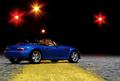
| 08/04/2004 06:15:29 AM |
Crossing The Lineby bongoComment: Perhaps the best in this challenge. Good lighting, you actually have something by which to gauge that the primary subject actually IS miniature. Heck, you even managed to capture some lovely lighting in the background that doesn' throw off your lighting of the subject but can be easily identified by anyone who's had to drive home at 3:00 AM from someone's house and barely been able to keep those eyes open. Very good composition and execution. |
| Photographer found comment helpful. |
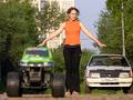
| 08/04/2004 06:12:16 AM |
My mustangsby paha_lComment: Good idea but you need to stop the lens down to get more definition in the toy truck on the left of the frame and your background is already clearly in focus. I'd suggest a different location so that the backdrop of trees, wires and buildings doesn't detract from the optical illusion you're crafting. In any photo you also might want to watch to be sure you don't have any well delineated objects appearing to come out of a person's head. The white edge of the building in the background bisects the human subject's head and while you might want to set apart two hemispheres to enhance the differences or the symmetry or some other facet of your composition, in this instance you lose that impact because both the tree limbs and the power/phone lines cross that imaginary boundary and dilute the separating power of the dividing line. |
| Photographer found comment helpful. |
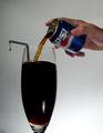
| 08/04/2004 06:03:23 AM |
237 mLby peeteComment: I don't understand the drop on the end of the straw. That seems extraneous to the composition. I hope in your notes you explain why its in the photo. |
| Photographer found comment helpful. |
| 08/04/2004 06:01:06 AM |
GUCCI Eau de Parfum II - Miniatureby MichaelsComment: It looks like the angles are tilted to the left. That may be an optical illusion from the bottles in the center and on the right. Good soft lighting of what I bet was a difficult subject. |
| Photographer found comment helpful. |
| 08/04/2004 05:58:51 AM |
Figure It Outby cassilda_terryComment: I think you might have been going for a collage type look or a scattered subject. I don't think you got either effect and just fail to see any other appealing design in this composition. The lighting seems to have a color cast and its fairly directional light but I don't see how the shadows add to the composition. It looks like the image has a relatively narrow DoF. The blue plastic house to the left of the black object (marble?) and the red die to the right of the black object seem to be in the field of focus while the farthest corner of the red car and the other blue plastic house, thimble and large white die seem to be blurred. A narrow DoF can be a useful way to direct the viewer's eye to what you as the photographer want to show as the main element but in this composition it appears to be the black object which is difficult to see any texture or definition in and is also uninterestingly centered. I think you have a good idea and you chose a style of photograph that can appeal to many viewers since it lends itself to having multiple objects, any of which might be familiar to a viewer. I think you could make this a more compelling shot by replacing the black sphere with the thimble or some other piece of miniature memorabilia, recomposing the shot so that its not so statically centered but so that it draws the viewer's eye off center a little and invites him/her to wander around the image and then put a few more items into the composition so that the wood grain of the underlying surface doesn't show as much. Good idea and good attempt. |
| Photographer found comment helpful. |
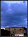
| 07/20/2004 08:04:23 PM |
The Boysby Spanish_GreaseComment: I really think you had a great subject and a good eye for it initially. I think this shot would have done better (IMO) as a square. Try cropping it just above the white billboard and then make the height match the width and see how it looks. I think it would make a fairly powerful statement with the deep cerulean sky just above the faded out words. |
| 07/20/2004 08:00:37 PM |
|
| Photographer found comment helpful. |
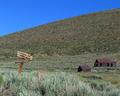
| 07/20/2004 07:56:35 PM |
Theby boomerComment: Wow I wish this was an advanced challenge so you could clone out the bird and the sticker on the sign. The sign with the expanse of sky as its setting is powerful enough, especially when coupled with the title. |
| Photographer found comment helpful. |
| 07/20/2004 07:54:55 PM |
Strawberry And Chromeby redfigComment: I think just a tad more DOF would have helped this. I think you exposed it well given the hot spot on the pliers/grips. Not too hot and the gradiation from light to shadow on the strawberry is nice. |
| Photographer found comment helpful. |
Home -
Challenges -
Community -
League -
Photos -
Cameras -
Lenses -
Learn -
Help -
Terms of Use -
Privacy -
Top ^
DPChallenge, and website content and design, Copyright © 2001-2026 Challenging Technologies, LLC.
All digital photo copyrights belong to the photographers and may not be used without permission.
Current Server Time: 06/01/2026 04:47:07 AM EDT.