| Image |
Comment |
| 06/30/2005 07:22:31 AM |
Peteby KiwiChrisComment: I like the gradual slide in tones across the background but this has a few little things that aren't bad but just some things you could consider. The subject stands out from his direct background just fine. Great job on that part. I see a vertical line of light farther to the image right, just beside the seam of the backdrop. This seems just a little contentious and I think you could easily burn that or heal it out of the shot along with the seam and just see how much of a difference it makes. On the subject's face, I love the definition you captured here. The mustache and hairline really create some character that looks fun to work with. Under the subject's eyes, however, I see darkness with strong edges. I think I'd at least try a version of this where those dark edges were healed with a soft-medium edged healing brush. It wouldn't totally remove the dark areas (which I feel add some character) but it might keep them from being so prominent. I think this is added to since the catchlights are relatively small in the subject's eyes (and I'm sure that's a function of you trying to keep the glare out of the glasses). The one thing I notice that you can't go back in processing to work on is the hand. Its fine that he has one hand up and (I presume) the other hand down. It does invite the viewer to consider whether he lost his hand and how. Neat if what you wanted was to intrigue your viewers. If, on the other hand (please pardon the pun), what you wanted was a good representation of the subject for family or professional work then I would think that keeping the viewer drawn up to that face with al its texture and lines and hairy hair hair, you might just have wanted a little of the subject's right hand to appear so that the viewer "felt" the symmetry without having to look down and wonder about the hand. Not a major issue; you've covered the major point of the subject by capturing his face well; maybe its just something to consider next time you look through the lens for a shot like this.
Oh yeah. I like your compositional idea here to move him off to the side. Were it me, I might have cropped the image a little taller to get his face closer to teh intersection of the top and left thirds lines but I'm afraid that such a cropping would lose the impact of having that face so prominently displayed. That's the trade off you have to try and then decide what you like. All-in-all, I like how you composed/cropped this shot, though.
Nice job on this one, too.
Kev |
 Photographer found comment helpful. Photographer found comment helpful. |
| 06/30/2005 07:10:59 AM |
smimg_2904.jpgby KiwiChrisComment: I like this image. Not too hot anywhere, crisp clarity in the face and the eyes. You might try burning the top where the light gray color is bright just so it doesn't compete with the face as much but a very good job as it sits right now. This has depth and tones; composition and execution. Very nice work.
Kev |
| Photographer found comment helpful. |
| 05/09/2005 12:12:40 AM |
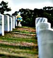
Remembranceby KevinRiggsComment: Good grief. ;)
Who gave this a 10? Someone(s) out there are more empathetic (or gonzo) than they realize. I had a feeling in the pit of my stomach when I shot this. The locale and the sense of lonliness I felt (perhaps from having our group all split up to shoot) probably contributed to the mood I felt when shooting. When I reviewed the shot and started screwing with it I got the same feeling when I hit on this version of the image. Maybe 4 other people out there have been walking through a cemetary or someplace and had a solemn sense of lonliness and this just brought it back for them. I completely get that this was supposed to be an attempt at "capturing and emotion" and not "evoking an emotion" so I pretty much expected this score. I'm surprised to see 4 other individuals who had a "10" kind of reaction.
If it worked for you then great. Thanks for the votes.
Kev |
| 01/03/2005 07:23:31 AM |
Phoenix_0016by cbellerComment: I like the warm tones given by the orange here. It keeps her skin warm and "soft". |
| Photographer found comment helpful. |
| 09/20/2004 06:56:56 AM |
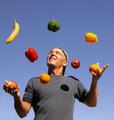
Juggling a Healthy Dietby ColeyComment: Great composition. I'm not sure whether I like the square crop on this or not. Perhaps a portrait crop would have lent a sense of gravity to the cascade of objects. Regardless you chose a wonderful background and I love the interplay of the blue gradient sky in the background with the gray shirt of the subject. Am I seeing some moire in the shirt or is that a textured pattern? Your exposure looks like it was difficult. The shadows cast on the subject are hard and the hot spots on the subject's cheek and fingertips tend to show that you probably had some difficult lighting to work with. The exposure on the all the fruit still allows some texture and details to show through; the texture of the lighter, more reflective oranges and the contours of the duller peppers show a nice range. I wonder what camera you used and what settings allowed you to get such a good exposure with strong directional light like this.
You did a good job catching the action here. Your subject is personable, perhaps its the backwards facing cap or maybe just the fountain of fruit but I can imagine him to be a brother or uncle who is just showing off at a family get together and making the kids laugh. The shot seems playful and yet it looks technically diffcult.
Good job. |
| Photographer found comment helpful. |
| 09/20/2004 06:46:47 AM |
The Waves Of Tronconesby Justin EvansComment: Great subject but it feels just a little soft especially around the rocks. It looks like this was shot pretty late or early in the day as the light has a color cast and seems to be coming from low on the horizon. I wonder what shutter speed and aperture you used on this shot.
Great choice of subjects. Wish I'd been there with you on this shoot. |
| 09/20/2004 06:44:05 AM |
Finally doing the laundryby siggiComment: I wish the composition wasn't so tight on the subject because it looks like the water droplets all the way around the photo extend beyond the border of the shot. Then again, a woman in a t-shirt falling into a pool? Nice composition. ;)
I do like the exposure you got here. The water on the sides has details and you didn't lose the details in the darker jeans or the white shirt. |
| Photographer found comment helpful. |
| 09/20/2004 06:41:44 AM |
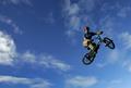
Sky Highby arnitComment: Great exposure on the sky. The subject has some harsh shadows but I think it works in this composition. I like the use of the space (is it truly negative space with the clouds providing a background of interest that the viewer can peruse?). I wish the subject were just a litlte higher in the composition to put the red helmet closer to the junction of the top and righthand thirds lines; as it is he seems to be almost centered top-to-bottom.
Everytime I look away and look back I notice the rider. This is a solid composition; the subject really pops out of this shot with action. Did you enhance the contrast on the bike rider? |
| Photographer found comment helpful. |
| 09/20/2004 06:38:01 AM |
Concentrateby TranquilComment: Good idea. Different from most shots in challenge. I like the angle you selected but think that widening the shot out a little to include all the racket head would have made this a slightly stronger composition. It looks like you had some fairly strong light here as the details along the arm seem blown out; the face and white shirt, however, retain some detail and those are the more important elements IMO. Nice use of DoF to direct the viewer's attention to the subject's face. |
| Photographer found comment helpful. |
| 09/13/2004 10:47:05 PM |
Keeyana, Candidby joannsComment: Wow!
Love this photo. It's sharp, its crisp but not overdone. You allow her skin and features to remain softly feminine without losing the spot on detail. The flowing line of the crease and the shadow lead upwards. The tones in this are spectacular for digital work. I love the way her face is lit and you have captured her lovely profile as though you'd been doing this for years and knew just when to take the shot. Great job!
If there is anything that you might consider I wonder how it would look if you selectively lightened the shadow on just above the bow. I'm not saying it'd be better but it might be worth your time to pop that shadow up just a shade or two and see the difference in the photo. One of the things that I like is the definition that the light gives to the subject so I can't say how it would affect it.
Regardless, this is a gorgeous capture and thinking that it was a candid rather than posed just adds to the appreciation.
Kev |
| Photographer found comment helpful. |
Home -
Challenges -
Community -
League -
Photos -
Cameras -
Lenses -
Learn -
Help -
Terms of Use -
Privacy -
Top ^
DPChallenge, and website content and design, Copyright © 2001-2026 Challenging Technologies, LLC.
All digital photo copyrights belong to the photographers and may not be used without permission.
Current Server Time: 05/31/2026 08:35:55 PM EDT.