|
|
|
Showing 261 - 270 of ~637 |
| Image |
Comment |
| 12/20/2002 07:32:05 AM | |
| 12/20/2002 07:31:10 AM | |  Photographer found comment helpful. Photographer found comment helpful. |
| 12/20/2002 07:29:38 AM | |
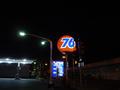
| 12/20/2002 07:28:35 AM | The Only Thing in Town! This is where I Work & Play!by PtmanComment: So what are you, Barfly? Hustler? Waitress? Hooker? The photo is a bit nondescript, it needs a point of focus which could have been the sign on the roof, or someone hanging about outside. Id have moved the green bin out of shot. | | Photographer found comment helpful. |
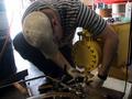
| 12/20/2002 07:25:33 AM | Pump Problemsby dadas115Comment: Bright light in the background could have been avoided. Good pose, the worker is directing attention to the yellow pump by framing it an looking at it. |
| 12/20/2002 07:19:49 AM | Study - Where I should beby stephanComment: Qt! have an extra point. I think the books could have been arranged a bit better, there is a line of reflection on the ASM book. The bottom seat could be set dead central, to help emphasise the way the seats dissappear up and to the right. | | Photographer found comment helpful. |
| 12/20/2002 07:16:12 AM | |
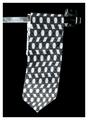
| 12/20/2002 07:14:47 AM | Office Identityby greenem2Comment: Needs more light on the top half. Composition could be better, there is too much weight on the left side (tie hangs in that direction, and bar goes out of frame on that side too. |
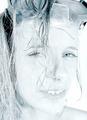
| 12/20/2002 07:09:23 AM | Would You Go Diving With Me?by ndsComment: I want to like this, but theres just something wrong and I cant put my finger on it, perhaps its the jaggies, the overexposure, the models sleepy look, dunno. | | Photographer found comment helpful. |
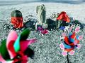
| 12/13/2002 06:07:15 AM | pinwheel requiemby kenboComment: At first I hated this, but the colours really work well against the grey, and the red cloths really give a sense of wierdness afoot. I'd crop the top off a bit, though.
(back again) I havent upped this to a 10 as there are a few minor flaws: The bit at the top, it feels as if the left side has dropped a bit probably cos the statue leans and the weight of the green windmill. On the plus side, there are several points of interest, the colours are just great, it leads the eye around the picture, the subject matter is unusual, the green windmill is the obvious starting place and points to the other major compositional elements, the blurred sten on the blue windmill stops it pointing out of frame. |
|
Showing 261 - 270 of ~637 |
Home -
Challenges -
Community -
League -
Photos -
Cameras -
Lenses -
Learn -
Help -
Terms of Use -
Privacy -
Top ^
DPChallenge, and website content and design, Copyright © 2001-2026 Challenging Technologies, LLC.
All digital photo copyrights belong to the photographers and may not be used without permission.
Current Server Time: 07/16/2026 11:14:42 PM EDT.
|