| Image |
Comment |
| 05/24/2013 06:47:09 PM |
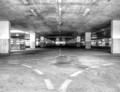
Which Wayby BenstedComment: I like the symetry on the right and left. Not sure the top/bottom symetry works as well. Perhaps cropping off the bottom third is something to try. |
 Photographer found comment helpful. Photographer found comment helpful. |
| 05/24/2013 06:45:11 PM |
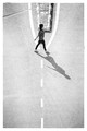
Street Mannersby giantmikeComment: Nice repeating patterns. Not sure cutting off the edges of the forks works here. Sometimes focusing on the 2nd object in a pattern can work better than the first. |
| Photographer found comment helpful. |
| 05/24/2013 06:43:57 PM |
|
| Photographer found comment helpful. |
| 05/24/2013 06:42:17 PM |
double forkby PennyStreetComment: I like how the black wall/partition divides the frame. The fork part is not really strong. |
| Photographer found comment helpful. |
| 05/24/2013 06:40:43 PM |
We all Bleedby MinzotoComment: Odd set of subjects. The not sure this eally looks like a road bleeding or just lumps of paint. I like the narow DOF. |
| Photographer found comment helpful. |
| 05/24/2013 06:38:19 PM |
Improvisationby hajekaComment: Very nice. The lage white border is offset nicely by the black background. The photo in the photo is not an appealing photo. |
| Photographer found comment helpful. |
| 05/24/2013 06:36:51 PM |
|
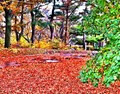
| 11/03/2012 10:08:23 PM |
Natures Bike Pathby Allen1634Comment: Wow, those colors sure grab you and scream "look at me". I think it is overdone and loses a lot appeal as a result. |
| Photographer found comment helpful. |
| 11/03/2012 10:06:39 PM |
family lifeby jmritzComment: I like a good abstract as much as anyone, but I still need a subject or focal point to look at and appeciate. The grey forms here blend into the grey background and did not grab my interest at all. |
| Photographer found comment helpful. |
| 11/03/2012 10:02:29 PM |
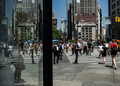
Where is everyone???by NikonJebComment: Interesting moment that has some humor value. That said the scene is kind of busy with too many objects and greenery competiting to be seen. The bride is the focal point but her back is turned and that really weakens it. |
| Photographer found comment helpful. |
Home -
Challenges -
Community -
League -
Photos -
Cameras -
Lenses -
Learn -
Help -
Terms of Use -
Privacy -
Top ^
DPChallenge, and website content and design, Copyright © 2001-2026 Challenging Technologies, LLC.
All digital photo copyrights belong to the photographers and may not be used without permission.
Current Server Time: 06/23/2026 09:50:48 PM EDT.