|
|
|
Showing 1361 - 1370 of ~4455 |
| Image |
Comment |
| 08/20/2009 07:57:47 AM | The Robots of Dawn, by Isaac Asimovby jlgloverComment: Hi from the C Club
Coooooooool robot!!!
I think what is missing out of this photo is his legs. It would have been a better POV with them in there. You are tack sharp on your robot, clarity is good.
I read that you wanted the shadows to pop out a little more to show that it is dawn. I played around in photoshop with your picture a little tweak with the shadow highlights, reduced the exposure and contrast, then brightness and contrast, then hue and saturation and selective colours. This made a difference with the shadows and made them more strong without compromising the robot. The hue and saturation and selective colours brought out the yellows and magentas you have in this shot and made them a little brighter, this way it looked like dawn and also made the picture more warm.
I will echo what Art said, I wannnnnnnnnnnnt one!!!!!!! |
| 08/20/2009 07:40:16 AM | The Iron Giantby martinsphotoboxComment: Hi from the C Club,
I was one of your high scorer's on this shot, here are the reasons why.
I liked the overall shot, The different aspects of it came together for me, the blur of the train, the straightness of the poles and of course the great sculpture of the hand. It sort of meshed together.
Now in saying all of that, I would have liked to have seen some more motion blur on the train, a little more sharpness around the whole image or even just on the hand and the rest of it blurry. If you are going to go with such a high contrast to this shot, maybe turning it into a black and white would have worked better. Also, the main focal point is the hand, so that needs to be straightened out, that would give the rest of the shot a very interesting and different angle.
When you are in the midday sun, try lowering your exposures in camera, you will find that that will go a long way, you can also do this in Photoshop, try out the brightness and contrast as well. USM would have helped this shot a lot as well.
It was a good try on this and would love to see you reshoot it!
|  Photographer found comment helpful. Photographer found comment helpful. |
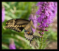
| 08/20/2009 05:33:42 AM | My, Oh My -- A Butterfly!by TirascoComment: Hi from the C Club
I thought this shot was great and gave it a 9 in voting.
To be honest I do not think that there is much that could be done to improve this shot. Your background is bokeh enough to be interesting, you are sharp in the right places, the purples, which are the hardest colours to photograph and get correct are just right.
The only thing that may improve this is the butterfly and its colour. Play around with your saturation levels or curves, the selective colours may make it pop just a little more.
|
| 08/19/2009 05:58:18 PM | Porno For Pyrosby TomsPhotosComment: Hi from the C Club,
Fun shot fits your title and challenge.
Your lighting is a little harsh in this shot, I would bouncing a light or a different angle. Even in post processing you can adjust the exposure, which in this case may have been the way to go.
A tighter crop off the top would have helped with the DOF and POV here. Cropping off the bottom would get rid of the line that separates the shot. You kinda chopped yoru knuckles off too!!
I would suggest a play with exposure, brightness and contrast and shadows and highlights to make this photo pop a little more, it is fairly flat right now.
Great capture of the flames. | | Photographer found comment helpful. |
| 08/19/2009 05:29:14 PM | "Curiosity"by ytshuvaComment: Hi from the C Club
Loved it when i saw it in voting and gave it a 7, here is why.
You are catching a moment in time right there, probably never captured again with this little one. Your post processing is excellent. I would crop out the right hand side just past those red squigly lines at the top of the shot and a tiny bit of the left side to crop out that white dot.
your sharpness is excellent, your clarity is to die for, your colours are outstanding, your subject engaging, interesting, pretty as a picture.
Well done on this shot, it is excellent |
| 08/19/2009 05:19:33 PM | | | Photographer found comment helpful. |
| 08/19/2009 05:19:19 PM | |
| 08/19/2009 05:15:21 PM | | | Photographer found comment helpful. |
| 08/19/2009 04:10:29 PM | 3 Inches of Bloodby adamslightComment: C Club here,
Not a lot I can say really about this photograph. It is in focus, dof is good, saturation is good, lighting is good. You got what you wanted with this shot by shocking people.
| | Photographer found comment helpful. |
| 08/19/2009 04:03:24 PM | The Photographer's Eye by Michael Freemanby bspurgeonComment: Hi from the C Club,
I gave this a 9 when i voted. I though it was a brilliant photograph.
I love the fact that you haven't got some bikini clad model doing this, this is what makes this shot so special.
The only thing that I can see is the banding in the sky which is easily remedied in Advance.
I wish I could make this a longer critique, but what can I say when faced with this shot. Stunning!
| | Photographer found comment helpful. |
|
Showing 1361 - 1370 of ~4455 |
Home -
Challenges -
Community -
League -
Photos -
Cameras -
Lenses -
Learn -
Help -
Terms of Use -
Privacy -
Top ^
DPChallenge, and website content and design, Copyright © 2001-2026 Challenging Technologies, LLC.
All digital photo copyrights belong to the photographers and may not be used without permission.
Current Server Time: 05/04/2026 12:26:37 AM EDT.
|