|
|
|
Showing 1251 - 1260 of ~4455 |
| Image |
Comment |
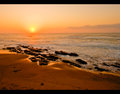
| 09/10/2009 10:09:22 PM | Sunrise in Umhlangaby tinkie2010Comment: Hi from the Critique Club,
You asked for your shot to have a comment from a member of the Critique Club.
Interesting shot, I think what is needed here is a little more contrast, you have some amazing colours going on.
In post processing, I think playing around with your selective colours could have brought more depth to this shot.
It really looks like a lovely place to be
|  Photographer found comment helpful. Photographer found comment helpful. |
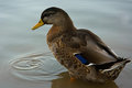
| 09/10/2009 10:05:41 PM | Duckby landon1013Comment: Hi from the Critique Club,
You asked for your shot to have a comment from a member of the Critique Club.
Interesting shot. You are sharp, clear, colours are good, subject reaches the rule of thirds.
But as you know on DPC, if it isn't right in your face and full of drama it will not do so well. To be honest here, I think that for once (on DPC) you where really voted on technique, because lets face it , it is a duck standing there.
So I think you should be very happy with the plaement on this shot as it is technically great.
|
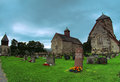
| 09/10/2009 10:01:55 PM | The Sister Churchesby BJokerudComment: Hi from the Critique Club,
You asked for your shot to have a comment from a member of the Critique Club.
this is an interesting shot.
I think what hurt you in this shot, is the over saturation of the colours and your leaning towers.
If you had made this black ad white, it may have had a more of an impact of the voters. It would have looked more moody and more drama added to it. As of right now, it kinda looks like a bit flat.
| | Photographer found comment helpful. |
| 09/10/2009 09:56:30 PM | Between The Wave And The Rock...by shadowdoc31Comment: Hi from the Critique Club,
You asked for your shot to have an in depth comment from a member of the Critique Club. This is an amazing image with such clarity and depth. YOur sharpness is excellent, the smooths on the fur is almost touchable. DOF and POV is spot on
There is nothing more I can add, as I really do think that this is a wonderful nature shot | | Photographer found comment helpful. |
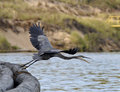
| 09/10/2009 09:54:36 PM | The Launchby DrakeComment: Hi from the Critique Club,
You asked for your shot to have an in depth comment from a member of the Critique Club.
This is really an excellent shot, I am not sure that there is much I can add to this, your sharpness is amazing, your clarity is excellent.
I think maybe pushing the contrast a little of the water and background would have made this really pop.
An excellent image, well done |
| 09/10/2009 09:51:43 PM | Clockwork Reduxby Pipe_DreamComment: Hi from the Critique Club,
You asked for your shot to have an in depth comment from a member of the Critique Club.
This is one of those shots, that although it is excellent, will not score highly on DPC. I personally gave it an 8 when in voting. Here are the reasons why.
I think there needs to be a little more expression in your models eyes. Right now they are just black holes. A little dodging and burning in post processing would have helped here.
If you are going to go to this extreme with a man in make up , it needs to be totally perfect. The stubble n the upper lip throws this shot off as it is all different lengths. The hat is tilted, it may not seem like a big thing, but it throws the shot off adn makes it appear like your horizon is off, which will get you voted down as well.
the white shirt that is showing is off from the rest of the shot with the black, it either needs to be all black or an even white undershirt.
your horizon is also tilted with the shoulders, this could explain the hat as well .\
With a make up artist at hand, and the affect that you where going for, which was Clock Work Orange, you really need to make it work, and go almost overboard. Because as of right now, your colours are washed out. I presumes that you want the focus on the eyes and the smoke, then pop those eyes, pop that smoke, use dodge and burn.
Your sharpness and clarity is amazing,
Well done on this shot
| | Photographer found comment helpful. |
| 09/10/2009 09:44:05 PM | Sunday morning:homemade pastaby Rino63Comment: Hi from the Critique Club,
You asked for your shot to have an in depth comment from a member of the Critique Club.
This is really an excellent shot, well done on this, There is nothing that I can see wrong with this shot. The only thing is, funnily enough, I want a closer crop on this to the left and right. I am not sure why though.
You have an excellent shot and should have done better here, your sharpness, your DOF and POV are excellent!
Well done | | Photographer found comment helpful. |
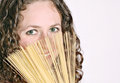
| 09/10/2009 09:41:03 PM | Got capellini?by InnaNComment: Hi from the Critique Club,
You asked for your shot to have an in depth comment from a member of the Critique Club.
This looks like a fun shot!!!
they eyes on this person seem very kind and fun! You had an excellent idea here, using the pasta as a fan. There is not a lot here that can be improved on it is a nice shot, maybe next time use a darker background as this would pop the pasta, eyes and skin.
You could have gone with more saturation with her eyes, there is a wonderful tutorial on here about eyes, have a look as I think this shot could do with a pop. Whether it be her eyes, the pasta or eyes.
|
| 09/10/2009 11:12:44 AM | Pasta Tradizionaleby airdanceComment: HI from the Critique Club
You asked for your shot in this challenge to have a comment from one of the members in the Critique Club.
I like your shot, it does have a slight feel of an Italian kitchen.
As has been stated, your lighting is backwards, your candles aren't really dong anything for the picture as they are blown out at the wick. I don't actually see any cheese in this picture, I think what J is talking about is the line behind the canister (it sort of looks like the edge of the table to me)? If it is cheese, it should be brought out to the front and replace the plastic bag.
In post processing, using the exposure and brightness and contrast could have brought more light to the forefront. A little dodging and burning also could have made your items brighter.
A very good try | | Photographer found comment helpful. |
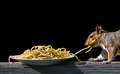
| 09/10/2009 11:04:39 AM | The Thiefby vawendyComment: HI from the Critique Club
You asked for your shot in this challenge to have a comment from one of the members in the Critique Club.
This is an excellent shot, you are so lucky to have all this wildlife in your life!!
There is not a whole lot that I can see that you could do to make this a better shot. The black back ground is very dominant but as you stated that is the foliage. The pasta looks ok, I think it is the peanut butter that is turning it brownish, just say it is wheat pasta!!!
Overall, you are sharp, clean, clarity is excellent, colours are spot on. Just the background that is hurting you!
well done on a nice score! | | Photographer found comment helpful. |
|
Showing 1251 - 1260 of ~4455 |
Home -
Challenges -
Community -
League -
Photos -
Cameras -
Lenses -
Learn -
Help -
Terms of Use -
Privacy -
Top ^
DPChallenge, and website content and design, Copyright © 2001-2026 Challenging Technologies, LLC.
All digital photo copyrights belong to the photographers and may not be used without permission.
Current Server Time: 05/02/2026 10:48:06 PM EDT.
|