|
|
|
Showing 7471 - 7480 of ~27276 |
| Image |
Comment |
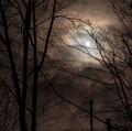
| 01/08/2016 09:34:49 PM | Mysterious moonby clickodakComment: Greetings from the Critique Club, Marcel!
What a lovely scene! So perfect for the challenge topic of "calm".
I don't think the bottom of the image adds anything, so I'd have cropped that out to focus on that fabulous moon and those great colors.
I don't understand the blur to it all. Is that added in post-processing or just Depth of Field?
I think a sharper moon would have resonated better with the voters.
I love the contrast... the darks and the lights... and the variance of colors.
Over all, I think it's wonderful scene, well-captured and I'm pleased that it scored over a six for you. |  Photographer found comment helpful. Photographer found comment helpful. |
| 01/08/2016 09:31:03 PM | Old Waysby bennettjamieComment: Greetings from the Critique Club, Jamie!
What a perfect post-processing job you've done here! I love the sepia you've used and the heavy contrast and noise to show old ways and age.
The details you've shown and the crop you've chosen pull the viewer into the scene and make us feel as if we truly are in another time.
I'm not sure I like the heavy light in the left... it competes with what you're showing the viewer and distracts from the subject, in my opinion. Hold your hand over the left side of the image here on your monitor. Doesn't the lack of the bright spot draw you into the subject more?
A simple crop off the left would solve that.
I also would have made the focus on the fabulous curve of numbers instead of that one screw in the foreground (or I'd have blurred the screw in post processing a bit).
I do love seeing the metalwork details.
I wish you'd entered this image in "Old Ways" challenge that was a month or so ago. I think it would have done very well.
I hope to see your images more often in 2016, Jamie! You have a great talent.
|
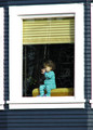
| 01/08/2016 09:23:18 PM | Who Watches the Watchers?by GeneralEComment: Greetings from the Critique Club, Paul!
What a fun image! I love the stripes of the clothing and the stripes of the building and the stripes of the blinds pulling the viewer in. Such a clever find!
I love the clash and merge of all of the colors. So intriguing.
What I'm not fond of is the blown whites of the window frame taking our attention away from your charming subject. The eye is automatically drawn to the brightest part of an image after finding the face. Since the face is not engaging us in anyway (the child is looking away), the viewer's gaze then goes to the window frame and is then lost... floundering for where to land next.
If the child were looking at the camera, engaging the viewer immediately, then the blown whites would have lesser negative impact.
As it is, the child has put up a "barrier" against us. His/her hand (the most in-focus part) is there on the window... as if to block us... and he is looking away. It almost makes me feel unwanted even though he/she is smiling at something we cannot see. If the hand weren't there to fend us off... I think we'd feel more free to explore whatever is drawing the child's attention away from us. More... "story".
As it is, I feel unwanted and uncomfortable viewing the image... Like I shouldn't be there.
So, my "diagnosis" of the image is that... you've found a wonderful scene... the colors, the striped everywhere, the human element of interest... but the "second in time" that you chose could have been chosen a second earlier or later... to engage the viewer more.
| | Photographer found comment helpful. |
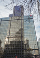
| 01/08/2016 09:13:19 PM | Illusionby clickodakComment: Greetings from the Critique Club, Marcel!
The reflections you've seen and captured here are amazing! I've enjoyed exploring all of them.
I think your score on this image is lower than others of yours this year because of the focus issues. The top, where the viewer starts is out of focus, so we wait as we search to find the "subject" of your image.
When we get to the end and find that we've been exploring the subject all along... it's disappointing a bit.
Compare this image to your stairs illusion image. That image is totally in focus and holds the viewer's attention the entire image.
This image seems a bit dull in the colors and... really has no "punch" to it. The goodness of the lower portion sneaks up and never gives the "oh wow" that it would if the upper portion were cropped out and the viewer came into the image in the in-focus part... and was submersed immediately into the wonderful reflections you've captured.
If this image were mine, I'd crop off the top (making it square), pump up the contrast and saturation, and watch the score climb.
I can't wait to see what you enter next!
| | Photographer found comment helpful. |
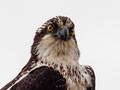
| 01/08/2016 09:04:47 PM | SSSHHHby PhocalComment: Greetings from the Critique Club, Ronnie!
How interesting that just today, I was enjoing through your portfolio and then... I've been assigned one of your images to critique. Ha!
I love your wildlife images.
In this image, I really enjoy the blown sky... as if he were in front of a white posterboard to highlight his features. I enjoy the wonderful focus right where it should be... right on his eyes.
I like the detail you've captured in his feathers.
Such a good job on all of these.
I think that the intense stare of his eyes... a raptor... keen eyesight watching and waiting for prey... isn't the perfect fit for a "Calm" image. The tension we feel seeing his alert gaze is probably what lowered your score on this moving image.
So... my "diagnosis" is that this is a wonderful image... but not in this particular challenge.
I can't wait to see your next entry, Ronnie.
| | Photographer found comment helpful. |
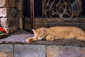
| 01/08/2016 08:59:24 PM | Don't Wake the Sleeping Tigerby dpeden182Comment: Greetings from the Critique Club, Daniel!
I love how you've seen "calm" in a world of chaos. This is definitely a purrfect example (sorry! Ha!) of calmness and peacefulness.
I agree with your commenter who wants the cat to be sharper in focus. In animals and humans, we automatically go to the eyes first. And in this image... we're a bit disappointed when we don't find the focus right there on the eyes. But, when it's not, we're okay with it... and we keep searching the image for the "real subject" that the photographer wants us to see and enjoy.
In this image, there are three things competing for attention in the image and we never really "settle in" in the image:
The swirly metal which seems to be the most in-focus object
The red, eye-catching flower
The cat
Put your hand over the red flower on the screen and look again. That eliminated one object... but the eyes still go to the swirly metal instead of the cat... much larger object and more in focus.
If this image were mine, I'd have cropped off the flower on the left and taken some off of the top to bring the visual focus in on the cat even if he weren't in actual focus from the camera. That gives more intimacy, I think.
I love the colors... and how you've seen the scene that meets the challenge perfectly.
| | Photographer found comment helpful. |
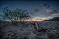
| 01/08/2016 08:50:23 PM | Death Valley Dawnby TommyMoe21Comment: Greetings from the Critique Club!
Tom! What a fabulous image!
I love the details that you've captured in what must have been a difficult situation.
I agree with the commenter who suggested pumping up that wood.
The scene could hold its own very well without the wood, but if you include it, it really needs to steal the scene. A bit of dodging in post processing could have made it really POP!
I really love the dips in the sand. So much detail! Add in the sunset and I see how you scored so well in a Free Study.
Well done! This is a capture to be proud of, Tom!
| | Photographer found comment helpful. |
| 01/08/2016 08:45:34 PM | Dr Lecterby KiritoComment: Greetings from the Critique Club!
Wow, Max! This is an intriguing image!
The colors, the detail, the empty background... all lead to mystery and intrigue.
I've not seen the series Hannibal, but... I like this style.
I agree with your commenter that the composition could be a bit better. I'd have taken a bit off the left... and added a bit to the right to make the viewer "see" what the model is seeing... and imagine what he's seeing.
I love the detail of your model and the glasses. The hairs and the skin texture... amazing!
I think what messed up your score is that... the mystery... the tension of the viewer trying to see what the model is seeing... and yet... there's no way to see it... the background is blank (which I've already said I love, but it adds tension). The tension doesn't match the challenge topic of CALM.
That's my opinion. I love the image for so many reasons... but not for this challenge topic.
I can't wait to see your next entry! | | Photographer found comment helpful. |
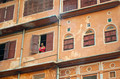
| 01/08/2016 08:38:47 PM | Jaipur Julietby PangurbanComment: Wow! What a composition! Wonderful!
The pop of red of the girl's clothing is magnificent among the palette of yellows and browns. In my opinion, it makes the whole image.
I love the diagonal of the whole of it and the vertical breaks in it.
The only thing I can see that made your image not score higher is the focus. There is nothing in focus and I really wait for the girl to come into sharp focus to make this image... SOAR.
It might be the rule constraints that made her not in focus as shown here, if she is in focus in the original. If so, perhaps try Save For Web to get more details in focus while staying within the rules.
In all, this is a beautiful image that you should be proud of, Ellie!
| | Photographer found comment helpful. |
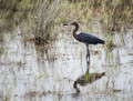
| 01/08/2016 08:30:42 PM | Reddish Egretby Ja-9Comment: Greetings, Janine, from the Critique Club!
I have NO idea why the score on this image is so low.
I like many things about it and don't like a few things about it, but... a 5.6? I don't understand that. *sigh*
The "bad stuff" first:
I'm not fond of the large clump of grass. I think it competes far too much with the subject. The rest of the foreground and background are so wonderfully blurred... EXCEPT for that grass clump. *sigh again*
I think you could have blurred it in post processing and been fully legal and fully amazing. :D It seems to me that everything is OOF in a glorious way except for the bird and the clump.
But, enough about the clump.
The colors are a tad bit drab. Maybe a pump up of them just a smidgen?
The good stuff:
Oh golly! The focus! Perfect!
The reflection... wonderful!
The crop... fabulous to show the scene and give us more of a feeling of where we are with the bird... but not too much area. Just enough.
Well done, Janine! Thanks for sharing this with us!
| | Photographer found comment helpful. |
|
Showing 7471 - 7480 of ~27276 |
Home -
Challenges -
Community -
League -
Photos -
Cameras -
Lenses -
Learn -
Help -
Terms of Use -
Privacy -
Top ^
DPChallenge, and website content and design, Copyright © 2001-2026 Challenging Technologies, LLC.
All digital photo copyrights belong to the photographers and may not be used without permission.
Current Server Time: 07/17/2026 06:33:10 PM EDT.
|