| Image |
Comment |
| 02/07/2008 10:09:10 AM |
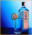
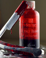
Sapphire Inspiredby timwest167Comment: I wish the label were turned into the photo instead of out of it. Drawing the eye into the image instead of on to the next page in the magazine this advertisement would be placed in. The lighting is superb. |
 Photographer found comment helpful. Photographer found comment helpful. |
| 02/07/2008 10:07:41 AM |
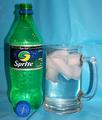
Sprite!by jere2201Comment: The blue background does not compliment the product. Perhaps a different color background and place the product further away... or decrease the DOF, so the creases are not so sharply seen in the blue material. The drink does not have the freshly-poured look of Sprite with carbonation bubbles... Just suggestions for making this a better 'advertisement'. And only my opinion, of course. |
| Photographer found comment helpful. |
| 02/07/2008 10:05:05 AM |
|
| 02/07/2008 10:04:06 AM |
|
| Photographer found comment helpful. |
| 02/07/2008 10:03:28 AM |
Body and Mindby MimPhotoComment: The blown highlights on the name of the product's name make this not so 'advertismenty'. |
| 02/07/2008 10:02:18 AM |
|
| Photographer found comment helpful. |
| 02/06/2008 08:49:00 PM |
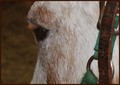
Pony Daydreamsby Donna21Comment: The tack distracts and steals the show as the focus for this one, in my opinion. |
| Photographer found comment helpful. |
| 02/06/2008 08:47:56 PM |
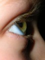
Delicate as a flowerby adukaComment: Well shot, but the unnaturalness of having a rose on her cheek puts me off a bit. I think if it were moved away from her eye a tad pit more, so the viewer doesn't feel like there's something in her eye and it's gotta bother her. You know? |
| Photographer found comment helpful. |
| 02/06/2008 08:47:24 PM |
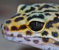
Serpent Eyesby golfercaz85Comment: There's no room for this guy to 'move' in the photo... some space on the left would have made this more pleasing, in my opinion. |
| 02/06/2008 08:46:55 PM |
|
Home -
Challenges -
Community -
League -
Photos -
Cameras -
Lenses -
Learn -
Help -
Terms of Use -
Privacy -
Top ^
DPChallenge, and website content and design, Copyright © 2001-2026 Challenging Technologies, LLC.
All digital photo copyrights belong to the photographers and may not be used without permission.
Current Server Time: 06/19/2026 08:50:50 AM EDT.