| Image |
Comment |
| 02/07/2008 10:31:07 AM |
|
| 02/07/2008 10:30:28 AM |
Fastest in it's classby bibuComment: Good idea for the ad... but the logo should be better lit, IMHO, to make sure the buyer sees which one is the leader. |
 Photographer found comment helpful. Photographer found comment helpful. |
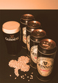
| 02/07/2008 10:29:55 AM |
Chucksby ctComment: The product should be more well lit, I think... and perhaps not shot from the underside to sell them... Just my opinion. |
| Photographer found comment helpful. |
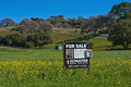
| 02/07/2008 10:29:17 AM |
For Saleby bobgaitherComment: I can't read the sign very well, if I wanted to buy your product... it should be more in focus, in my opinion. |
| Photographer found comment helpful. |
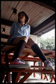
| 02/07/2008 10:28:19 AM |
Chillinby David1411Comment: The product could be more brightly lit (or the whole photo since this is Basic Editing) to draw more attention to the product. It blends in too much now, IMHO. |
| Photographer found comment helpful. |
| 02/07/2008 10:26:49 AM |
|
| Photographer found comment helpful. |
| 02/07/2008 10:26:22 AM |
Stella Artoisby vladoComment: The ratio of label to the rest of the photo is too little in my opinion. |
| Photographer found comment helpful. |
| 02/07/2008 10:25:51 AM |
|
| Photographer found comment helpful. |
| 02/07/2008 10:24:59 AM |
|
| Photographer found comment helpful. |
| 02/07/2008 10:24:21 AM |
|
| Photographer found comment helpful. |
Home -
Challenges -
Community -
League -
Photos -
Cameras -
Lenses -
Learn -
Help -
Terms of Use -
Privacy -
Top ^
DPChallenge, and website content and design, Copyright © 2001-2026 Challenging Technologies, LLC.
All digital photo copyrights belong to the photographers and may not be used without permission.
Current Server Time: 06/19/2026 11:52:59 AM EDT.