| Image |
Comment |
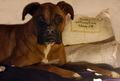
| 02/25/2008 09:30:04 AM |
Spoiledby geoComment: The pillow being so lighted, competes with the dark dog. Cute dog. |
 Photographer found comment helpful. Photographer found comment helpful. |
| 02/25/2008 09:29:40 AM |
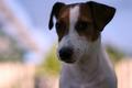
Stellaby Rino63Comment: Too close for a portrait, I think. I'd want more of my face (and my ears) if I were getting a portrait of myself. |
| Photographer found comment helpful. |
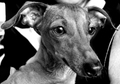
| 02/25/2008 09:29:03 AM |
|
| Photographer found comment helpful. |
| 02/25/2008 09:28:34 AM |
Ginoby RetroesqueComment: background is a bit busy for a portrait, in my opinion |
| Photographer found comment helpful. |
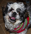
| 02/25/2008 09:28:16 AM |
Please take me home.by DeniseComment: The colorful outfit competes with the face... especially since the eyes are not seen clearly. |
| Photographer found comment helpful. |
| 02/25/2008 09:26:38 AM |
Topperby MCCullenComment: Odd tilt to the photo, I think... and it doesn't appear to be a pet portrait since there's so much in the photo other than the pet. |
| 02/25/2008 09:25:49 AM |
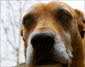
Kiskaby Bruce_the_RobertComment: The nose needs to be sharply focused (and eyes) for this 'in your face' shot to work, in my opinion. |
| Photographer found comment helpful. |
| 02/25/2008 09:25:14 AM |
Mangoby mangoComment: The adorable face is too shadowed for me. |
| Photographer found comment helpful. |
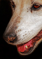
| 02/25/2008 09:24:59 AM |
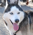
Bright Eyesby ZwieselDaveComment: Since nothing's really sharply focused, my eye goes to the tongue as the subject. |
| Photographer found comment helpful. |
| 02/25/2008 09:24:06 AM |
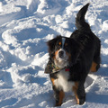
Jettby dogzComment: Snow photos are hard... the shadows here (especially on the face) make this less appealing for me. Cute dog. |
| Photographer found comment helpful. |
Home -
Challenges -
Community -
League -
Photos -
Cameras -
Lenses -
Learn -
Help -
Terms of Use -
Privacy -
Top ^
DPChallenge, and website content and design, Copyright © 2001-2026 Challenging Technologies, LLC.
All digital photo copyrights belong to the photographers and may not be used without permission.
Current Server Time: 06/20/2026 06:41:21 AM EDT.