| Image |
Comment |
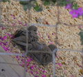
| 08/27/2009 10:02:46 AM |
Friendly Flyerby libertyComment: A bit over neatened... but still it's a 7. Would have been an 8, though.
ETA: Looking again at this, I think it's not really the smoothness, that's kinda cool in a way... it's the extra stem being so in focus that detracts. I know that's impossible to control, but it does affect the photo.
The colors are wonderful. |
 Photographer found comment helpful. Photographer found comment helpful. |
| 08/26/2009 08:50:25 PM |
|
| Photographer found comment helpful. |
| 08/26/2009 08:49:35 PM |
|
| 08/26/2009 08:48:59 PM |
American Eagleby sfmorrisComment: I think to be 'thirdy' the eye should be on one of the thirds intersections. Also, it seems a bit dark to me. |
| Photographer found comment helpful. |
| 08/26/2009 08:48:12 PM |
|
| Photographer found comment helpful. |
| 08/26/2009 08:47:40 PM |
the windowby frazel_photoComment: It's perfectly "thirdy", but not such a great image, in my opinion. It's grainy and lacks 'oomph' of contrast and color, I fear. Still a 6 for meeting the challenge 'head on'. *grin* |
| 08/26/2009 08:44:59 PM |
|
| Photographer found comment helpful. |
| 08/26/2009 08:44:45 PM |
daddyby bladComment: Wow! He has long legs. *grin*
7 from me... it's just really pleasing to the eye... and perfectly on the thirds. |
| Photographer found comment helpful. |
| 08/26/2009 08:39:16 PM |
|
| Photographer found comment helpful. |
| 08/26/2009 08:38:24 PM |
The Star of Parisby ShadowfaxComment: I'm lovin' that upper horizontal third on the light... but the centered subject really ruins the thirds for me. If you'd cropped it off left or right to put the tower on a vertical third this would be an 8 for me. As is, it's a 6. |
Home -
Challenges -
Community -
League -
Photos -
Cameras -
Lenses -
Learn -
Help -
Terms of Use -
Privacy -
Top ^
DPChallenge, and website content and design, Copyright © 2001-2026 Challenging Technologies, LLC.
All digital photo copyrights belong to the photographers and may not be used without permission.
Current Server Time: 06/21/2026 01:36:43 PM EDT.