| Image |
Comment |
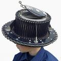
| 08/27/2003 06:35:15 PM |
Head measuring toolby fanfuineComment: Fun, quirky shot... not every day I see a head measuring tool. I like the way your background is burnt out. The lighting on the face doesn't seem quite right, maybe just a tad too much in shadow. 8 |
 Photographer found comment helpful. Photographer found comment helpful. |
| 08/27/2003 06:33:29 PM |
Twice Daily by K-RobComment: Great colours, lighting and texture. You're always on to a winner at DPC if you play around with water! The composition is a bit too centred for my taste. I love the graduated background. 8 |
| Photographer found comment helpful. |
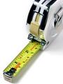
| 08/27/2003 09:35:31 AM |
Tape Measureby JMSComment: Nicely lit, you managed to avoid any flare. Nice use of negative space. Good dof. Technically well done, but not enough to draw my personal interest to lift this above an 8. Score: 8 |
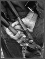
| 08/27/2003 09:33:52 AM |
Used tools by jjbeguinComment: Great character shot, very effective in b&w. Interesting composition. Good use of contrast. Very sharp. 9 |
| Photographer found comment helpful. |
| 08/27/2003 09:32:51 AM |
Stainless by willemComment: My favourite this challenge and only 10. The lighting is very impressive, no glare to be found anywhere, well done! Pleasing composition and cropping. Great overall tint and range of tones. Good professional shot! |
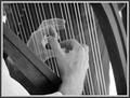
| 08/27/2003 08:30:49 AM |
Tools Of The Tradeby Silent SisterComment: Don't see male harpists that often! Nice shot, black and white effective here. I find the hair a bit distracting on the left though. I'd have liked more dof, or substancially less. Nice composition. 7 |
| Photographer found comment helpful. |
| 08/26/2003 06:35:33 PM |
Traktor.jpgby JohannesFrankComment: Superb! Stunning composition. I look forward to seeing more of your pictures in the challenges! |
| Photographer found comment helpful. |
| 08/26/2003 09:42:46 AM |
Monument To Technologyby jodiecostonComment: Not sure what we're looking at here, or if it qualifies as a monument to me. Subject needs to stand out more from the background. The background elements at the bottom don't add to the picture. Looks a bit too much like a snapshot, hard to see any effective composition here. 3 |
| 08/26/2003 09:41:06 AM |
By Any Other Nameby sherComment: Difficult to make out what we're seeing here. I presume there must be a rose involved, judging by your title. Highlights are burnt out. Picture seems very noisy. Why are there toes on the left? Very baffling shot... 3 |
| 08/26/2003 09:39:36 AM |
Indian Warsby falveyComment: I'm afraid this picture leaves me very little to coneect with... who was George Rowland? What Indian wars? Do you need to be American to understand the significance? Not enough sharpness, and the stone is burnt out. The grass showing above the horizon looks haphazard, and distracts the eye. Lighting is not very effective. 2 |
Home -
Challenges -
Community -
League -
Photos -
Cameras -
Lenses -
Learn -
Help -
Terms of Use -
Privacy -
Top ^
DPChallenge, and website content and design, Copyright © 2001-2026 Challenging Technologies, LLC.
All digital photo copyrights belong to the photographers and may not be used without permission.
Current Server Time: 07/24/2026 03:39:37 AM EDT.