| Image |
Comment |
| 09/12/2003 04:46:08 AM |
|
| 09/12/2003 04:39:31 AM |
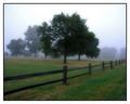
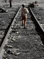
When trains ran on time ...by tonywComment: Why the selective desaturation? I can't understand what it's trying to achieve. Nice composition though, the foreground light works well. 6 |
| 09/12/2003 04:35:34 AM |
|
 Photographer found comment helpful. Photographer found comment helpful. |
| 09/12/2003 04:34:37 AM |
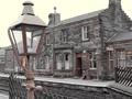
glowby IRELAND69Comment: Picture is far too small, and I don't know how this is supposed to take me back in time. 2 |
| 09/12/2003 04:34:04 AM |
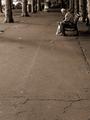
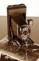
The Good'ole Daysby SonifoComment: Normally I can't stand these borders, but it is appropriate here and works well. Very nice sepia toning, a little different to the usual kind but very effective. Lovely textures, the tree is particularly nice. The tyres are a nice touch. Great composition. Gorgeous lighting and exposure. 8 |
| Photographer found comment helpful. |
| 09/12/2003 04:27:42 AM |
|
| 09/12/2003 04:20:32 AM |
Let-her (Letter)by zerocusaComment: Very amusing. Bed wetting was a nice touch!
Nicely lit. Composition is unusual, but effective. 7 |
| 09/12/2003 04:19:03 AM |
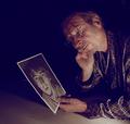
His first self portrait...in 1964 or so.by fanfuineComment: It doesn't look as if the subject is looking at the photo, it's too tilted. A real shame about the ugly shadows from the glasses frames. I think I'd have liked a much tighter crop, and following the top-left to bottom-right diagonal so he is looking down to the right. The first self portrait is great! I would have knocked out a lot of the extreme shadows in PS to make the background appear black. 6 |
| Photographer found comment helpful. |
| 09/12/2003 04:06:52 AM |
Remember...Running Awayby DoorskidderComment: Lovely idea, but for this to take me back, I think I'd need to see it from the child's point of view which is difficult from this overbearing vantage point. I'd have been tempted to get to his height or lower. The selective desaturation leaves me puzzled... I can't see what it's trying to achieve. I'd have prefered complete b&w. The composition is a little odd... are his feet in the centre of the frame because that's where you want my eye to focus first? I naturally want to look at his head first which is right at the top of the frame. IMO, the eye is more comfortable if the focal point is in the centre 3rd. 6 Message edited by author 2003-09-17 09:48:46. |
| 09/12/2003 04:02:06 AM |
No.1 Pocket Kodakby dan_pendletonComment: I don't like the way your background horizon cuts through the camera. The placement of the photo doesn't quite work for me either. The camera is too centred in the frame for my taste. Could do with some sharpening. Nice sepia toning though. 6 |
Home -
Challenges -
Community -
League -
Photos -
Cameras -
Lenses -
Learn -
Help -
Terms of Use -
Privacy -
Top ^
DPChallenge, and website content and design, Copyright © 2001-2026 Challenging Technologies, LLC.
All digital photo copyrights belong to the photographers and may not be used without permission.
Current Server Time: 07/24/2026 07:33:53 PM EDT.