| Image |
Comment |
| 09/29/2003 06:24:38 AM |
|
| 09/29/2003 06:22:48 AM |
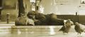
nap timeby La-LunaComment: Wonderful photo, I really wish that the crop was tighter though, I can't see the point of including anything left of his bag. Possibly a little over-NeatImaged. The pigeons are a really great touch. Shame about the levels of glare. 7 |
 Photographer found comment helpful. Photographer found comment helpful. |
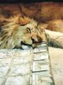
| 09/29/2003 06:19:34 AM |
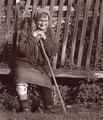
Krestyankaby kiwinessComment: Great shot, not sure about the sepia toning though, I think I'd have prefered normal b&w.
I'd have also prefered the gamma a bit darker. 7 |
| Photographer found comment helpful. |
| 09/29/2003 06:06:44 AM |
|
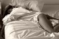
| 09/29/2003 05:46:30 AM |
Afternoon Napby studio1graphicsComment: Shame you didn't expose for the highlights and then adjust in Photoshop, as you've got unfortunate burnt out highlights here. Great light, interesting composition. Very attractive model! A very effective intimate portrait. 7
Edit: Another shot where I'm mystified that my comment is one of the few not marked as helpful. Message edited by author 2003-10-07 09:45:29. |
| 09/29/2003 05:44:23 AM |
|
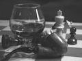
| 09/29/2003 05:42:47 AM |
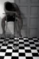
Game Overby jfaulknerComment: Photo could definitely do with more tonal contrast. Composition feels very chaotic to me. The pipe, glass and foreground chess pieces all seem to blend into each other, which lessens the impact of the shot. More could have been made of the refraction in the glass. Background needs to be more black. You need to find a way of avoiding the glare on the glass and pipe. Nice idea though... 5 |
| Photographer found comment helpful. |
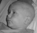
| 09/29/2003 05:38:21 AM |
Waiting For A Cureby SiousxiequeComment: Subject is blurred, and the shadow caused by the flash detracts heavily from the shot. Perhaps I'm being picky, but I don't get a feeling of calm from this shot. There is a distracing object at the top of the subject's head. 3
ps, hope he gets better... |
| 09/27/2003 10:59:11 AM |
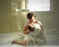
Lullabyby tcherringComment: A beautiful picture, lovely atmosphere has been captured. It's a shame about the burnt out highlights on the mother's face and the shawl. This is acceptable from the window, but not from the subject of the photo!
I can't help but feel that the composition isn't quite right. I'd have liked the subject definitely not centred, and there seems to be too much negative space relative to the subject. It implies that the photographer thinks that the viewer's eye should spend plenty of time taking in the background, but there's not enough interest there to warrant that. 7 |
| Photographer found comment helpful. |
| 09/27/2003 10:53:58 AM |
after reading...by imagesloyolaComment: A curious use of soft-focus. The feeling from this shot is that the creator wanted an 'art' feel to the shot, but other than that I'm not really sure what the intent was. Why is the man naked? How did he fall asleep on such an uncomfortable chair? Why is he on such an unstable chair? Is this important? Is it significant that he is blocking the door? What is the book? Is it really hot? The photo is a fantastic study in light and composition... I love the shapes here and how they all fit together, but ultimately this picture leaves me with more questions than answers. And I'm not sure if this is really what the photographer wanted. 8 |
Home -
Challenges -
Community -
League -
Photos -
Cameras -
Lenses -
Learn -
Help -
Terms of Use -
Privacy -
Top ^
DPChallenge, and website content and design, Copyright © 2001-2026 Challenging Technologies, LLC.
All digital photo copyrights belong to the photographers and may not be used without permission.
Current Server Time: 07/25/2026 12:42:38 PM EDT.