| Image |
Comment |
| 03/25/2004 05:41:41 PM |
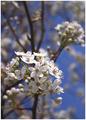
Our State - North Carolinaby MJENNIComment: Nice composition, although I would have been tempted to flip it horizontaly... I prefer the top-left to bottom-right diagonal. Great colours, and nice use of limited DOF. Personally I think there's just a little too much going on in the foreground... the composition would work better if there was more overall simplicity in the white elements. |
 Photographer found comment helpful. Photographer found comment helpful. |
| 03/25/2004 05:38:18 PM |
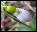
Your Gardenby MonaComment: Very nice shot, good use of top-left to bottom-right diagonal. Very effective use of limited depth of field. However, the shot is very noisy, I would have cleaned this up with NeatImage. IMO the flower needs much more sharpening in PS. I think your thick black border detracts from your photo. Your camera needs a bit of help in PS with colours and saturation... the colours seem a bit dull and lifeless. |
| Photographer found comment helpful. |
| 03/24/2004 10:40:06 AM |
Backstage Magazineby rhipsterComment: Nice shot, I like the motion blur. Shame you can see the background, it would have worked a lot better if the background was completely black. I would also have liked to see more of the acrobat's face. |
| Photographer found comment helpful. |
| 03/24/2004 10:37:19 AM |
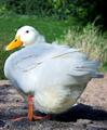
WaterFowlby faidoiComment: Very cute... a little overexposed though, especially on his face where you have blown-out highlights. The rest of him could do with darkening so you can see more of the textures in the feathers. The whiteish foliage to his right in the background detracts a little, and the shadow detracts a lot. I think negative space is always needed in the direction that a person or animal is looking into. Here, you need more negative space to the left of the shot to give him room to look into. |
| Photographer found comment helpful. |
| 03/24/2004 10:33:20 AM |
Weddings and Honeymoons (or Second Honeymoons)by TranquilComment: Shot seems to much like a snapshot. Too overexposed. The composition is not effective, it looks like the photographer wanted more of the gondola in the shot and misfired. The gondolier's face is obscured by his arm. The couple in the gondola are not interesting and look bored. The background does not look like it has been thought about. |
| Photographer found comment helpful. |
| 03/24/2004 10:30:13 AM |
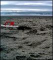
Travel and Leisureby lizzyc3Comment: Very interesting composition, which invites the viewer to reflect on it for a while. Subtle and imaginative use of blue and red. Not sure what happened to your foreground texture though, it doesn't look good up close. Is this as a result of butchery by NeatImage? Maybe too much contrast? I would say that the overall mood, although very effective, is too drab and bleak for a tourism magazine. |
| Photographer found comment helpful. |
| 03/24/2004 10:25:44 AM |
Los Angeles Times Magazineby qmdiComment: Photo seems okay, but doesn't really grab me. A couple of things bother me... you need more depth of field, the signs in the background are blurred. And the vertical writing in the left of the frame distracts me as it looks like it has been unintentionally chopped in half. The arrows in your shot could have been used as a composition device to lead the eye to something of interest, but that doesn't really happen here. |
| 03/24/2004 10:22:13 AM |
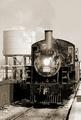
Classic Trainsby TerryGeeComment: Nice shot, great composition for a magazine cover. However, there seems to be too much detail in the shot, I would prefer more simplicity... there's just too much for the eye to look at which leads the eye away from your train. The light seems a little harsh, and it's unfortunate that shadows obscure a lot of the detail at the front of the train. |
| 03/24/2004 10:17:13 AM |
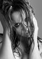
Photo by DrJOnesComment: Wow, a stunning shot. Excellent model, great attitude. Very effective in b&w. Composition is excellent, I love the tilt of the head and the placement of the hands. Great use of water. The hair looks fantastic. Imaginative and effective crop. Only criticism is that in my opinion it is a little overexposed. This may have been intentional, but the effect doesn't quite work for me. |
| Photographer found comment helpful. |
| 03/24/2004 10:14:00 AM |
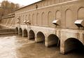
HYDRO REVIEWby fisheyeComment: Nice level of detail in the foreground, but I think you needed greater depth of field. The foreground water seems a bit overexposed... if you haven't already I would decrease the contrast levels in your camera so you can capture a greater dynamic range and increase the contrast back in Photoshop. The composition seems to lead the eye out of the shot, which is not a good thing here. The eye should be led to a point somewhere in the picture, preferably at one of the thirds junctions. Not quite sure why you went for a sepia look here. The trees in the background take away from your composition. Not sure what you wanted to achieve here in general. |
| Photographer found comment helpful. |
Home -
Challenges -
Community -
League -
Photos -
Cameras -
Lenses -
Learn -
Help -
Terms of Use -
Privacy -
Top ^
DPChallenge, and website content and design, Copyright © 2001-2026 Challenging Technologies, LLC.
All digital photo copyrights belong to the photographers and may not be used without permission.
Current Server Time: 07/26/2026 08:57:23 PM EDT.