| Image |
Comment |
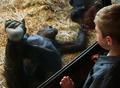
| 04/14/2004 10:56:55 AM |
Me need band-aidby cabaComment: Nice shot, but looks a little too much like a snapshot. Because the boy is the only element in shap focus, it is confusing as to what the main point of focus here is. As you are presumably trying to get the viewer's eye to settle on the chimp's(?) hand, I would have taken the shot from behind the boy to make it clearer what we are supposed to look at. |
 Photographer found comment helpful. Photographer found comment helpful. |
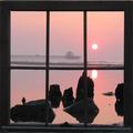
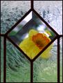
| 04/14/2004 10:53:58 AM |
Sunday Sunrise by UNCLEBROComment: Wow, very nice! I can't see why this photo shouldn't do very well in this challenge. Great colours, nice soft silhouettes. I like the reflection of the sun. You really should have tidied up that rogue top pixel in your crop which looks accidental to me. As this is an advanced challenge, I'd have used the distort/perspective command in Photoshop to make the windowframe completely square, and then perhaps cropped tighter. |
| Photographer found comment helpful. |
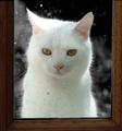
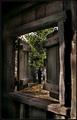
| 04/14/2004 10:50:15 AM |
Also in Whiteby ClarneyComment: Absolutely gorgeous. As this is an advanced challenge, I would have used the perspective tool in Photoshop to make the window frame completely parallel to the edge of the photo. Lovely backlighting on the fur and the drops add compositional interest and texture. It's a shame that the windowframe isn't more squre so that we can see the top of it in the photo. |
| Photographer found comment helpful. |
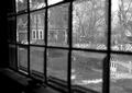
| 04/14/2004 10:47:33 AM |
Plantationby RefocusedComment: Not a very inspiring view, and the extreme range of tones in the shot means that the view out of the window is washed out and lacking in detail. There is no clear point of focus for the eye to settle on, and I think this is my main problem with this shot. |
| Photographer found comment helpful. |
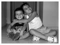
| 04/14/2004 10:44:40 AM |
Laura & Alejandro Portrait.by jealbornComment: Critique Club:
I'm glad I got this picture, I gave it a relatively high score and was surprised it finished so low.
It's a wonderful portrait and captures great expessions. Black and white works very well here. Perhaps the voters were put off by a few technical failings... there is some kind of vase growing out of your niece's head and the photo needs straightening. You did well not to blow out too many highlights given the range of tones here. Another member of DPC mentioned in a forum post that when you take portraits of children, you should aim not to show the soles of the feet and perhaps you could have repositioned the feet. However, this is really nitpicking as I love the overall feel of the shot. Perhaps a little more sharpness would have been nice. |
| 04/14/2004 07:05:41 AM |
Through a Beveled Windowby MarjoComment: Interesting idea, some interesting composition and textures. Overall the picture is not sharp enough, the textured glass is very blurry and the large amounts of glare on the right side of the frame is very offputting. The bevelled part of the shot works very well. |
| Photographer found comment helpful. |
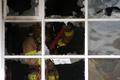
| 04/14/2004 07:03:10 AM |
Ventilationby willtataComment: Interesting idea, but the fireman has been caught in just the wrong position. I'd have liked to be able to focus on his face/mask or the sledgehammer. These are both currently obscured. Catching him at the point where the glass was breaking would really transform the picture. I'm not sure you exposed for the fireman, and I think this would also have helped. |
| Photographer found comment helpful. |
| 04/14/2004 07:00:47 AM |
The Shining Crescentby tyt2000Comment: Nice shot, well composed. I wish the conical thing below the crescent was more centred though. Great exposure, especially the trees. This is what makes the shot so striking for me. I would have liked more sharpness, maybe with soft focus added after having sharpened. |
| Photographer found comment helpful. |
| 04/14/2004 06:57:59 AM |
through beveled glassby muckpondComment: Not quite sure what you wanted to achieve here, the view seems compositionally very messy and uninteresting. It's almost an interesting study of light and shadow, outside and inside but the composition doesn't pull this off. There are too many burnt out highlights. A clear point of focus is what the photo really needs. |
| 04/14/2004 06:55:10 AM |
Walking in the woods by heidaComment: Interesting shot, nice range of tones. I wish the figure's silhouette was clearer. I like the subtle colours, maybe black and white would have been even more effective? I like the way the picture draws me in and makes me ask what is happening. |
| Photographer found comment helpful. |
Home -
Challenges -
Community -
League -
Photos -
Cameras -
Lenses -
Learn -
Help -
Terms of Use -
Privacy -
Top ^
DPChallenge, and website content and design, Copyright © 2001-2026 Challenging Technologies, LLC.
All digital photo copyrights belong to the photographers and may not be used without permission.
Current Server Time: 07/27/2026 11:05:22 AM EDT.