| Image |
Comment |
| 10/03/2004 06:45:53 AM |
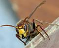
The Hornetby rhipsterComment: Spectacular macro... the background doesn't quite work for me, it's too distracting especially as the change of colour cuts the hornet in half. Amazingly sharp, very deep dof for a macro such as this. It looks like you selectively blurred the foreground, and it looks a bit odd. 7 |
 Photographer found comment helpful. Photographer found comment helpful. |
| 10/03/2004 06:45:49 AM |
Parrot Portraitureby buzzrockComment: I'm a sucker for parrot portraits, and this one's a cracker(!). The feathers aren't quite as defined as I've seen on other shots here, and it seems ever so slightly overexposed but the main thing that would have improved this in my eyes would have been to have nothing behind his beak. Above and to the right of his eye looks very blurred... did something go wrong in PS? 7 |
| Photographer found comment helpful. |
| 10/03/2004 06:45:44 AM |
Up and over... and in?by arnitComment: Great capture, not really sure what's happening here though. There's a really distracting diagonal grey element in your background which doesn't help. Incredibly sharp shot. Well exposed, great colours. 7 |
| 10/03/2004 06:45:39 AM |
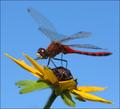
Red Dragonby JackoComment: Wow. Great composition, well timed capture. I normally don't mind limited dof in a macro, but here I would have liked much more, especially on the wings. The greens could have used a bit of PS work, not quite vibrant enough here for my taste. The focus is slightly out... the eyes should be tack sharp, instead only a portion of some wings is really sharp. Not an easy shot though. 7 |
| Photographer found comment helpful. |
| 10/03/2004 06:45:34 AM |
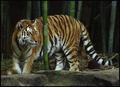
Prowlin'by karmatComment: Wonderful shot, the head is nice and sharp. Shame the dof couldn't include the reast of the body. I love the bamboo. I'd definitely have gone for a tighter crop... the head is too far to the left for my taste in this shot. The foreground concrete thing really needs to go as well, it shouts 'zoo'! The perfect shot for me would have been a longer lens, with the head, upper legs and bamboo in portrait orientation. 7 |
| Photographer found comment helpful. |
| 10/03/2004 06:45:30 AM |
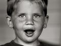
Ethan, Dirty Face and Allby smellyfish1002Comment: Wonderful portrait, the limited dof works well here. Superb expression, lots of detail. Great eyes. The composition lets it down for me though. Is it trying to be centered, or off centre? This looks in-between like the photographer couldn't make up their mind as to where to place him in the frame. I'd have cropped closer and lost more of the forehead. 7 |
| Photographer found comment helpful. |
| 10/03/2004 06:45:24 AM |
Shadowboxerby scalvertComment: Great idea, you seem to have gone to a lot of effort for this one! I think I'd have liked more sharpness here, especially your model's face. By your shallow dof, you intended the pof to be on the shadow, but my eye rests on the boxer first... so I would have increased the dof. 7 |
| Photographer found comment helpful. |
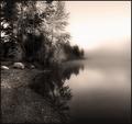
| 10/03/2004 06:45:16 AM |
Misty Morningby jodiecostonComment: Wonderful shot, but the foreground is too oversharpened for my taste. I feel this has taken away from the power of the shot. Great composition. I'm not quite sure about the colours chosen for your duotone... I think some different tones could really have maximised the impact of this photo. 7 |
| Photographer found comment helpful. |
| 10/03/2004 06:45:11 AM |
The Blue Windowby aKiwiComment: Great Mediterrenean colours, reminds me of Andalucia. Nice and sharp. Good composition. Not quite enough to keep me captivated though. 7 |
| Photographer found comment helpful. |
| 10/03/2004 06:45:06 AM |
A Study in Colorby HRoxasComment: Wow, very striking. I love the blue and red, the green could do with being a bit more vibrant. The thing that really puts me off is the glare... could you have sorted this with a polariser? Wonderful composition. 7 |
| Photographer found comment helpful. |
Home -
Challenges -
Community -
League -
Photos -
Cameras -
Lenses -
Learn -
Help -
Terms of Use -
Privacy -
Top ^
DPChallenge, and website content and design, Copyright © 2001-2026 Challenging Technologies, LLC.
All digital photo copyrights belong to the photographers and may not be used without permission.
Current Server Time: 06/11/2026 01:09:23 AM EDT.