| Image |
Comment |
| 11/15/2004 11:04:17 AM |
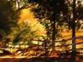
Country Sunrise by BradComment: Looks very much like a texture filter from PS, which I really don't care for here. I'm sure your photo didn't need this gimmick, and would have been much better complemented by Gaussian Blur, or similar for this challenge. Besides, this filter looks more like an oil painting than an impressionist watercolour. Do PM me if I'm wrong. 1 |
 Photographer found comment helpful. Photographer found comment helpful. |
| 11/15/2004 11:04:04 AM |
Say it With Flowersby librodoComment: I very much don't care for this filter, which makes the photo look like graphic design, and in no way gives an impressionist feel to the shot. 1 |
| Photographer found comment helpful. |
| 11/15/2004 11:03:50 AM |
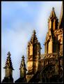
Church Spiresby KonadorComment: Looks like a PS filter... I don't like the effect on this shot and don't think it looks particularly impressionist. 2 |
| Photographer found comment helpful. |
| 11/15/2004 11:03:44 AM |
Windmillby marboComment: Don't care for the overuse of a PS filter, which looks like the dust & scratches filter, or median blur filter. I'll bet this was a gorgeous photo before the PP. 2 |
| Photographer found comment helpful. |
| 11/15/2004 11:03:36 AM |
The Deliveryby RefocusedComment: Looks very much like a Photoshop watercolour filter effect, which I don't really care for here. I'm not very keen on your choice of subject matter for this challenge, which seems a bit mundane. 3 |
| 11/15/2004 11:03:27 AM |
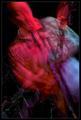
Still LIfe With Pearsby dsidwellComment: Doesn't really strike me as impressionistic... I don't like the quality of noise in the reds. Nice mood here though. 4 |
| Photographer found comment helpful. |
| 11/15/2004 11:03:18 AM |
The Artist by scalvertComment: Interesting take on challenge, but really goes against the spirit of trying to create the impressionist feel in the camera IMO. Nothing technically to fault about this photo. 4 |
| Photographer found comment helpful. |
| 11/15/2004 11:03:14 AM |
Downy Fieldby dsa157Comment: Not sure the white sky complements this shot. However, the subject matter is good for an impressionist challenge but the picture misses that wow factor IMO. 4 |
| Photographer found comment helpful. |
| 11/15/2004 11:03:08 AM |
Sunshine Of Your Loveby jmsetzlerComment: Reminds me of Setzler's pic that he became very attached to despite (or maybe because of) it's poor placement in a challenge. This technique used in this context doesn't really say a lot to me, and looks a bit gimmicky. It doesn't come across to me as impressionistic... I don't feel a mood created by the use of this technique. 4 |
| 11/15/2004 11:03:02 AM |
Colorsby crabappl3Comment: The flag and everything else in the reflection is not really clear enough, and I don't think reflections work too well when too much plain white/grey is in the composition. 4 |
Home -
Challenges -
Community -
League -
Photos -
Cameras -
Lenses -
Learn -
Help -
Terms of Use -
Privacy -
Top ^
DPChallenge, and website content and design, Copyright © 2001-2026 Challenging Technologies, LLC.
All digital photo copyrights belong to the photographers and may not be used without permission.
Current Server Time: 06/10/2026 03:07:05 PM EDT.