| Image |
Comment |
| 05/29/2003 10:07:03 AM |
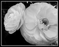
Queen of the gardenby pitsamanComment: Nice focus, clean, tidy, good contrast with the background. The flowers pop, as if they were glued to my monitor. |
 Photographer found comment helpful. Photographer found comment helpful. |
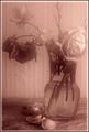
| 05/29/2003 10:06:35 AM |
wiltingby Pep VentosaComment: I know you did it on purpose, but the blur makes it look like there's a dirty window between me and the subject, and is distracting as hell. The lighting is very bright and harsh on the right and very dark on the left, without seeming to highlight where we're 'supposed to look' in any way. The only real focus of attention I can find is the fallen petals at the bottom or the shapes on the wall ... which I doubt is what you intended. |
| Photographer found comment helpful. |
| 05/29/2003 10:03:36 AM |
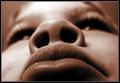
A Very Unusual Portraitby smellyfish1002Comment: I know it's what you intended, but the forced perspective and total blur on everything but the upper lip induces a bit of vertigo in me, as if I were leaning back and forth from the screen. Good concept, execution somewhat lacking. |
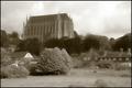
| 05/29/2003 10:02:40 AM |
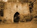
Castleby trishComment: A little more contrast/blackpoint might have helped the castle jump from the background a bit more strongly. This might have been a 9 or 10 ... but even as-is, definitely 7. |
| Photographer found comment helpful. |
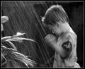
| 05/29/2003 10:01:59 AM |
Rain, Rain, Stay and Play!by christeyComment: The blurred arm distracts from the shot, especially since nothing in the frame is really *in* focus. The eye tries to fasten on the kid, but then slides off to the plants because of focus and lighting. A good 'almost' shot. If time and equipment permitted, I'd have shot lots of frames of the same session, and picked the one that worked out of twenty or so. |
| Photographer found comment helpful. |
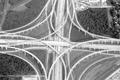
| 05/29/2003 10:00:48 AM |
Where Highways meetby jab119Comment: A tiny bit crisper focus here might have gotten a ten from me; as it is, it's still a fascinating subject, laid out to look almost like a cathedral rose window. |
| 05/29/2003 10:00:10 AM |
The source of all of the colour BROWNby MorganComment: The color is so saturated that it actually distracts from the image - it makes it harder to distinguish the subject from the background, because they all bleed together with no clear boundary. Focus and composition decent, though. |
| Photographer found comment helpful. |
| 05/29/2003 09:59:32 AM |
Lancing collageby marboComment: Hrm. I know the focus artifacts in this are probably on purpose, but I find them incredibly distracting. It draws the eye to the bush in front and drops it there (and I doubt the bush was your intended center of attention). 6, but coulda been 8. |
| Photographer found comment helpful. |
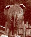
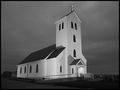
| 05/29/2003 09:58:47 AM |
Midnight Churchby tyrkinnComment: I like how the church is clean and flat-seeming, almost like it's made out of cardboard, against a gently cottony sky. Nice textures, especially played against each other. |
| Photographer found comment helpful. |
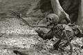
| 05/29/2003 09:58:01 AM |
Bone crushingly bad dayby YomiComment: Wow. I'll be looking to find out where this was shot, after the competition. :-> It looks like a museum diorama, sort of; if so, the lighting is amazingly good (usually museums are so harshly lit it's a bitch to photograph 'em). It's got personality, its composition is strong and uncluttered. Definitely 10. |
| Photographer found comment helpful. |
Home -
Challenges -
Community -
League -
Photos -
Cameras -
Lenses -
Learn -
Help -
Terms of Use -
Privacy -
Top ^
DPChallenge, and website content and design, Copyright © 2001-2026 Challenging Technologies, LLC.
All digital photo copyrights belong to the photographers and may not be used without permission.
Current Server Time: 07/27/2026 10:44:21 PM EDT.