|
|
|
Showing 201 - 210 of ~540 |
| Image |
Comment |
| 05/29/2003 03:59:48 PM | Italian cuisineby gceramiComment: 5. Fits the theme well enough, and there are no blatant 'you suck!' flaws to it, but neither does it really grab me for any reason at all. For reasons of composition, cropping, or subject choice, it's just a photo, and doesn't do especially much for me, aesthetically.
The focus is kind of scattershot. The two burner-prongs point your eye at the round bit, but then when you're there you can't really *see* it very well, which is kind of frustrating. None of the crumbs are focussed, though the tiny dropsplat of water lower-right is. |
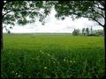
| 05/29/2003 03:58:53 PM | My own meadowby KINGComment: 5. Fits the theme well enough, and there are no blatant 'you suck!' flaws to it, but neither does it really grab me for any reason at all. For reasons of composition, cropping, or subject choice, it's just a photo, and doesn't do especially much for me, aesthetically.
Shot slightly differently, the same place and lighting might have given the flowers in front a starring role, or the trees on the horizon, or even the (fence? forest?) right at the horizon, or one of the trees to left or right. As it is, a flat expanse of grass is what the eye is most drawn to, and then there's nowhere else for it to go. |  Photographer found comment helpful. Photographer found comment helpful. |
| 05/29/2003 03:57:58 PM | tractorby kblmComment: 5. Fits the theme well enough, and there are no blatant 'you suck!' flaws to it, but neither does it really grab me for any reason at all. For reasons of composition, cropping, or subject choice, it's just a photo, and doesn't do especially much for me, aesthetically.
Nothing is lit or focussed to draw the eye, except maybe the puddle in front. The overall 'vaseline-on-the-lens' look encourages the overall feel of sameness, rather than pulling your attention where the photographer wants it. |
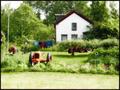
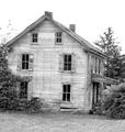
| 05/29/2003 03:57:07 PM | Homeby EJComment: 5. Fits the theme well enough, and there are no blatant 'you suck!' flaws to it, but neither does it really grab me for any reason at all. For reasons of composition, cropping, or subject choice, it's just a photo, and doesn't do especially much for me, aesthetically.
The lighting pulls the eye away from the door, but there's nothing in the well-lit parts to hold the eye either. | | Photographer found comment helpful. |
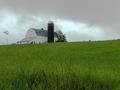
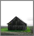
| 05/29/2003 03:56:39 PM | Home on the Rangeby mullany1957Comment: 5. Fits the theme well enough, and there are no blatant 'you suck!' flaws to it, but neither does it really grab me for any reason at all. For reasons of composition, cropping, or subject choice, it's just a photo, and doesn't do especially much for me, aesthetically.
The crop and focus almost makes the shot about the grass in the foreground, which is an odd choice. If the grass were more blurred and the building in better focus, that might make the building central. If the shot were aimed slightly more left (building at left edge, windmill near center and focussed sharp), likewise. Also, the overprocessed odd color of the sky's kind of distracting. |
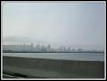
| 05/29/2003 03:55:34 PM | Montreal - My home sweet homeby RawkgurlComment: 5. Fits the theme well enough, and there are no blatant 'you suck!' flaws to it, but neither does it really grab me for any reason at all. For reasons of composition, cropping, or subject choice, it's just a photo, and doesn't do especially much for me, aesthetically.
If it weren't so grey and hazy, it might have more personality; if the buildings were bigger, or the sky more interesting, likewise. | | Photographer found comment helpful. |
| 05/29/2003 03:54:56 PM | Olympic Mts. Sunsetby kebbieComment: 5. Fits the theme well enough, and there are no blatant 'you suck!' flaws to it, but neither does it really grab me for any reason at all. For reasons of composition, cropping, or subject choice, it's just a photo, and doesn't do especially much for me, aesthetically.
The colors are very pretty, but there's just nothing for the picture to be about, no center of attention where the eye is drawn. |
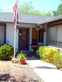
| 05/29/2003 03:54:30 PM | my dream homeby pookey83Comment: 5. Fits the theme well enough, and there are no blatant 'you suck!' flaws to it, but neither does it really grab me for any reason at all. For reasons of composition, cropping, or subject choice, it's just a photo, and doesn't do especially much for me, aesthetically.
The tilt to the house in particular is mildly disturbing (perhaps on purpose). I don't find the very-white-ness of the whole to be a detracting feature, interestingly. |
| 05/29/2003 03:53:42 PM | Home Sweet Home of Our Ancestorsby pncowleyComment: 5. Fits the theme well enough, and there are no blatant 'you suck!' flaws to it, but neither does it really grab me for any reason at all. For reasons of composition, cropping, or subject choice, it's just a photo, and doesn't do especially much for me, aesthetically. | | Photographer found comment helpful. |
| 05/29/2003 03:53:30 PM | No Huntingby mariomelComment: 5. Fits the theme well enough, and there are no blatant 'you suck!' flaws to it, but neither does it really grab me for any reason at all. For reasons of composition, cropping, or subject choice, it's just a photo, and doesn't do especially much for me, aesthetically.
They sky is so very white that it draws the eye, but then its featurelessness doesn't do anything with that attention. The house itself is so plain-dark (esp. in contrast to the sky and grass) that likewise, it doesn't hold the eye. |
|
Showing 201 - 210 of ~540 |
Home -
Challenges -
Community -
League -
Photos -
Cameras -
Lenses -
Learn -
Help -
Terms of Use -
Privacy -
Top ^
DPChallenge, and website content and design, Copyright © 2001-2026 Challenging Technologies, LLC.
All digital photo copyrights belong to the photographers and may not be used without permission.
Current Server Time: 07/28/2026 11:49:01 AM EDT.
|