| Author | Thread |
|
|
06/10/2003 09:51:30 AM |
Greetings from the Critique Club!
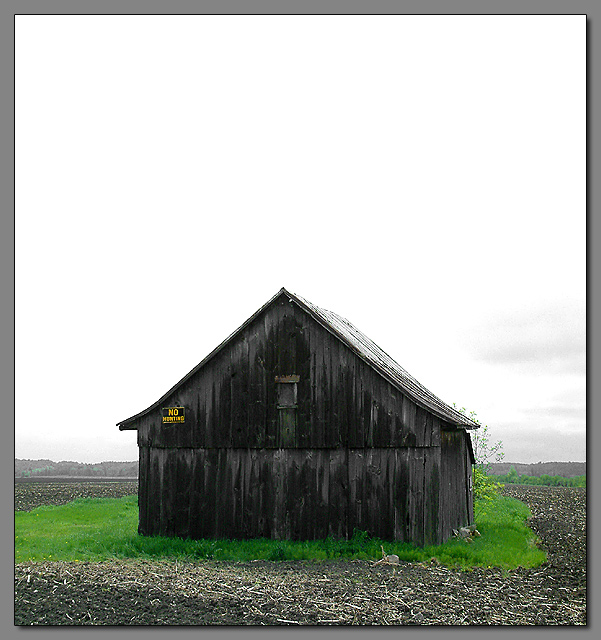
I love these old barns and homes with such character. This one is good.
On my monitor it's a little dark but I can still make out some detail.
The sky not having any color, is allotted too much of the composition, I think. Although it does contribute to the stark, and isolated feel. The vivid green patch stands out the most. I like it, but it almost seems as if THAT is the subject.
I look forward to seeing more of your work.
Regards,
Grayce |
|
|
|
06/04/2003 12:35:35 PM |
|
what!!.....this was my "photo of the week" |
|
Comments Made During the Challenge  |
|
|
06/03/2003 11:37:26 PM |
|
good use of negative space. Green looks a little bit oversaturated ? It's close though, I could be wrong. |
|
 Photographer found comment helpful. Photographer found comment helpful. |
|
|
06/03/2003 11:13:29 PM |
|
There's some humor in this picture, with the little green island in the middle of brown. |
|
| Photographer found comment helpful. |
|
|
06/03/2003 12:49:15 PM |
|
|
|
06/03/2003 12:29:12 PM |
|
the sky is too white here to be so much of the shot. I think composition would be improved if you cropped some of that out, or waited until the sky was more interesting. :) |
|
| Photographer found comment helpful. |
|
|
06/01/2003 10:09:00 PM |
|
Neat old building, like the contrasting color combination. Nice job. (border?) |
|
| Photographer found comment helpful. |
|
|
05/31/2003 04:32:10 PM |
|
Nice colors make this very cool photo... |
|
|
|
05/31/2003 07:48:17 AM |
|
Great image. Nicely done. Superior colours, lighting, composition, and textures all related to the challenge's theme. 8 Morgan |
|
| Photographer found comment helpful. |
|
|
05/30/2003 05:01:49 PM |
|
Nice - have you considered using a graduated density filter for the sky though? |
|
|
|
05/29/2003 03:53:30 PM |
5. Fits the theme well enough, and there are no blatant 'you suck!' flaws to it, but neither does it really grab me for any reason at all. For reasons of composition, cropping, or subject choice, it's just a photo, and doesn't do especially much for me, aesthetically.
They sky is so very white that it draws the eye, but then its featurelessness doesn't do anything with that attention. The house itself is so plain-dark (esp. in contrast to the sky and grass) that likewise, it doesn't hold the eye. |
|
|
|
05/28/2003 09:34:13 PM |
|
I think more subtle colours would work well here. Nice drop shadow border. |
|
|
|
05/28/2003 04:57:07 PM |
|
What a pity there weren't blue skies, imagine the contrast with those greens! But this is still a very good shot - 8. |
|
| Photographer found comment helpful. |
|
|
05/28/2003 02:26:17 PM |
|
Hmmmm... first impression is this is too boring. But then that becomes its draw.... I like what the square crop does for the image. The roof of the barn points up at that empty sky. Just wish that the patch of green grass was completely contained within the frame. Also, nice colors... green and yellow, and alternating shades of gray in the from the ligtest in the sky, alternating shades in the barn, and that light patch of sticks next to the darker mud.... NEATO! 8 |
|
| Photographer found comment helpful. |
|
|
05/28/2003 04:38:29 AM |
|
nice work on desaturating the colours from the original image, I'm still trying to master this! (how about a tutorial?) but the "sky" lacks meaning for being so big. |
|
| Photographer found comment helpful. |
|
|
05/28/2003 02:34:42 AM |
Love the name of this pic. :)
Honestly, I would have cropped more off the top though. |
|
| Photographer found comment helpful. |
|
|
05/28/2003 01:48:41 AM |
|
I like what you did with the color, it's very intriguing. I would have placed the house just a bit more off center and lost the gray border. Nice shot. |
|
| Photographer found comment helpful. |
|
|
05/28/2003 12:58:13 AM |
|
Very good, but I think you included a little too much sky at the top - don't crop it all off, but a bit less. 8. |
|
| Photographer found comment helpful. |
Home -
Challenges -
Community -
League -
Photos -
Cameras -
Lenses -
Learn -
Help -
Terms of Use -
Privacy -
Top ^
DPChallenge, and website content and design, Copyright © 2001-2026 Challenging Technologies, LLC.
All digital photo copyrights belong to the photographers and may not be used without permission.
Current Server Time: 06/28/2026 04:53:56 PM EDT.