| Image |
Comment |
| 11/07/2008 07:26:31 PM |
|
 Photographer found comment helpful. Photographer found comment helpful. |
| 11/07/2008 07:25:56 PM |
untitledby whiterookComment: I see an awful lot of artifacting in this image. The file size itself it normal, but the image itself looks like it was either oversharpened or saved with excessive compression at some previous point. |
| 11/07/2008 07:23:19 PM |
Flightby sugatenaComment: Catching this bird may have been just blind luck, or there may have been a bunch flocking. Either way, this works well for me. |
| Photographer found comment helpful. |
| 11/07/2008 07:21:58 PM |
|
| 11/07/2008 07:20:23 PM |
|
| Photographer found comment helpful. |
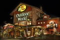
| 11/07/2008 07:19:47 PM |
Grand Openingby VenomComment: Not the kind of shot I normally expect to see in a challenge on this site. Pretty decent for what it is. Well composed, decently lit. My eye is guided right up to the store's name. If I had hired you to do a good shot of this store for an advertisement, I would be pleased. If I were an overly picky and anal DPC member, I might have bumped up the curves, saturation and contrast just a wee bit to give it a little more visual impact. Good thing that's not the case...
Actually, the more I look at this, the more I think you've done a good job with a relatively ordinary subject. A type of shot that is bread and butter for many professional photogs. |
| Photographer found comment helpful. |
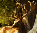
| 11/07/2008 07:09:38 PM |
The Warriorby SoulMan1978Comment: Maybe a little too much of that golden glow keeps it from standing out against the background. Might be able to make some selective adjustments to get the buck to stand out better. |
| Photographer found comment helpful. |
| 11/07/2008 02:16:39 PM |
Head in the Cloudsby K3MasterComment: Neat looking, and a fun idea. Sometimes you can manage this kind of partial desat in basic and it works great.
Edit to fix typo. (I'm a little anal about misspellings) |
| Photographer found comment helpful. |
| 11/07/2008 02:14:53 PM |
Sweet Sorrowby Matty_lettuceComment: A little dark, and the major elements all seem to be arranged around the outer edges of the frame. There seems a big empty area in the middle.
Added: Hmmm,... a big empty area in the middle. I wonder if that is part of what you are trying to convey here. My vote on this one is going up. If that was actually intended to be part of the message it was too subtle for most voters, including me. |
| Photographer found comment helpful. |
| 11/07/2008 12:36:47 AM |
|
| Photographer found comment helpful. |
Home -
Challenges -
Community -
League -
Photos -
Cameras -
Lenses -
Learn -
Help -
Terms of Use -
Privacy -
Top ^
DPChallenge, and website content and design, Copyright © 2001-2026 Challenging Technologies, LLC.
All digital photo copyrights belong to the photographers and may not be used without permission.
Current Server Time: 06/19/2026 09:02:09 AM EDT.