| Image |
Comment |
| 03/01/2009 02:56:42 PM |
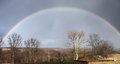
Februaryby DianaComment: Nice catch of this rainbow. Could possibly use a bump up in curves and saturation. A great rainbow needs some "wow" applied. |
 Photographer found comment helpful. Photographer found comment helpful. |
| 03/01/2009 02:55:18 PM |
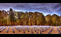
MAYby SDWComment: Not what I would normally expect to see on a calendar, but for certain themes, I suppose. |
| Photographer found comment helpful. |
| 03/01/2009 02:53:55 PM |
|
| Photographer found comment helpful. |
| 03/01/2009 02:52:19 PM |
|
| Photographer found comment helpful. |
| 03/01/2009 12:37:22 PM |
The Lookby dwterryComment: Not exactly a natural pose. Well, perhaps for a model it is! I like it though, but that pose makes me wonder what she is doing. |
| Photographer found comment helpful. |
| 03/01/2009 12:35:48 PM |
Gleam of Hopeby Shutter-For-HireComment: Cool glow and nice textures. Maybe a little centered for my preference, but I don't know how else you would crop this shot. |
| Photographer found comment helpful. |
| 03/01/2009 12:34:36 PM |
Armillary sphereby GemGemComment: Interesting shapes. What is it?
I see a big problem with this, however.
There is a lack of sharpness and clarity to this photo and I think most of it is due to the use of excessive JPEG compression. Your file size of only 44k indicates a highly compressed image and that is what is robbing a lot of the detail and sharpness from this image. Check your compression settings when you save your file. Always adjust JPEG compression so that your file size is as large as possible, but within the challenge limit. (200k for this one) |
| Photographer found comment helpful. |
| 03/01/2009 12:11:18 PM |
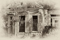
House nostalgicby MelethiaComment: The effect suits it quite well. The original just appears a snapshot, while the edit has that authentic vintage digital look to it. (Is that an oxymoron?) |
| Photographer found comment helpful. |
| 03/01/2009 12:06:44 PM |
Number 8 - Painting the Cityby KelliComment: I think you got what you were after. The original was fairly soft and flat. You did well. I might have done some selective NR or blurring on they sky to get rid of some of that graininess, but I like smooth skies. What did you use to get the look? It appears to be Topaz or what I do in PSP that has been dubbed "clarify abuse". Message edited by author 2009-03-01 12:07:18. |
| Photographer found comment helpful. |
| 03/01/2009 12:02:10 PM |
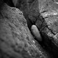
Stuckby RetroesqueComment: Simple but effective. I like all the grainy detail of the rocks. How did you do the b/w conversion? |
| Photographer found comment helpful. |
Home -
Challenges -
Community -
League -
Photos -
Cameras -
Lenses -
Learn -
Help -
Terms of Use -
Privacy -
Top ^
DPChallenge, and website content and design, Copyright © 2001-2026 Challenging Technologies, LLC.
All digital photo copyrights belong to the photographers and may not be used without permission.
Current Server Time: 06/23/2026 12:10:49 PM EDT.